Your wishlist is empty.
Secure Payment
30 days return

You're standing in front of a blank wall with a hammer in one hand and a canvas in the other, wondering whether “earth tone” means another safe beige rectangle. It doesn't. The best earth tone art brings clay, ochre, moss, terracotta, espresso, and mineral warmth into a room without draining it of personality.
The trick is choosing depth instead of defaulting to taupe. Warm color can feel settled, not sleepy. Texture can make a restrained palette feel layered. And a darker earth tone can give a room the same visual anchor that black or navy often provides, without turning the space cold.
Earth tone art is artwork led by low- to medium-saturation colors associated with soil, stone, vegetation, and weathered materials. Brown, ochre, sienna, umber, terracotta, moss, bone, and muted plum all belong in the conversation. The category reads as grounded because its colors resemble things found in the natural world, not because every piece has to be beige.
That distinction matters. Earth-tone aesthetics became especially prominent in the 1970s and early 1980s, with one design reference placing the peak popularity roughly between 1973 and 1984. Brown, yellow, and orange dominated artwork, logos, and interiors during that period, before flashier styles such as Memphis Design displaced much of that look by the mid-to-late 1980s, as documented in this history of earth-tone aesthetics. Today's version borrows the warmth but drops the dated formula.
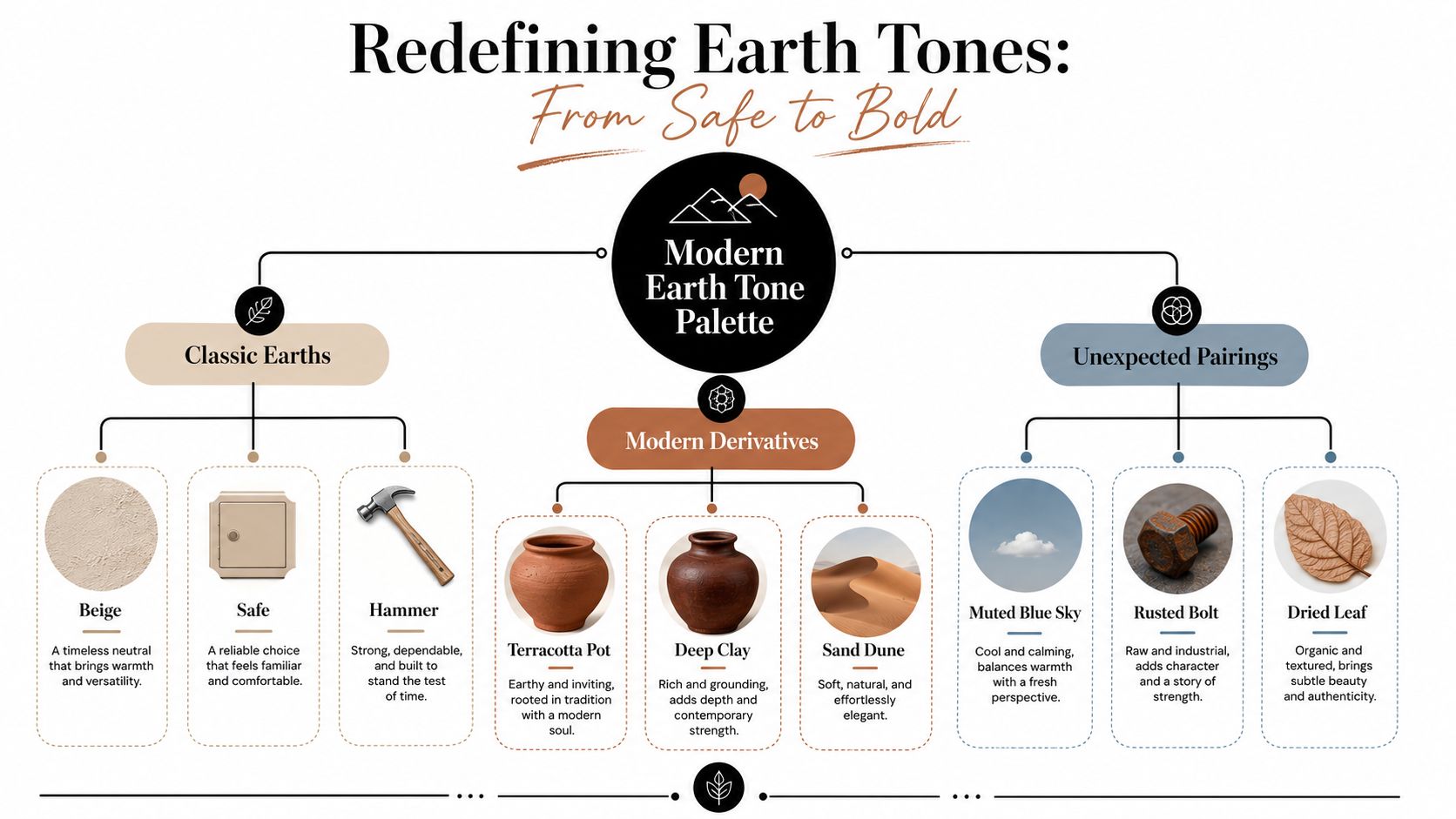
A modern piece might pair burnt clay with moss green, set espresso against sand, or use ochre beside a dusty blue. Those combinations still feel natural, but they create contrast. That's the current appeal: buyers want warmth without visual heaviness, depth without gloom, and color that could plausibly exist in a desert, forest, mountain range, or sunlit field.
The strongest examples also use surface to keep the palette alive. Visible brushwork, linen texture, layered pigment, and uneven edges stop warm colors from becoming a flat block. A beige print can disappear against a neutral wall. A textured terracotta canvas can give the same wall a focal point.
My rule: If the art could be mistaken for a paint swatch, it probably needs more texture, more contrast, or both.
The earth-tone family starts with actual materials. Natural iron-oxide pigments commonly called earth colors have been used on artists' palettes for more than 40,000 years, making earth-tone art one of the oldest continuous color traditions in visual culture, according to Gamblin's history of iron-oxide pigments.
Artists built practical palettes from what the ground offered. Yellow ochre resembles dry, sunbaked clay. Burnt sienna has the color of rust and warm brick. Raw umber feels like a wet forest floor, while burnt umber moves toward dark coffee, bark, and smoked wood. These colors harmonize because many are mineral-based, with iron-oxide or manganese-oxide chemistry behind their muted appearance, as explained in this technical overview of earth-tone pigments.

The pigment alone doesn't determine the result. A thin glaze lets the undertone glow through. Scumbling creates a broken, dusty surface where lighter paint catches the texture. Mixing with white bone or another pale neutral softens the color and makes it feel chalky, airy, or sunwashed.
Think of the same sienna applied three ways. A transparent layer can resemble late-afternoon light. A thick, opaque passage feels like fired clay. A pale scumble over it suggests faded plaster. That range is why earth colors don't have to look dull.
You can see this logic in Bisbee Sunset Over Hills - Canvas Wall Art, whose scene uses coral, sage, and burnt sienna across layered Arizona hills. The green hills catch orange light, while purple enters the shadows, giving the warm palette enough variation to stay lively.
For a closer look at how burnt orange translates beyond paint, this resource on Atlanta custom upholstery in burnt orange is useful when coordinating art with fabric, seating, and other tactile surfaces.
Flat earth tone art usually fails because every color is asked to do the same job. Give the palette a hierarchy instead. Choose one dominant tone, one supporting tone, and one accent. A practical interior rule uses 70% primary tone, 20% secondary tone, and 10% accent, a proportion described in Havenly's earth-tone palette guidance.
The dominant tone should carry the emotional weight. Clay, terracotta, or deep ochre can lead. The secondary tone gives the eye somewhere to rest, with moss, taupe, sand, or bone working well. The accent should sharpen the composition, perhaps through espresso, muted plum, rust, or a restrained blue.
Warm palettes built from terracotta, amber, cinnamon, and burnt sienna feel enveloping. Cooler combinations using sage, slate, driftwood, and blue-gray feel quieter and more architectural. Both work. The mistake is using warm and cool earth colors at full strength without a bridge neutral.
Raw sienna beside dusty rose can look muddy because the colors compete in similar middle values. Add bone, charcoal, or a clear cream and the relationship becomes more deliberate. Likewise, moss beside terracotta benefits from a dark brown or pale sand that separates the two families.
For a broader approach to coordinating art, furnishings, and surrounding surfaces, this expert color palette guide from Giorgi Bros. Furniture offers a useful reference point.
| Palette Direction | Dominant | Secondary | Accent | Resulting Mood |
|---|---|---|---|---|
| Warm and tactile | Terracotta | Bone | Espresso | Welcoming and substantial |
| Desert landscape | Ochre | Burnt sienna | Muted plum | Sunlit and expressive |
| Botanical cool | Moss | Driftwood | Rust | Calm with organic contrast |
| Mineral neutral | Sand | Walnut | Clay red | Restrained but not sterile |
Scale changes the effect, too. A small patch of saturated terracotta can energize a room more effectively than a large, pale wash. Use intense colors in smaller areas when you want punctuation, and reserve broader fields for softened versions of the same family.
Treat each room as a lighting problem before treating it as a decorating problem. The same umber canvas can feel rich in a dim bedroom and heavy in a shadowed hallway. Placement, surface protection, and surrounding materials decide whether earth tone art looks intentional or merely brown.
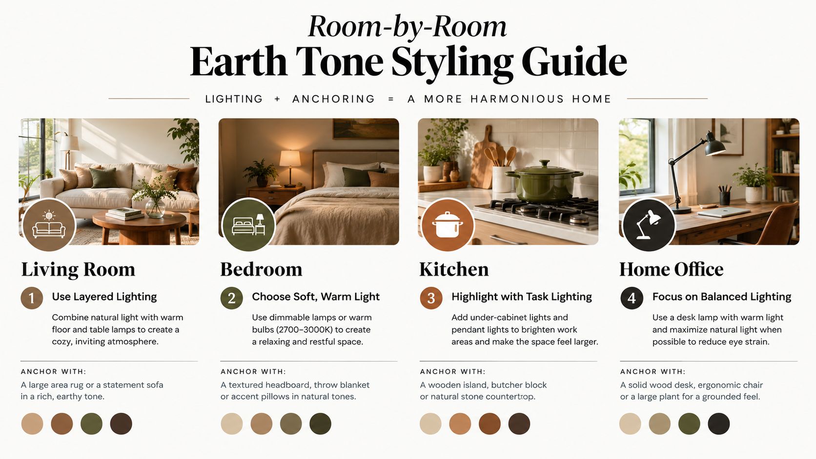
Give the living room a lighter load. Daylight shifts across the space, and the room already has visual activity from seating, rugs, books, and movement. A large terracotta or umber canvas over the sofa can anchor the wall, while smaller moss or oat pieces elsewhere pull the eye through the room.
Don't create a brown island. Repeat one art color in a cushion, ceramic object, wood tone, or rug so the canvas belongs to the room rather than floating above it. Jessie's Home's living room wall art collection is organized for this kind of room-specific browsing.
Bedrooms can handle deeper, more saturated earth colors because the mood benefits from absorption and softness. Clay, espresso, walnut, and muted plum work especially well when the room has cool morning light. One oversized piece above the headboard usually feels calmer than a busy gallery wall.
Keep the composition broad and quiet. A scene with a low horizon or an abstract with large, unbroken shapes will support rest better than a crowded image full of competing details.
These rooms need reflective contrast. Matte clay art can look murky beside dark cabinetry or under flat overhead lighting, so pair it with brass, copper, glazed tile, glass, or polished stone. The reflective material catches light that the artwork doesn't, giving the whole arrangement more clarity.
A small warm-toned piece near a dining banquette can work better than a giant canvas competing with dishes, shelves, and pendant lights. Let the art provide color, then let the surrounding finishes provide sparkle.
Bathrooms demand protection. Favor framed prints behind glass or sealed surfaces rather than unprotected canvas in areas exposed to steam. Rust, sand, and raw sienna tend to remain readable where gray-leaning neutrals can become cold or lifeless.
In a home office, moss and walnut create a composed backdrop without forcing the space into corporate blue. Add a warmer accent, such as clay or ochre, if the room needs more energy. Offices, clinics, hospitality areas, and other higher-traffic settings increasingly use earthy palettes for their material story and biophilic feel, with textured formats such as linen, jute, embossed canvas, and terracotta relief receiving attention in commercial wall-art trend coverage.
The useful question isn't whether a canvas contains brown. Ask what role the color plays. Does it lead the composition, ground a scene, interrupt green, or let texture carry the interest? Those are four distinct approaches, and confusing them is how a room ends up with several pieces that all look like variations of the same beige idea.
A warm-dominant abstract needs surface variation. Terracotta and clay can become blunt when printed as a perfectly even field, but visible brushwork breaks the color into movement. This style belongs over a sofa, console, or dining credenza where the art has enough surrounding space to breathe.
Earth tone art handles earth tones differently. Ochre and burnt sienna naturally support horizon lines, distant hills, rock formations, and fading light. The image gives those colors a reason to exist, so they feel grounded instead of decorative.
The green-broken botanical is the case for cooler earth tone art. Moss and walnut create a complex relationship that doesn't depend on orange or red. It works particularly well in an office, library, entryway, or room with wood furniture.
The texture-led neutral is quieter. Sand and espresso can look almost severe if the surface is smooth, but linen weave, raised marks, or restrained linework gives the limited palette something to say. Use it in a bedroom or reading corner where the art should settle the room rather than dominate it.
| Piece Style | Dominant Palette | Best Room | Why It Works |
|---|---|---|---|
| Textured abstract | Terracotta and clay | Living room | Brushwork prevents warm color from becoming a flat block |
| Horizon landscape | Ochre and burnt sienna | Dining room | Landforms give the palette visual grounding |
| Botanical composition | Moss and walnut | Office or library | Green breaks the warm bias without losing natural character |
| Minimalist line canvas | Sand and espresso | Bedroom or reading corner | Texture carries interest while the colors stay restrained |
For shoppers who prefer a softer starting point, Jessie's Home's beige abstract canvas wall art can work when the piece includes enough line, tonal variation, or surface character. Beige isn't the problem. Beige without structure is the problem.
Earth tone art isn't popular because everyone suddenly wants a beige house. The palette has expanded into clay red, warm ochre, moss green, terracotta orange, and espresso, a richer range identified in recent 2026 art color trend coverage. That shift gives designers warmth without forcing them back into the dated brown-and-orange rooms associated with earlier decades.
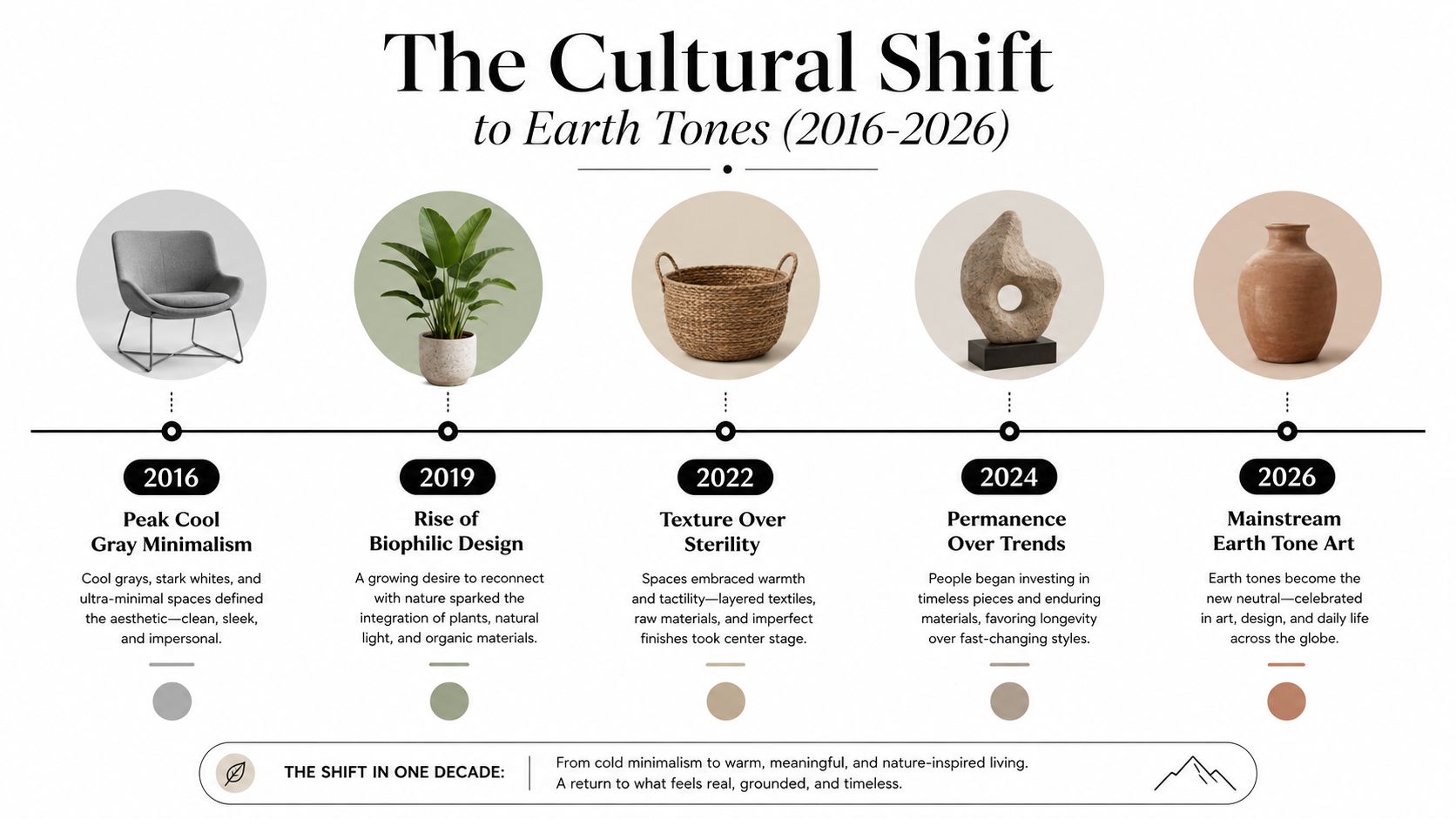
Cool gray minimalism made rooms look orderly, but it often left them visually thin. Earth-tone interiors answer that problem with texture and material memory. Limewashed walls, raw wood, unlacquered brass, woven fibers, and softly marked canvases all suggest that a room is meant to be lived in, not staged for a photograph.
That doesn't mean every room needs to look rustic. Espresso can feel modern beside pale plaster. Moss can look refined with black metal. Terracotta becomes almost architectural when it appears in a sharp geometric composition instead of a rustic scene.
The current palette feels fresh because it has contrast. Warmth alone is cozy. Warmth with shadow, green, or mineral blue has character.
Natural materials also make practical sense in commercial settings. Designers favor earthy palettes for biophilic impact, material story, and versatility, while textured surfaces can add visual interest where a glossy print would feel too reflective. The same principle applies at home. A canvas with layered marks looks more permanent than a thin, anonymous color block.
Lighting matters to the trend's success. Before you judge a piece, evaluate the bulbs and fixtures around it. A helpful guide to sizing light fixtures for your home can improve the room's overall proportions and help the art receive deliberate rather than accidental illumination.
Run every potential piece through four filters: texture, scale, lighting, and palette commitment. Skip one and you may buy art that looks appealing online but disappears, overwhelms, or turns muddy on your actual wall.
Flat warm color often reads like cardboard. Look for visible brushwork, canvas grain, layered pigment, raised marks, or a composition with enough tonal variation to catch changing light. Texture matters most when your walls, sofa, or bedding are already smooth.
The artwork should feel connected to what sits beneath it. Compare the canvas width with the sofa, bed, credenza, or dining console rather than judging the wall alone. A single substantial piece usually creates a stronger anchor than a scattered collection of undersized frames, especially above large furniture.
If you prefer clean lines and restrained materials, browse canvas wall art for Scandinavian homes. The key is still contrast. A pale room needs an artwork edge, shadow, or color shift that keeps the wall from looking unfinished.
North-facing rooms can flatten warm pigments. South-facing rooms can intensify them. Mixed LED temperatures can push ochre toward an unpleasant yellow, so don't make the decision from a product thumbnail alone. Hold a printed color reference, sample image, or the actual artwork against the wall during the hour you use the room most.
Before you buy: View the piece beside your flooring, upholstery, metal finishes, and largest nearby surface. Earth tones are forgiving, but they still need a deliberate relationship.
Use this short checklist:
Jessie's Home offers artist-made canvas wall art and gallery-quality photo prints, including abstract, botanical, minimalist, and other styles that can support a layered earth-tone scheme. Visit Jessie's Home to browse pieces by room, style, subject, or place, then choose the warm canvas that gives your blank wall an actual point of view.

Discover how to pick, place, and style art with cat themes across your home. Covers popular styles, room-by-room placement, and mixing feline art
Discover how to pick, place, and style art with cat themes across your home. Covers popular styles, room-by-room placement, and mixing feline art

Discover how black and white minimalist art transforms any room with calm, contrast, and timeless style, plus tips on prints, framing, and placement.
Discover how black and white minimalist art transforms any room with calm, contrast, and timeless style, plus tips on prints, framing, and placement.

Discover watercolor abstract art techniques, learn how prints differ from originals, and get styling tips for your home. A complete guide for wall art lovers.
Discover watercolor abstract art techniques, learn how prints differ from originals, and get styling tips for your home. A complete guide for wall art lovers.


