Your wishlist is empty.
Secure Payment
30 days return

You're standing in the middle of the room with a cushion in one hand and a paint sample in the other, staring at the same blank wall you've ignored for months. The sofa is comfortable, the lighting is fine, and the room still feels unfinished. Every color option seems to create a new problem. Yellow can look dated, red can become the whole conversation, and beige disappears.
Burnt orange wall art solves that problem with more restraint than most warm accents. It brings energy without the sharpness of bright orange, depth without the formality of deep red, and enough earthiness to sit comfortably beside wood, cream, stone, or woven textures. It's the warm middle ground that makes a room feel considered rather than decorated in a hurry.
The difficulty usually isn't finding something attractive. It's choosing something that won't make every other decision in the room feel wrong. A large abstract print can dominate the sofa, a small botanical piece can look stranded, and a trendy color can make the room feel tied to one decorating moment.
Burnt orange is unusually useful because it carries several moods at once. Its orange side adds life, while its brown-red depth keeps that energy controlled. The result feels welcoming and slightly nostalgic, but it doesn't automatically turn a modern room into a 1970s time capsule.
A renter might use one canvas to give a white living room more character without repainting. A homeowner might place it above a walnut console to connect pale walls with deeper furniture. In both cases, the artwork does more than fill space. It gives the room a visual temperature.
That historical range helps explain the color's staying power. The term burnt orange began appearing in English as a color name in 1915, and the University of Texas later trademarked a specific burnt-orange hue in 1966, helping establish the shade as a recognizable identity color in North American design culture. It also became closely associated with 1970s interiors, when earthy colors were widespread in home decor and fashion. Figma's burnt orange color history offers useful context for why the shade can feel both established and current.
If you're planning a painted feature wall as well as artwork, it's worth reviewing practical feature wall paint and panel tips before committing to a strong treatment. The wall finish, panel lines, and artwork should support one another, not compete for attention.
Stylist's rule: If the blank wall feels intimidating, choose one warm artwork with a clear composition before adding smaller decorative pieces around it.
The rest comes down to discipline. Choose the right undertone, give the artwork breathing room, and place it where the color can anchor something useful, such as a sofa, dining table, console, or desk. Burnt orange works best when it looks intentional, not scattered.
Burnt orange sits between true orange and rust. It still reads as orange, but brown and red undertones soften its brightness and give it a more settled character. That difference matters. Pure orange demands attention immediately, while brown-heavy orange feels calmer and easier to live with.
Design guidance on burnt orange highlights the same practical advantage. Brown, red, and umber undertones reduce visual intensity while preserving warmth, which helps the shade feel mature rather than childish. On a neutral wall, the contrast lets the artwork become a focal point without requiring an enormous format or highly saturated color. This guide to burnt orange paint tones explains why the undertone does so much of the work.
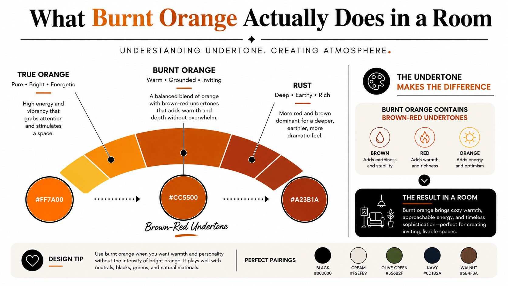
In a living room, the color can feel cozy and grounded. In a dining room, it feels sociable and warm under pendant lighting. In an office, one controlled piece can soften cool white surfaces and technology. In a bedroom, the same hue can feel comforting, but a large uninterrupted field may become too active.
Bright orange is louder and more playful. Deep red is more formal and can feel heavy when it occupies too much visual space. Burnt orange sits between them, offering warmth with a little nostalgia, but without forcing a room into a theatrical theme.
Lighting changes the final impression. Daylight can make the orange appear clearer and more energetic, while warm lamp light deepens it toward rust and red. Judge the artwork in the light the room uses, especially if the space is used mainly in the evening.
The key takeaway is simple: burnt orange is a mood-setting color, not just a decorative accent. A softly graded scene creates a different atmosphere from a solid geometric block, even when both use the same hue. The artwork's composition decides whether the room feels like a warm retreat or a dated color experiment.
The strongest pairings create contrast without turning the room into a color chart. Burnt orange needs one confident partner, then quieter supporting materials. Add too many competing accents and the artwork loses its authority.
| Partner Color | Why It Works |
|---|---|
| Deep teal | Its cool depth balances the warmth and gives the orange a sharper, more deliberate edge. |
| Navy | Navy is dependable against burnt orange, especially on pale or cool walls. |
| Warm cream | Cream keeps the room soft and lets the artwork provide the stronger color note. |
| Soft blush | Blush extends the warm palette gently without making the room feel rustic. |
| Sage | Sage adds a natural, muted counterpoint that suits botanical and landscape imagery. |
| Charcoal | Charcoal gives the artwork structure and works well in contemporary rooms. |
| Chocolate leather brown | Chocolate brown connects the orange to leather, walnut, and other rich materials. |
Use the wall as your starting point. If it's cool white or grey, bring in navy or deep teal through a chair, rug, vase, or nearby textile. If the wall is warm cream, soft blush or sage will keep the composition relaxed. If the room already contains plenty of timber, leather, or woven brown textures, let those materials support the artwork instead of adding another bright accent color.
Material matters as much as hue. Matte paper, linen, wood grain, and plaster-like surfaces reduce glare and make burnt orange feel more natural and substantial. Pairing it with complementary blues or cool neutrals improves separation and stops the composition from feeling visually dense. This burnt orange palette guide provides useful direction on surfaces and complementary tones.
For artwork with metallic details, a restrained gold accent can work, particularly in an abstract composition. Keep the finish quiet rather than shiny. A subtle gold element, such as the kind found in gold abstract canvas wall art, should support the orange rather than create a second focal point.
Photographic pieces deserve the same care. Color grading affects whether burnt orange looks earthy, dusty, or aggressively saturated, so photographers and buyers can benefit from this practical resource from Jimmy Clemmons Photographer.
Skip bright primary red, which fights the orange's undertones. Neon pink steals attention, lemon yellow creates a busy high-energy mix, and stark black can make the artwork feel harsher than intended. Choose one strong partner color per room. The burnt orange piece should be the quiet hero, not one voice in a shouting contest.
The living room is the safest place to start. Hang a horizontal scene or abstract piece above the sofa, or position a vertical work over a console where it can connect the furniture to the wall. Grey upholstery, cream textiles, natural timber, and aged brass all give the color room to breathe.
A dining room is even better for artwork with sunset, foliage, or painterly movement. Pendant light brings out the warmer side of the pigment, while the color creates a more welcoming backdrop behind the table. Choose a piece with variation, such as shadow, cream, brown, or blue, rather than a single unbroken orange field.
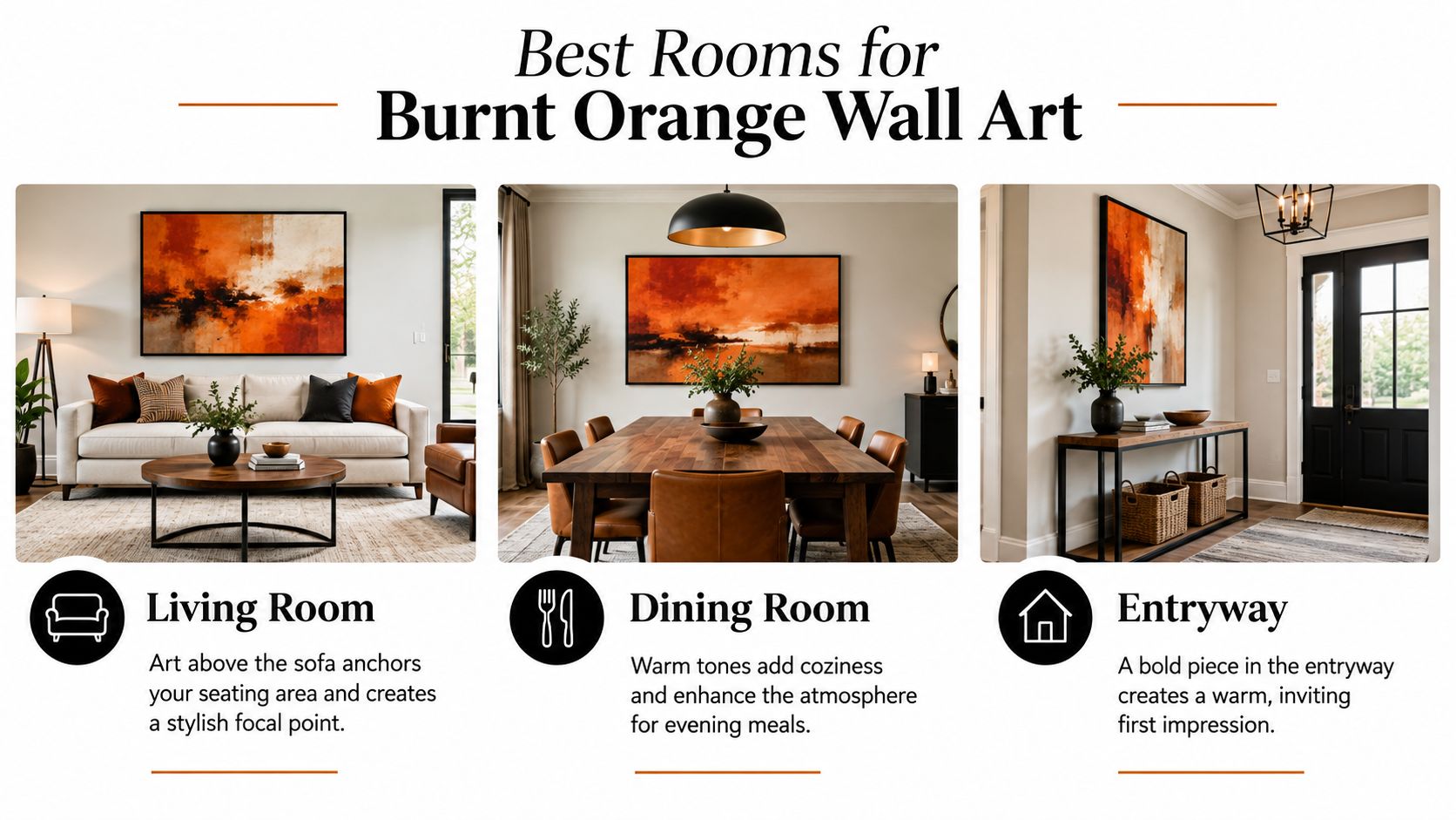
Kitchens are often less forgiving. Strong cabinetry, open shelving, appliances, and patterned backsplashes already create plenty of visual activity, so burnt orange can look tacked on unless the artwork is small and exceptionally well placed.
I'm also cautious with small windowless bathrooms. Fluorescent or yellow-tinted lighting can muddy brown undertones, and the enclosed footprint gives a dense color fewer places to settle. If you use it there, choose a lighter composition with cream or pale blue breaks and keep the surrounding accessories minimal.
The simplest test is to ask whether the room needs warmth or already has too much visual weight. Burnt orange earns its place in rooms that need a focal point. It's the wrong choice for a space where every surface is already competing.
Burnt orange looks better on a surface that gives the color somewhere to go. Textured canvas catches light unevenly across its weave, so a painted gradient can shift subtly from rust to amber as the day changes. That variation makes the piece feel more like an object with depth and less like a flat poster.
A matte or satin canvas finish is especially useful. Glossy paper creates hot spots under windows, ceiling fixtures, and lamps, which can flatten delicate color transitions and make warm pigment look more artificial. Canvas keeps the surface quieter, allowing the brown-red undertones to remain visible.
| Factor | Canvas | Flat Print |
|---|---|---|
| Light handling | The weave breaks up reflections and keeps color comfortable in changing light. | Smooth surfaces can reflect fixtures and windows directly into the viewer's eye. |
| Color depth | Texture adds subtle variation to gradients and painterly areas. | Flat ink can make broad areas feel more uniform. |
| Wall tolerance | Stretched construction gives the piece physical presence and can disguise minor wall unevenness behind the frame. | Thin paper shows more of the wall and depends heavily on the frame and glazing. |
| Visual character | Reads as substantial and ready to hang. | Can look crisp, but may feel more temporary in a prominent position. |
| Best finish | Matte or lightly textured. | Non-glare paper is preferable to high gloss. |
The material also changes how large the artwork feels. A canvas with a visible weave can hold a broad burnt orange passage without looking as flat or aggressive as a smooth poster with the same color coverage.
If you're moving or storing a canvas, protect corners, keep the surface from rubbing against other objects, and use safe packing methods for prints and sculptures before wrapping the piece. Good handling protects both the surface and the frame.
For shoppers comparing formats, canvas wall art is the sensible direction when the artwork will sit above a sofa, dining table, or other visually important piece of furniture. Canvas makes burnt orange look more forgiving, more dimensional, and more expensive in everyday light.
The first style I'd recommend is a restrained abstract composition built from horizontal bands of rust, clay, soft cream, and muted sky. The burnt orange works best in the middle ground, where it warms the composition without occupying every inch. Cream at the top creates visual relief, while darker land or shadow near the bottom gives the eye somewhere to settle.
This format suits a living room above a grey sofa or a long console. Choose a width that follows the furniture below rather than stopping abruptly in the middle of it. Keep the rest of the palette quiet, with oatmeal upholstery, walnut or oak, and one cool accent such as navy glass or a deep blue cushion.
The second strong option is a botanical line drawing on a muted burnt orange ground. Dark stems, leaves, or branches break up the color, so the orange behaves like a field behind the subject instead of a solid block. That negative space keeps the work contemporary and prevents the piece from drifting into overly nostalgic territory.
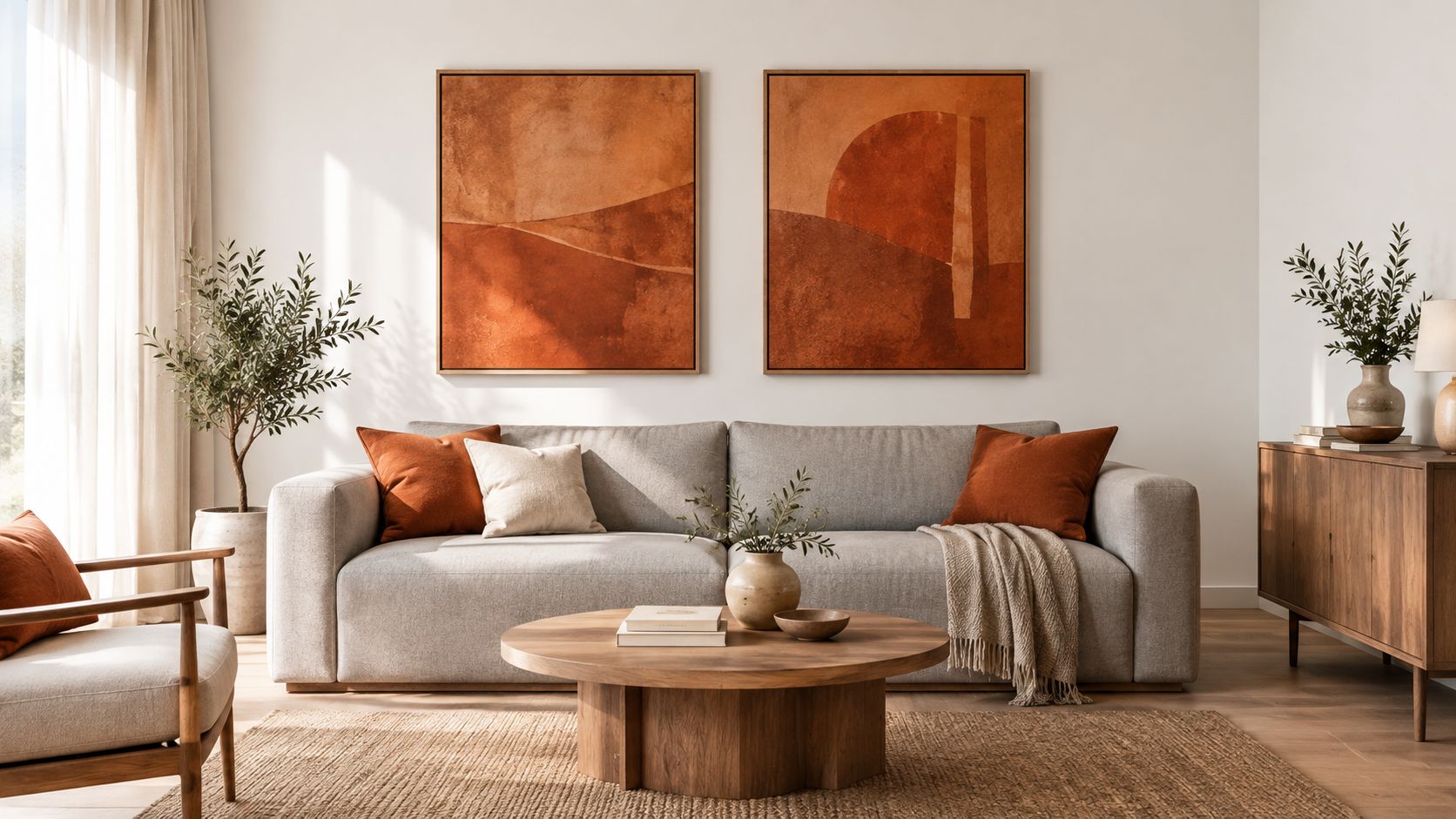
A scene painting is forgiving because the color is broken by sky, shadow, foliage, or a path. It can cover more wall while still allowing the eye to move through the image. A botanical design is more graphic, so it suits a smaller wall, a bedroom, an entryway, or a home office where crisp lines balance the dense background.
Look for variation within the orange. Rust, clay, amber, cream, brown, and muted blue make the artwork easier to place than a single saturated orange. That variation also gives you more freedom with cushions, rugs, and curtains, because you won't be forced to match one exact shade.
Avoid buying solely because the product photo has a dramatic orange background. Ask what remains once the artwork is on your wall, beside your furniture, and under your evening lamps. The best piece gives the room a focal point while leaving enough quiet space for the rest of the interior to function.
Burnt orange needs breathing room. Hang it too close to a shelf, lamp, or cluster of small frames and the dense pigment becomes part of a visual pile. Give the artwork a clean field around it, then let one piece of furniture provide the anchor.
Use the 57-inch centerline rule as a starting point, with the center of the artwork near average eye level rather than measuring from its top edge. Adjust for the room. A piece above a sofa sits lower than artwork in a hallway, and a work viewed mostly from a dining chair should make sense from that seated sightline too.
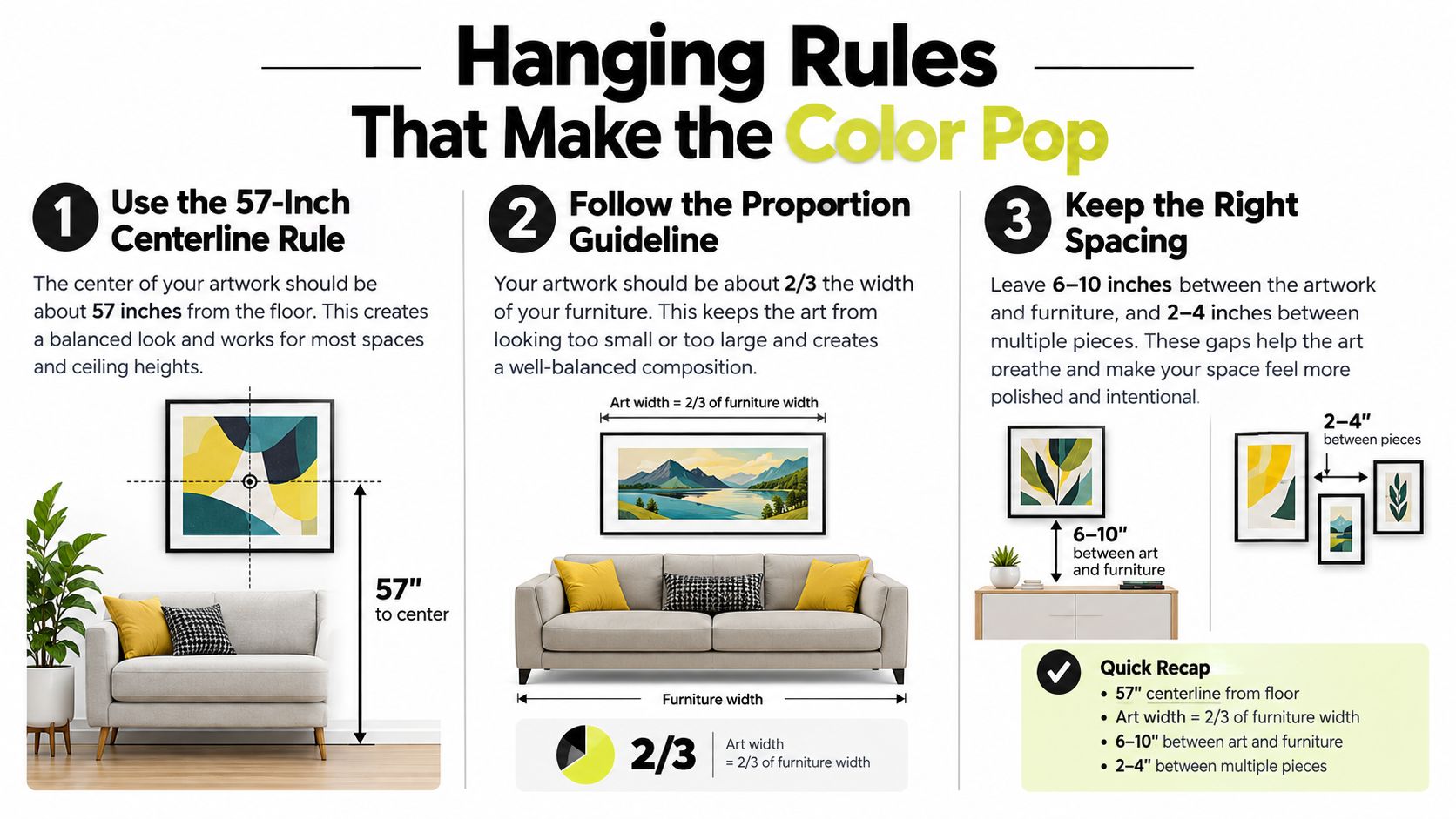
The artwork should be roughly two-thirds the width of the sofa or console beneath it. That proportion feels connected without making the furniture look undersized. A small piece on a long, empty wall usually looks accidental, while an oversized, saturated orange block can set the temperature for the whole room.
Leave a safe clearance zone of roughly six to twelve inches above seating. The exact position depends on the artwork, the furniture height, and the room's sightlines, but the principle is firm. Don't let the bottom edge float too high or hover uncomfortably close to the sofa.
Never place two dominant burnt orange pieces directly opposite each other. The eye will bounce between them, and the room can feel overcommitted even if each artwork is attractive alone.
For a desk or study wall, keep the same proportional discipline when browsing home office wall art. A smaller work can soften a workspace without turning the background into another source of distraction.
Use this hanging rules video as a visual reminder before drilling. Hold the piece in place with paper templates first, then check it from the sofa, doorway, and standing position.
Run through these questions before you add the piece to your cart:
Three mistakes appear again and again. First, don't buy burnt orange solely to match a cushion. Exact matches often look forced, while related shades from the artwork's wider palette feel more natural. Second, don't hang a small piece alone on a long wall without a console, bench, or grouped arrangement to give it scale. Third, don't choose a glossy flat poster for a bright room and expect the warm gradients to stay comfortable under changing light.
The rule to keep is simple: choose the undertone first, the surface second, and the placement third. When those three decisions agree, burnt orange wall art looks deliberate, current, and easy to live with.
Jessie's Home offers artist-made canvas wall art and gallery-quality photo prints in styles including abstract, scenery, botanical, and minimalist work, with pieces made for rooms such as living areas, bedrooms, offices, and dining spaces. Browse the Jessie's Home collection to find a burnt orange piece with the right composition, surface, and scale for your wall.

Explore the beauty of modern landscape art and how to choose prints that transform your home. From trends to room-by-room styling tips, this guide covers it
Explore the beauty of modern landscape art and how to choose prints that transform your home. From trends to room-by-room styling tips, this guide covers it

Learn how to choose and style beach wall art for living room spaces — from coastal palettes and framing to scale, grouping, and avoiding kitsch.
Learn how to choose and style beach wall art for living room spaces — from coastal palettes and framing to scale, grouping, and avoiding kitsch.

Abstract Painting for Living Room. Learn how to choose the perfect abstract painting for your living room with our guide on scale, color, placement, and styling
Abstract Painting for Living Room. Learn how to choose the perfect abstract painting for your living room with our guide on scale, color, placement, and styling


