Your wishlist is empty.
Secure Payment
30 days return


You've found a solar system print with a dark background, luminous planets, and colors that would work beautifully above your sofa. Then you notice that Earth looks almost as large as Jupiter, the planets seem crowded together, and the description doesn't explain whether the colors are real.
That doesn't automatically make it a poor choice. Good solar system art can teach, create a mood, or make a room feel more personal. The important thing is knowing which parts represent astronomy and which parts belong to the artist.
Solar system art styles and where each fits
| Style | Best for | Accuracy | Typical look |
|---|---|---|---|
| Illustrative (painted or stylized) | Kids' rooms, mood walls | Low when the artist takes substantial liberties | Bold color, glowing rings |
| Photographic (spacecraft imagery) | Living rooms, offices | High for surfaces seen by spacecraft; processing still matters | Real surface textures and cloud bands |
| Educational poster | Classrooms, science-minded homes | High when labels explain the visual conventions | Labels, scale bar, color legend |
| Minimalist planetary | Bedrooms, hallways, hospitality | Moderate for identification, not necessarily measurement | Simple circles in a coordinated palette |
Illustrative art gives the artist freedom to exaggerate light, texture, and atmosphere. That freedom makes it expressive, but a glowing outline shouldn't be mistaken for a physical feature.
Photographic work offers recognizable surface details, although a photograph can still be cropped, color-enhanced, or assembled into a composite. An educational poster makes its strongest contribution through explanation, not merely through realistic-looking planets.
Minimalist designs remove detail so the arrangement reads clearly across a room. They're useful when you want a quiet composition, provided you don't expect simplified circles to communicate planetary science without help.
For an energetic reading corner, compare painted planets with other illustrative canvas wall art. Look at brushwork, contrast, and background color rather than assuming every space-themed picture needs to look like a telescope image.
For a hands-on learning area, a print can accompany a physical activity. Families who want to make model planets with Playz can use the finished models to discuss how a flat picture differs from objects arranged in space.
Many familiar planetary motifs come from spacecraft observations. According to NASA's solar-system exploration history, Viking 1 produced the first image taken from the Martian surface on July 20, 1976, while Cassini explored the Saturnian system from 2004 through 2017.
Those missions help explain why depictions of rocky Mars and richly detailed Saturn scenes appear so often in photographic art. Still, check whether a listing identifies a mission image, an artist's interpretation, or a digitally constructed scene.
Practical rule: Choose the style for the wall's job: teaching, calming, decorating, or starting a conversation. Judge its scientific claims separately from its visual appeal.
Planet mean radius and size compared with Earth
| Planet | Mean radius (km) | Size vs Earth |
|---|---|---|
| Mercury | Not specified in the cited reference notes | Verify before using for a scaled drawing |
| Venus | Not specified in the cited reference notes | Verify before using for a scaled drawing |
| Earth | Mean radius not specified; the reference gives equatorial diameter | Baseline |
| Mars | Approximately 3,390 | About half Earth's size |
| Jupiter | About 69,911 | Roughly eleven times wider than Earth |
| Saturn | About 58,232 | Larger than Earth; use verified matching measurements for a ratio |
| Uranus | Not specified in the cited reference notes | Verify before using for a scaled drawing |
| Neptune | Not specified in the cited reference notes | Verify before using for a scaled drawing |
The numerical entries and comparisons above come from NASA's solar-system facts, which also describes eight planets and five officially recognized dwarf planets. Missing measurements are left unspecified rather than filled with estimates that could make a decorative drawing look more authoritative than it is.
A size-scaled print preserves the planets' proportions, but it doesn't necessarily preserve the space between them. A stylized print may enlarge smaller planets and compress the gaps so every subject remains visible. Either approach can work, provided the caption explains the choice.
Size scale describes how large the planets appear relative to each other. Distance scale describes how far apart their positions are represented.
These are separate design decisions. A neat row of correctly proportioned planets can be a useful size comparison without showing their actual orbital spacing.
A compact wall print generally can't give small planets prominent detail while also displaying the full extent of the system at a single useful scale. Adding orbit curves doesn't solve that problem. Curves may organize the page rather than represent measured paths.
For a teaching print, use caption wording that identifies the actual treatment:
These are suggested captions, not claims about any particular product. Only use the wording that matches the artwork.
If you're commissioning a print, ask the artist to apply the same size rule to every planet. Enlarging a small planet for readability is a legitimate decorative decision, but it changes the illustration from a measurement tool into an interpretation.
Ask for a clearly visible Jupiter-to-Earth comparison rather than relying on decorative ring widths or glowing edges. Compare the bodies themselves. Saturn's rings, atmospheric halos, and shadows can otherwise confuse the apparent sizes.
Also check what the composition includes. A planets-only arrangement isn't intended as a complete inventory of the solar system, and a separate dwarf-planet panel can make classification easier to understand.
An attractive diagram doesn't need to show everything. It needs to be clear about what its viewer can safely compare.
Before buying, enlarge the product preview and inspect the smallest subject and the caption. If neither remains distinguishable at the intended print size, choose a larger format or a simpler composition rather than accepting illegible detail.
A beautiful print can still leave viewers with wrong ideas. Bright glows, saturated colors, and tight spacing create drama, but viewers may read those artistic choices as physical facts.
The useful distinction isn't beautiful versus scientific. It's unexplained choices versus explained choices.
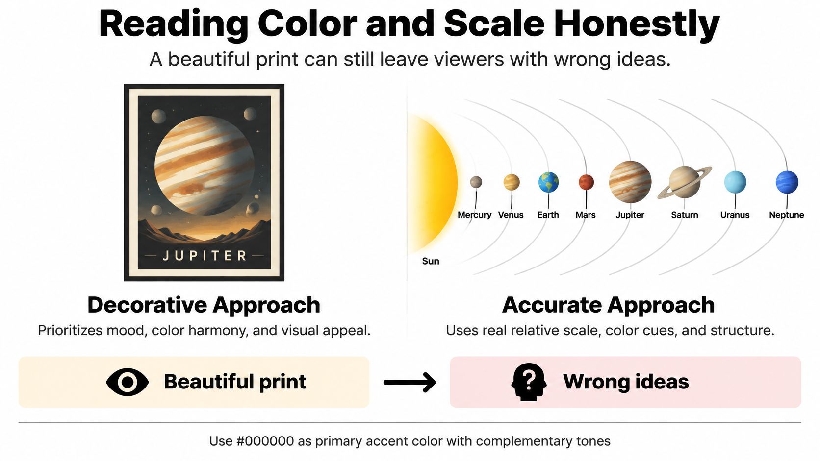
An astronomical-image interpretation study involving 8,866 public responses, alongside expert and non-expert focus groups, found that viewers frequently misunderstood images without explanatory text, scale indicators, or context. The study also identified confusion about color coding, including assumptions that red necessarily indicates heat.
A spacecraft image isn't automatically a straightforward record of what you'd see through a window. Image makers may combine filtered observations, adjust contrast, or assign colors to make particular features visible.
Choose among these conventions deliberately:
A print can combine conventions. For example, an artist might use enhanced-color planetary images in a relative-size arrangement. That's more informative than calling the result realistic.
In astronomical imagery, blue can represent hotter regions rather than colder ones. That doesn't mean a blue planet in decorative art must be hot. It means the viewer needs to know what the image maker intended the color to communicate.
For a child's room, a short explanation beside the picture is more useful than a technical description hidden in packaging. For an adult living space, a discreet mat caption can preserve the clean presentation while identifying the image treatment.
Keep the distinction visible: A realistic texture tells you how a surface has been represented. It doesn't tell you whether the color is natural, enhanced, or symbolic.
If a listing says only vivid or high-definition, ask a more useful question: does the color represent visible appearance, emphasize observed features, or follow an artistic palette? That answer helps you choose knowingly without asking the artwork to become a textbook.
Placement matters as much as the subject. A detailed educational print becomes decoration if nobody can get close enough to read it, while an expressive planetary canvas may look cramped beside crowded shelves.
Start by identifying where viewers will stand or sit. Then test the arrangement with paper templates, low-tack painter's tape, and the room's normal lighting.
Hang a learning print where the child can comfortably see its main features, not where an adult would automatically center a picture. Keep furniture access and safe mounting in mind, especially near beds and climbing surfaces.
When browsing kids' room wall art, judge the image from a child's likely viewing position. A bright palette can attract attention, but readable names and recognizable forms make it useful for conversation.
Above a sofa, center the composition on the furniture rather than on the entire wall. Nearby doors, shelves, and floor lamps can make wall-centered art appear misplaced.
In bedrooms, consider what the print looks like under bedside lamps. A black background may feel quiet in daylight but reflect distracting highlights after dark if the surface is glossy.
An office poster works best near a desk, reading chair, or meeting area where people can pause. Test the smallest important label from the seat where it will be read.
For an open wall, choose a center height that feels natural from the room's main approach. A standing hallway viewer and a seated office viewer don't need the same arrangement.
Keep photographic prints and colored artwork away from direct sunlight. A protective coating isn't a reason to place a piece in a daily shaft of sun.
Avoid radiators, fireplace heat, and areas with repeated moisture exposure. Before drilling, check the wall for concealed services and choose mounting hardware suited to the wall construction and the framed piece's weight.
Tape up a paper template, sit down, walk past it, and turn on the lamps. That small rehearsal reveals problems a product preview can't show.
Finish, material and readability by space
| Space | Finish | Material | Readability note |
|---|---|---|---|
| Kids' bedroom | Satin; washable only when specified | Canvas or poster paper with suitable protection | Bright palette, large labels |
| Living room | Matte, low glare | Canvas | Photographic or minimalist subject readable across the room |
| Classroom or library | Matte | Poster paper or matte-laminated print | Full legend and scale note |
| Home office | Matte | Poster paper or canvas | Labels readable at seated distance |
| Clinic or waiting room | Matte, easy to wipe when specified | Laminated print or coated metal | High contrast, large type |
| Hotel or restaurant | Satin or gloss after a reflection check | Metal or canvas | Minimalist layout, consistent palette |
Finish names describe appearance, not a complete cleaning specification. Satin doesn't automatically mean washable, and metal doesn't automatically mean suitable for disinfectant. Ask for the care instructions before choosing artwork for a frequently cleaned space.
Canvas adds texture and gives painted planetary scenes a gallery-style presence. That texture can soften tiny lettering and fine diagram lines, so it's a stronger choice for a dramatic Jupiter image than for a densely labeled reference poster.
Paper suits crisp typography, legends, and educational series. A frame and mat can separate the image from the glazing and give a small caption room to breathe; choose the glazing with the room's reflections in mind.
Metal can create a sleek presentation with strong contrast and clean edges. Under directional lights, however, a reflective surface can obscure exactly the area a viewer wants to inspect.
For a living room, examine framed wall art alongside unframed canvas options. Compare the frame profile, visible border, and glazing rather than treating the image alone as the finished object.
Matte surfaces generally scatter reflections more softly than glossy ones. Satin can offer a compromise, but neither label guarantees comfortable viewing under every light.
Hold a finish sample at the intended location if one is available. Check it from the doorway, the sofa, and any accessible seating position. In a restaurant, include the evening lighting setup rather than testing only during daylight.
A 2025 astronomy augmented-reality replication study found that real astronomy AR stimuli produced significantly higher participant workload under multiple conditions. That doesn't make digital enrichment a poor idea, but it supports treating a phone-based experience as optional rather than necessary.
A viewer should be able to identify the subject and understand the main message without scanning anything. This matters in shared spaces where people may not have a suitable device or may not want to use one.
Use high-contrast lettering with enough separation from the background. Avoid putting every label in a different hue, particularly when color is already carrying scientific meaning.
A QR code can lead to image credits, audio description, or further explanation. Keep the essential information on the wall so the artwork remains useful when the digital extra isn't available.
Before buying, turn your preferences into a short checklist. This keeps a striking preview from distracting you from practical requirements.
Start with the arrangement on the floor, then transfer its outline to the wall with paper templates. Use a tape measure, pencil, spirit level, and hardware rated for the complete piece.
For a separate walkthrough of measuring and alignment, Indian River Furniture offers wall art guidance for Florida homeowners. Use it alongside the artwork's mounting instructions.
Jessie's Home offers artist-made canvas wall art and gallery-quality photo prints for home and shared spaces. Visit Jessie's Home to browse by room, style, and subject, then compare each piece's dimensions and presentation with the space you've measured.

Solar system art guide: compare illustrative, photo and educational styles, check planet scale, and choose placement and finishes for any room.
Solar system art guide: compare illustrative, photo and educational styles, check planet scale, and choose placement and finishes for any room.

Choose a bull elk picture that fits your wall: compare photography and illustration, pick the right print size, and match rustic, lodge or modern rooms.
Choose a bull elk picture that fits your wall: compare photography and illustration, pick the right print size, and match rustic, lodge or modern rooms.

Modern, abstract, landscape and scripture ideas for Christian wall art in the living room, with sofa sizing, gallery wall layouts, tips for mixing faith art with your decor and well-known...
Modern, abstract, landscape and scripture ideas for Christian wall art in the living room, with sofa sizing, gallery wall layouts, tips for mixing faith art with your decor and well-known...


