Your wishlist is empty.
Secure Payment
30 days return

You've found the right wall, moved the sofa twice, and are now holding a watercolor abstract print against the paint to see whether it belongs there. From across the room, the colors look perfect. Up close, you're wondering whether a print can carry the same presence as an original, how long either option will last, and whether the artwork will still look balanced when the afternoon sun moves across the room.
That decision becomes easier when you look beyond color alone. Watercolor abstract art depends on flow, transparency, paper, pigment, scale, and light. An original offers physical marks and one-of-a-kind variation, while a carefully produced canvas print can provide a more flexible and practical way to bring that visual language into a busy home.
The first thing people notice about a strong watercolor abstract is movement. A pale wash may seem to drift into a darker pool, while a sharp mark holds the composition in place. Nothing needs to depict a scene, figure, or object. The artwork can create its effect through color relationships, softened edges, empty space, and the visible direction of the brushwork.
I've seen this happen when someone holds a piece against a bare wall and initially focuses on whether the dominant hue matches the room. After a moment, their attention usually shifts to the rhythm of the image. A quiet blue passage may echo the openness of a nearby window, while a warm ochre shape gives the wall enough visual weight to feel finished. That response is one reason abstract watercolor works across changing interiors. It can complement a room without spelling out exactly what the viewer should see.

Watercolor has a long history across Egypt, China, Japan, and Europe, where artists used it on supports such as papyrus, silk, ivory, and paper. Its abstract possibilities became particularly important in modern art around the early twentieth century. Wassily Kandinsky's work traditionally known as Untitled (First Abstract Watercolor) is often discussed as an early purely abstract painting, although its date is contested between the conventional attribution of 1910 and later scholarly interpretations. The uncertainty makes the “first abstract watercolor” label debatable, but Kandinsky's sustained abstract practice and theoretical writing remain important to the medium's history. Art in Context's overview of abstract art provides useful background on that transition.
The broader story is more gradual than a single breakthrough. Indiana University's Landscape and Abstraction in Watercolor, 1780–1980 exhibition used a 200-year framework to trace how observational depiction practices developed toward deliberate ambiguity and nonrepresentational imagery across Europe, the United States, and Latin America. The Eskenazi Museum of Art exhibition description shows why today's flowing wall art is connected to older experiments with atmosphere, transparency, and changing light.
For a room with clean furniture and restrained decoration, explore colorful abstract canvas wall art by asking what the composition contributes, not just which shade matches the cushions. The right piece should give your eye somewhere to rest and somewhere to travel.
Watercolor is a conversation between pigment and water. The artist guides that conversation, but never controls every part of it. That tension gives abstract work its particular character.
In wet-on-wet painting, the artist places pigment on damp paper. The moisture allows color to spread, merge, and form soft transitions. Think of dropping colored ink into a shallow pool. The first mark establishes a direction, but the water determines how far the color travels and how gently it meets the next hue.
This technique works well for:
The risk is muddiness. If the paper is too wet, the colors may travel farther than intended. If the artist keeps adding pigment while the surface is drying, the wash can develop unwanted edges. A successful abstract uses those accidents selectively rather than allowing every passage to compete.
Wet-on-dry means applying wet paint to dry paper. The paper stops the color from moving as freely, so the artist can make firmer lines, defined shapes, and more deliberate overlaps. In an abstract composition, these marks often act as anchors around which softer washes can circulate.
Look closely at an original and you may see where a controlled edge interrupts a loose bloom. That contrast creates visual rhythm. A print can reproduce the appearance of the contrast, but it can't recreate the physical moment when wet pigment stopped at the edge of a dry sheet.
Lifting removes some pigment from the paper with a clean, damp brush, cloth, or carefully controlled absorbent tool. It can create highlights, break up a heavy area, or recover a sense of air inside a dense passage. The result depends on the pigment, paper, and degree of drying, so lifting is less like erasing pencil and more like pulling light back through a stained surface.
Practical rule: Judge a watercolor by the relationship between controlled marks and permitted accidents. Random spreading isn't the same as purposeful flow.
The paper matters as much as the technique. Internal sizing is added during pulp formation, while surface sizing is applied after the sheet is made. Both affect how quickly water enters the fibers. Harder sizing generally keeps pigment near the surface longer, supporting cleaner edges and easier lifting. Softer sizing absorbs water sooner, which can soften edges and reduce wash saturation. For layered translucent washes, guidance on paper weight, texture, and sizing recommends testing the exact paper before committing to a large piece. A flat wash, graded wash, and lifting test reveal more than a label alone.
An original watercolor and a premium canvas print may share the same composition, but they aren't the same object. The original is the artwork itself. The print is a reproduction designed to carry the artwork's colors and structure into another material and format.
That distinction affects value, texture, handling, and display. An original watercolor on paper contains physical pigment lodged in and around the sheet's surface. You may see variations in granulation, tiny blooms, uneven edges, and places where the paper remains untouched. A canvas print translates those features into ink on a prepared surface. It can look luminous and convincing, but the surface doesn't contain the original paint decisions.
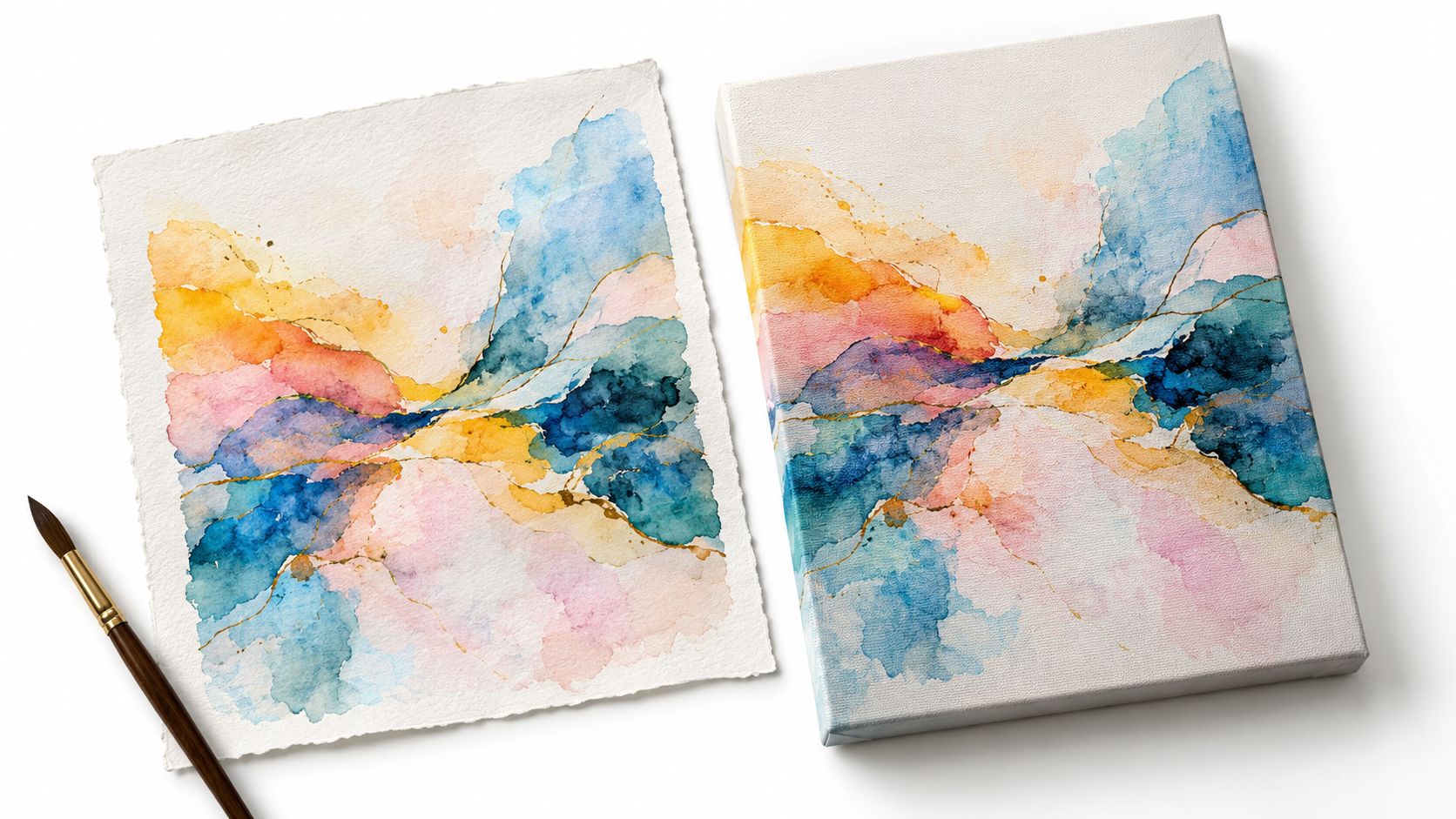
With an original, the price reflects singularity, the artist's direct labor, the physical artifact, and its place within a body of work. No later print can reproduce every raised pigment deposit or the exact irregularity of a hand-painted edge. If you collect for authorship and tactile evidence, those qualities matter.
A high-quality canvas print answers a different need. It can offer consistent color, a larger decorating format, and a surface that suits ready-to-hang display. Premium production may use cotton-blend canvas, vibrant fade-resistant inks, a solid wood frame, and a protective UV coating, but shoppers should still ask how the image was printed, what substrate was used, and what protection covers the finished surface. A claim such as “fade-resistant” is meaningful only when the maker explains the inks, substrate, protective layer, and expected display conditions.
The difference becomes clear when you compare care requirements. An original generally deserves careful framing behind glazing, controlled light, and cautious handling. A canvas print usually needs less specialized treatment, though it still shouldn't be treated as immune to sunlight or moisture. For a personalized format, compare the options available through custom canvas wall art, then examine the production details rather than assuming every canvas print has the same construction.
Watercolors are particularly light-sensitive, and conservation research reports that some highly sensitive pigments can show noticeable fading after approximately 1.2 megalux hours of exposure. The conservation study in Heritage Science also makes an important point for buyers: paper chemistry, pigment choice, framing, and light interact. Ultraviolet filtering can slow damage, but it doesn't make color change impossible.
For original works and serious reproductions, lightfastness should be treated as a material question rather than a visual impression. ASTM D4303 describes testing artists' colorants under controlled light exposure and measuring change with the CIE 1976 Lab* color-difference equation. You don't need to perform that test at home. You do need to favor documented pigments or printing materials over unnamed dyes and vague assurances.
For a visual demonstration of watercolor-inspired artwork and presentation, watch the video below after considering the material differences between paper and canvas.
A watercolor abstract changes character according to its surroundings. The same pale composition can feel airy above a light oak console and nearly disappear against a bright white wall. The same saturated piece can energize a living room but feel restless beside a bed. Styling works best when you judge contrast, visual weight, and rhythm before trying to match individual colors.
Start with the wall and the light. A sunny room exposes artwork to more illumination, so color permanence becomes part of the placement decision. A dim hallway or north-facing room may benefit from brighter tonal passages and clearer contrast, while a wall near a large unfiltered window deserves more caution, especially for an original watercolor.
Warm and cool lighting also changes perception. Warm bulbs can make yellow, rose, and ochre passages appear richer. Cooler LEDs may emphasize blue, green, and gray while making low-contrast washes seem crisper. Hold a sample or preview the artwork at different times of day if the room's lighting changes dramatically.
A watercolor doesn't need to match every object in a room. It needs to belong to the room's visual rhythm.
Above a sofa, bed, sideboard, or console, the artwork should feel intentionally related to the furniture beneath it. A very small image can look stranded above a broad sofa, while an oversized high-contrast piece can overpower delicate furniture. Use the width, height, and visual density of the furnishing as your starting point, then consider whether the artwork should act as a quiet backdrop or a focal point.
For hanging alignment and spacing, these picture-hanging tips from Critelli Furniture offer a useful practical reference. The technical placement matters because even beautiful art can feel awkward when it sits too high, too low, or out of relationship with nearby lines.
In a bedroom, restrained washes and generous negative space can support a calmer atmosphere. In a living room, a stronger edge or deeper tonal area can give the seating arrangement definition. In an office, repeated vertical or horizontal marks may reinforce the room's architectural order without introducing a literal subject.
A pale abstract can complement neutral furniture through repeated curves, similar spacing, or a balanced distribution of light and dark. It doesn't need to share the exact beige of the rug. Conversely, a colorful work can sit comfortably in a restrained room if the surrounding objects remain simple.
For contemporary interiors, browse canvas wall art for modern homes with the room's light exposure and furniture scale in mind. The most successful choice is often the piece that repeats a shape or tonal relationship already present in the room, even when its palette differs.
Shoppers often compare an original watercolor with a canvas print as if one material were automatically superior. A better question is whether the artwork's construction matches your priorities. If you want an irreplaceable object with visible handwork, choose an original. If you need a flexible, easy-to-display piece for a rental, office, hospitality setting, or frequently rearranged home, a high-quality print may make more practical sense.
| Feature | Original watercolor | Premium canvas print |
|---|---|---|
| Image formation | Pigment is applied directly by the artist to paper | The image is reproduced with printing inks on canvas |
| Surface character | Paper texture, granulation, blooms, and lifting can remain visible | Canvas weave and print finish shape the viewing experience |
| Variation | Every sheet contains unique marks and decisions | Multiple reproductions can preserve a consistent composition |
| Light considerations | Pigment and paper chemistry require careful protection | Ink permanence and protective coatings depend on the production specification |
| Handling | Benefits from professional framing and cautious treatment | Usually suited to simpler routine dusting, while still requiring sensible placement |
| Best fit | Collectors who value singularity and direct authorship | Decorators who value accessibility, consistency, and ready-to-hang presentation |
For originals, ask about the paper's fiber content, sizing, pigment permanence, glazing, and framing. 100% cotton paper with consistent internal and external sizing is especially useful for heavily worked pieces because longer cotton fibers can tolerate more treatment than many wood-pulp sheets. A paper label alone doesn't tell you how the artwork was handled, so look for information about the actual sheet and finished frame.
For prints, ask whether the maker identifies the canvas blend, ink type, protective coating, frame construction, and display guidance. “Canvas” describes the support, not the entire quality of the object. A print with saturated inks and UV protection may be a sound decorating choice, but you should still evaluate how the surface looks at close range and whether the finish suits the room's lighting.
A clear frame can help an original sit comfortably in a modern interior without adding visual heaviness. For ideas on effortless elegance with lucite frames, look for examples where transparency supports the art rather than competing with it.
Preview the piece at its intended viewing distance. A delicate original may reward close inspection in a reading nook, while a print with broader tonal blocks may hold a large wall more effectively. Pay attention to whether pale sections remain visible against the wall and whether the darkest marks create enough structure under the room's actual lights.
Good care starts before the artwork reaches the wall. Buyers who understand pigment, paper, ink, and light can make a more confident choice because they know what the piece needs. They won't mistake a protective coating for total immunity, or assume an original and a print require identical treatment.
Direct sunlight is the clearest placement risk, particularly for light-sensitive watercolor pigments. If an original will hang near a large window, consider a less exposed wall, UV-filtering glazing, or window protection. For a print, a UV coating and fade-resistant inks can improve resistance, but they don't cancel the effects of prolonged illumination. Artificial light can also alter how colors appear, so check the work under the lighting used most often in the room.
Conservation guidance recommends comparing color change against a controlled reference rather than trusting memory. For valuable originals, keep documentation such as a labeled paint swatch or a controlled photograph. That record gives you a more reliable reference if the artwork's subtle relationships seem different later.
Display decision: Choose the wall first, then select the material that can live comfortably under that wall's light.
An original watercolor should be protected from casual contact, damp conditions, and unstable framing materials. Paper can react to its environment, and aggressive cleaning may damage both the sheet and the paint. Use professional conservation advice when the work has significant financial or personal value.
Canvas prints are less demanding for routine care, but “low maintenance” doesn't mean “carefree.” Dust the surface gently with a soft, dry cloth. Don't scrub the coating, spray cleaner onto the canvas, or place the piece where steam and splashing are routine. Kitchens and bathrooms can be attractive locations, yet heat, moisture, and airborne residue make them less forgiving than a dry living area or bedroom.
A seller should be able to explain the paper or canvas, colorants, protective layer, frame, and recommended placement. If the description relies only on words such as “archival” or “fade-resistant” without material details, treat those terms as a starting point rather than proof.
The most sensible investment is the one you can maintain. An original may be worth the additional framing and light control because its singularity matters to you. A premium print may be the better decision when you want a strong visual result, simpler upkeep, and the freedom to place art in a room that gets everyday use.
A couple once held two very different abstracts against the same dining-room wall. One was quiet, with diluted blue and generous paper showing through. The other carried a warm, energetic mark that seemed to pull the room toward it. They expected to choose the one that matched their chairs. Instead, they chose the piece that made them pause when they entered the room.
That reaction is a practical measure of value. Abstract art doesn't have to provide a recognizable subject to become personal. It can mark a transition, soften a hard architectural line, recall a favorite scene through color, or bring energy to a room that felt unfinished. The important question is whether the work continues to reward attention after the first impression.
Look at the piece in the morning, under evening lamps, and from the doorway. Notice whether its visual weight feels right beside the furniture, whether the negative space gives the room breathing room, and whether the material suits the light available there. An original watercolor can offer intimate evidence of the artist's hand. A well-made canvas print can offer a dependable, approachable way to enjoy the same abstract language in a practical home setting.
You don't need to solve every decorating decision at once. Choose the work that makes the wall feel more like yours, then hang it with enough care to let its color and movement work over time.
Jessie's Home offers artist-made canvas wall art and gallery-quality prints in styles that include watercolor-inspired abstracts, with premium cotton-blend canvas, vibrant fade-resistant inks, hand-stretched wood frames, and a protective UV coating. Visit Jessie's Home to explore pieces by room, style, or subject and find artwork that brings the right balance of color, rhythm, and longevity to your space.

Discover how black and white minimalist art transforms any room with calm, contrast, and timeless style, plus tips on prints, framing, and placement.
Discover how black and white minimalist art transforms any room with calm, contrast, and timeless style, plus tips on prints, framing, and placement.

Discover watercolor abstract art techniques, learn how prints differ from originals, and get styling tips for your home. A complete guide for wall art lovers.
Discover watercolor abstract art techniques, learn how prints differ from originals, and get styling tips for your home. A complete guide for wall art lovers.

Explore the beauty of modern landscape art and how to choose prints that transform your home. From trends to room-by-room styling tips, this guide covers it
Explore the beauty of modern landscape art and how to choose prints that transform your home. From trends to room-by-room styling tips, this guide covers it


