Your wishlist is empty.
Secure Payment
30 days return

A blank wall can create a surprisingly difficult decision. You know you want something calm, modern, and substantial, but every print on the screen starts to look either too plain or too dramatic. Black and white minimalist art solves part of that problem by reducing the palette while making shape, proportion, texture, and empty space do more of the talking.
The style works in a small apartment, a family living room, a bedroom, an office, or a hospitality setting. Yet it isn't automatically soft, accessible, or timeless. The same sharp contrast that gives a print presence can produce glare, visual harshness, or an awkward focal point if the scale and finish are wrong. The most useful way to choose monochrome art is to understand its history, how the eye responds to contrast, and how those principles behave on a real wall.
You're standing in front of a bare wall, scrolling through prints. One has a black circle, another has a few loose lines, and a third shows a pale gray shape that almost disappears into its background. You like all three, but you can't explain why one feels like art while another feels like generic neutral decoration.
Black and white minimalist art uses a deliberately limited visual language. It usually works with black, white, and the grays between them, while reducing the number of subjects, lines, shapes, and competing details. The empty area matters as much as the printed area. A black form may sit alone on a pale ground, or a small group of repeated marks may create rhythm across an otherwise quiet surface.
That intention separates minimalist art from any random black-and-white poster. A monochrome photograph can be attractive without being minimalist. A neutral print can match a sofa without using restraint, repetition, or carefully controlled proportion. Minimalist work asks you to notice how a line ends, how much space surrounds a shape, and how a dark mark changes the balance of the whole composition.
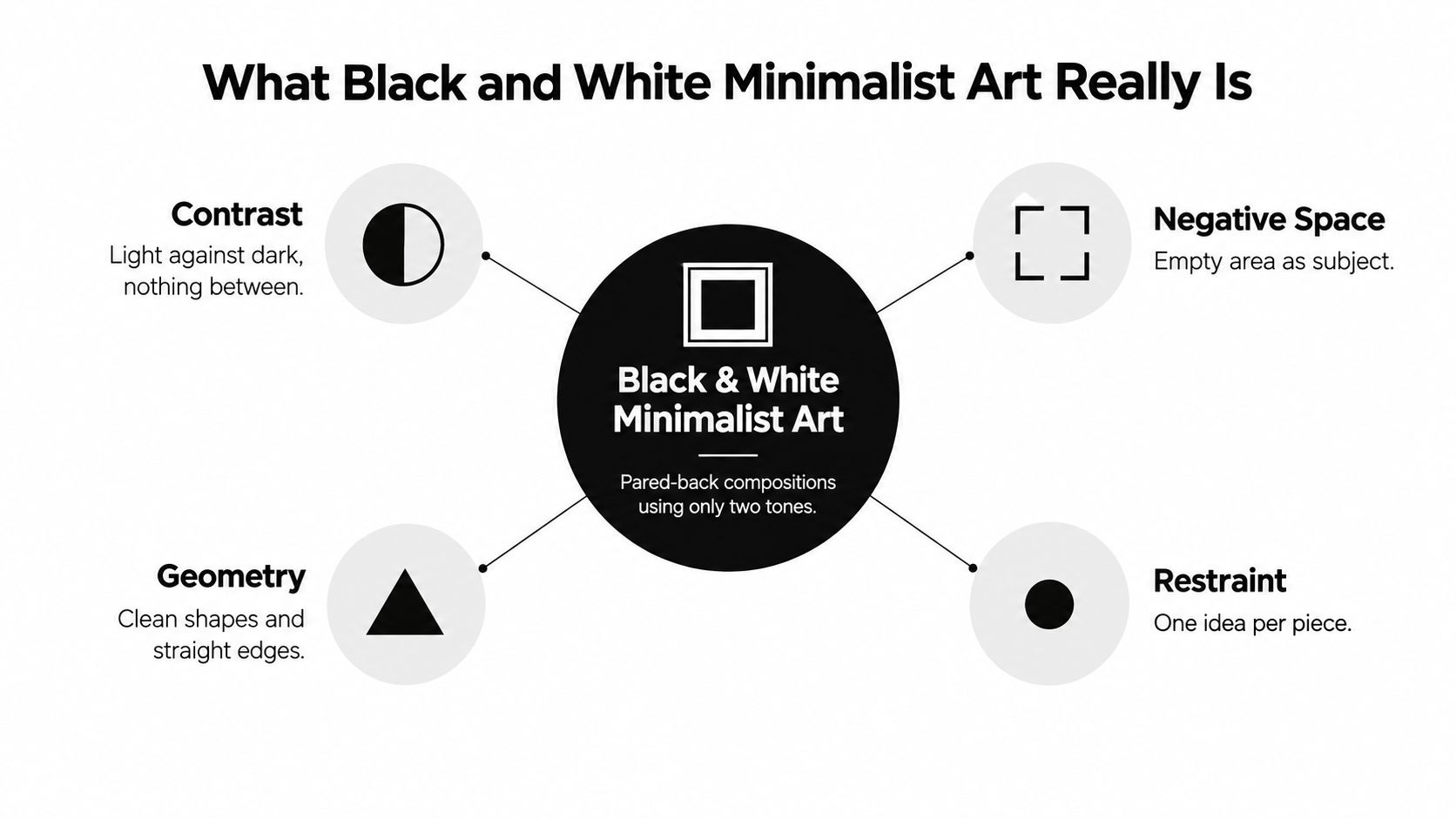
Color often carries mood and narrative. Remove most of it, and the eye has fewer signals to process. The result can feel like entering a quiet room after standing in a busy street. You may notice the shape of a chair, the light on a wall, or the distance between objects because nothing is competing for attention.
That calm isn't guaranteed. A huge area of solid black can feel forceful, while a pale gray composition may feel gentle. The room changes the reading, too. The same print can look crisp and graphic against a white wall, then softer against plaster, linen, oak, or a textured neutral surface.
If you're comparing collections, look for black and white abstract canvas wall art that gives the dark marks enough surrounding space. A restrained composition should feel intentional, not unfinished. The strongest pieces leave you with one clear visual idea, rather than a collection of decorative effects.
Minimalist compositions rely on a small group of visual tools. Think of them as the grammar of the style. Once you recognize them, you can judge a piece without relying only on the label “minimalist.”
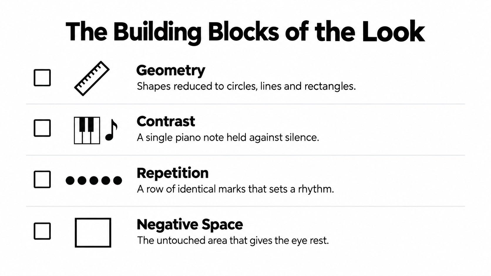
Circles, rectangles, triangles, grids, straight lines, and measured blocks create order. A square can feel stable. A vertical line can pull the eye upward. A horizontal band can make a composition feel wider and more settled.
Geometry doesn't have to look mathematical. A slightly irregular brush edge can soften a strict shape, while a hand-drawn line can keep a geometric work from feeling sterile. Look at the relationship between shapes, not just the shapes themselves. Two similar rectangles may create balance, while one small shape placed far from a large one may create tension.
Black carries visual weight. White gives that weight somewhere to land. A single dark mark against a pale field is like one piano note held in a quiet room. The note feels important because silence surrounds it.
Contrast refers to lightness and darkness, not only color. A black shape beside white has a different force from a charcoal shape beside gray. Intermediate tones can make a piece more comfortable and dimensional, especially when the artwork will be viewed close up.
A row of similar windows on a quiet street feels orderly because the eye can predict what comes next. Minimalist art uses the same principle through repeated lines, dots, bands, or geometric units. Repetition can feel meditative, architectural, or slightly mechanical.
Spacing controls the rhythm. Marks placed close together create density. Wider gaps slow the eye and introduce breathing room. Uneven spacing can add a human quality, but it should look deliberate rather than accidental.
On a crowded page, your eye looks for a clear patch where it can rest. In minimalist art, that untouched area often becomes part of the subject. White space can isolate a small black form, make a line appear more significant, or prevent repeated marks from becoming visual noise.
These principles also appear in the built environment. If you're drawn to pared-back architectural details beyond the wall, Ultra Modern Rails cable railing options offer a useful example of how clean lines and open space can shape a larger setting.
For a home, begin by asking four questions. Is the geometry clear? Does the darkest value have a purpose? Does repetition create a readable rhythm? Does the empty space feel generous rather than accidental? A piece that answers yes to all four will usually hold up better than a print chosen only because it matches a neutral sofa. Browse minimalist canvas wall art with those questions in mind.
The history of monochrome minimalism is longer than the current neutral-room trend. Its roots include radical experiments that asked whether a painting could become powerful through reduction alone.
Minimalism then expanded into sculpture, light, and installation through artists including Donald Judd, Dan Flavin, Carl Andre, Sol LeWitt, Agnes Martin, and Robert Morris. Posters, photography, interiors, and affordable wall prints later carried those ideas into ordinary rooms.
Your print isn't a museum object just because it is black and white. But its visual vocabulary may descend from a long conversation about geometry, repetition, material, and space.
A monochrome print changes personality when you move it from one room to another. Above a sofa, a broad composition can act as the social anchor. Beside a bed, the same high-contrast design may feel too active, while a graphite-heavy or softly textured version can settle into the background.
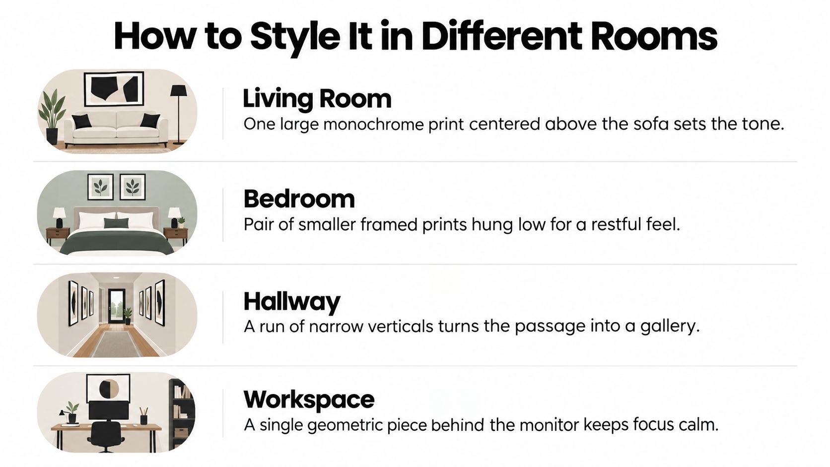
In the living room, one substantial piece above the sofa often creates a clearer focal point than a scattered collection of small prints. Choose a broad horizontal work, a large square, or a carefully spaced pair. Leave enough wall around it for the negative space to remain visible.
The bedroom benefits from softer contrast, open compositions, and graphite-like grays. A pair of smaller framed works can create quiet symmetry above the bed, while a single pale canvas can support a room with linen, wool, wood, or plaster textures.
In the kitchen, small geometric studies work well near a breakfast table, pantry wall, or open shelving. Keep the surrounding area practical and avoid placing art where steam, splashes, or grease will repeatedly reach the surface.
An office can handle a stronger black-and-white composition because the room often benefits from visual definition. Place one geometric piece behind or beside the desk, rather than filling the entire working area with competing marks.
Hallways and entryways are viewed while people move, so broad shapes and clear silhouettes tend to work better than delicate details. A vertical print, diptych, or run of narrow works can guide the eye through the passage. In a dining room, a horizontal composition hung at a comfortable viewing height can echo the length of the table without competing with place settings.
A bathroom or powder room gives you permission to use a smaller, more surprising piece. Choose a sealed or protected presentation suited to humidity, and keep the work away from direct water exposure.
Black-and-white photography and restrained geometric work can suit guest rooms, short-term rentals, boutique hotels, offices, clinics, and restaurants because the palette doesn't compete with many furniture schemes. That doesn't mean every monochrome print will suit every guest. Select images with clear composition, moderate visual pressure, and finishes that won't create reflections in photographs or under bright service lighting.
For a broader selection of pieces intended for social spaces, explore living room wall art. The practical test is simple: view the art from the doorway, from the main seat, and from the side. If the composition only works from one close-up angle, it may not be the right choice for a shared room.
Contrast isn't just a way to make art look bold. It determines whether a line remains visible, whether a shape reads from across the room, and whether a surface feels clear or harsh.
Luminance contrast describes the difference between light and dark. Color contrast depends on differences between hues. For monochrome art, luminance does most of the work, which is one reason black, white, and gray can remain legible without relying on color recognition.
Perception research found that, across 10 different perceptual testing procedures, equal-energy black stimuli were represented as stronger than equal-energy white stimuli, with black typically producing about 1.28 times the perceptual response of white. The measured effect ranged from 8% to 67%, depending on the task. The vision study supports a useful design lesson: a small black contour may command more attention than an equal-sized pale mark.
Reserve the darkest values for the structure you want people to notice first. If every corner contains near-black accents, the composition loses hierarchy. White space around a dark shape can increase its apparent salience, while gray or textured surroundings soften the difference.
| Contrast level | Best viewing distance | Best for |
|---|---|---|
| Soft, gray-led contrast | Close viewing | Bedrooms, reading areas, intimate compositions |
| Moderate black, gray, and white | Mixed viewing | Living rooms, dining rooms, offices |
| Strong black against white | Longer-distance recognition | Hallways, hospitality spaces, large wall displays |
Maximum contrast isn't automatically the most beautiful choice. A study of abstract paintings found that viewers gave the highest appreciation ratings to versions with a moderate contrast increase. The strongest contrast improved recognition memory but reduced liking, while a separate cross-cultural study generally found a preference for high contrast over low contrast, particularly in abstract works. The abstract-painting contrast research points toward calibration rather than excess.
Accessibility adds another layer. Guidance from vision-accessibility research emphasizes that brightness and lightness differences, particularly achromatic combinations such as black, white, and gray, are dependable for visibility. Vision-accessibility guidance also reminds us that art visibility isn't the same as navigation safety.
Practical rule: Use high contrast to help an artwork read, but control glare with a matte surface, careful lighting, and sensible placement.
Reflective glass can wash out fine lines and create bright patches that are uncomfortable for viewers with reduced contrast sensitivity. Matte paper, non-reflective glazing, or a carefully positioned light can preserve detail without turning the wall into a mirror. Avoid placing glossy art beside stairs, doorways, or other areas where reflections could confuse visual boundaries.
Two artworks can share the same image and still look entirely different on a wall. The substrate, surface, frame, and glazing determine whether the composition feels soft, crisp, tactile, or industrial.
Canvas absorbs and diffuses light. Its weave adds a quiet physical layer, which can make a black shape feel less severe and a pale composition feel more substantial. Canvas suits large abstracts, textured monochrome work, and relaxed rooms with linen, wood, wool, or plaster.
Paper or cotton-rag prints preserve fine edges and small tonal shifts. They're a strong choice for line drawings, delicate grids, photography, and compositions where a narrow gray transition matters. Framing under glazing protects the surface, but reflective glass can interfere with viewing, so ask about non-reflective options.
A thin black metal frame reinforces graphic structure and creates a gallery-like edge. Natural maple or walnut introduces warmth, which can stop black-and-white art from feeling severe in a room with cream upholstery or warm wood. A slim white frame can nearly disappear against a pale wall and let the artwork remain the focus.
The frame should respond to both the art and the room. A heavy dark frame can overwhelm a delicate gray drawing. An unframed canvas may feel too casual in a formal dining room. When in doubt, hold a frame sample beside the wall and view it under daytime and evening light.
For long-term display, look for fade-resistant pigment inks, a stable archival substrate, and acid-free matting when the work is framed. UV-protective glazing or coating can reduce the effects of light exposure. These features don't make artwork immune to fading, so direct sunlight still deserves caution.
U.S. and Canadian buyers can compare print-on-demand services, local framing shops, museum stores, and independent galleries. A local framer can also help solve practical problems, such as choosing acrylic instead of glass for a large work, specifying a low-reflection surface, or selecting a deep frame for textured canvas.
Material test: If the artwork depends on a raised surface, view it from the side. If it depends on a fine line or delicate gray, inspect it under both direct and indirect light.
Black-and-white minimalism has a stronger historical foundation than a passing décor cycle, but that doesn't mean every monochrome print will age well. A geometric composition can remain flexible for years, while a fashionable presentation can date quickly even when the palette stays neutral.
Search-interest reporting for 2025 and 2026 indicated that minimalist art prints reached a February 2026 peak, while remaining less searched than broader “modern art prints” and “abstract art prints” categories. The same market reporting should be treated carefully because seller-generated trend data can be fragmented. A separate 2026 U.S. art-market report found that 93.6% of transactions in 2025 occurred below $1 million, which suggests that market activity is concentrated in more accessible price tiers rather than only elite collecting. The market reporting offers context, not a guarantee that any particular style will remain desirable.
The more durable question is whether the artwork engages basic visual ideas. Malevich's square, Stella's bands, and Judd's reduced forms have remained relevant because they focus attention on perception, geometry, material, and space. Those concerns aren't tied to a particular sofa trend.
| Likely timeless | Likely trending |
|---|---|
| Clear geometry and deliberate proportion | A presentation copied mainly from current social media décor |
| Strong composition that works without a fashionable frame | Script phrases or motifs chosen for a short-lived aesthetic |
| Texture and materials that remain attractive as lighting changes | A gray border or filter that makes the work resemble a specific décor cycle |
| A piece that can sit beside vintage or future furniture | Artwork that only works with one current neutral palette |
| Archival substrate and considered construction | A low-quality print chosen only because it is inexpensive |
Try a furniture test. Would the piece still make sense beside a mid-century sofa, a traditional oak cabinet, or a future screen-based living room? If the answer depends on a current beige, gray, or Scandinavian styling formula, the work may be trending. If the composition remains clear when the surrounding objects change, it has a better chance of staying useful.
Adaptability is more realistic than a promise of eternal timelessness. Black and white can coordinate easily, but composition, scale, material quality, and surrounding architecture decide whether the art continues to feel considered.
Before ordering, make five decisions.
Can black-and-white art sit beside family photos or colorful art? Yes. Treat the monochrome piece as an anchor. Keep a consistent frame material, repeat one shape or line quality, and give the anchor enough space so the gallery wall doesn't become a crowded patchwork.
What works best for renters? Lightweight framed prints, canvas, leaning arrangements, and removable hanging strips can reduce wall damage. Check the product's weight rating and the condition of the paint before hanging. For a heavier canvas, leaning it on a console may be safer than relying on an adhesive system.
How can I make stark art feel warmer? Pair it with wood, linen, woven baskets, wool, clay, warm bulbs, or a natural frame. Soft texture around the art changes the room's temperature without adding visual clutter.
Can high contrast improve accessibility? It can improve artwork visibility, but it doesn't make every installation accessible. Check for glare, reflective glazing, confusing edges, and risky placement near stairs or doors. A clear print under harsh lighting may still be uncomfortable.
What should I do today? Tape a paper rectangle to the wall, view it from the sofa and doorway, then choose the composition that still feels balanced when you stop standing directly in front of it.
Jessie's Home offers artist-made canvas wall art and gallery-quality photo prints, including black-and-white photography and minimalist designs for rooms that need a quieter visual anchor. Visit Jessie's Home to compare room-focused collections and choose a monochrome piece by scale, subject, and finish.

Discover how black and white minimalist art transforms any room with calm, contrast, and timeless style, plus tips on prints, framing, and placement.
Discover how black and white minimalist art transforms any room with calm, contrast, and timeless style, plus tips on prints, framing, and placement.

Discover watercolor abstract art techniques, learn how prints differ from originals, and get styling tips for your home. A complete guide for wall art lovers.
Discover watercolor abstract art techniques, learn how prints differ from originals, and get styling tips for your home. A complete guide for wall art lovers.

Explore the beauty of modern landscape art and how to choose prints that transform your home. From trends to room-by-room styling tips, this guide covers it
Explore the beauty of modern landscape art and how to choose prints that transform your home. From trends to room-by-room styling tips, this guide covers it


