Your wishlist is empty.
Secure Payment
30 days return

You're standing in the living room with a beach print in your hands, looking from the artwork to the blank wall behind the sofa. It seemed perfect online. In the room, though, the blue feels louder than expected, the frame looks too small, and the whole idea is starting to resemble a holiday rental.
That hesitation is useful. Beach wall art for a living room is a styling decision before it's a shopping decision. The right piece should echo the room's existing colors, materials, light, and proportions. It shouldn't force your sofa, rug, and coffee table into a brand-new coastal theme.
A beach print works best in the living room when it supports the seating arrangement instead of competing with it. This room usually has the clearest focal wall, the largest concentration of furniture, and the strongest connection between upholstery, rugs, lighting, and timber. Above a sofa or console, a shoreline photograph or abstract seascape can anchor the room while leaving enough visual space around the composition.
Treat the seating area as one design unit. Choose artwork that relates to the sofa, rug, curtains, cushions, and coffee table, then check how its colors and texture sit against the full arrangement. A piece that suits the empty wall but ignores the furniture will look disconnected. A piece that echoes the room's existing materials will make the wall feel planned.
The distinction between coastal influence and coastal theming matters. Coastal influence draws from sea foam, warm sand, weathered wood, soft light, and the openness of a horizon. Coastal theming piles on anchors, rope, shells, blue stripes, and nautical symbols until the room starts reading like a holiday rental. Use the first approach. It gives beach wall art a longer life and lets the room feel coastal without becoming a set.
Wall art has become a substantial home-decor category. The global wall art market was valued at USD 53.05 billion in 2022 and is projected to grow at a 5.4% CAGR from 2023 to 2030, according to market data on wall art and home decor. The same source reports that living rooms held 30.37% of home decor market share in 2025, photography-based wall art appealed to 62% of homeowners, and scenic prints appealed to 49%.
Those figures support the room choice, but they do not dictate the artwork. Beach imagery belongs in a high-visibility space where photography, calm color shifts, and familiar natural subjects can connect with everyday living. Choose a format that gives the seating zone a clear focal point, then let the rest of the room stay quiet.
Styling rule: Choose beach art that looks as though it belongs in your living room after you remove the word “beach” from its description.
Personal meaning makes the choice stronger. If you want a phrase, memory, or family reference in the composition, explore personalised art with Quote My Wall. A personal detail keeps coastal artwork from feeling like a generic seasonal accessory and gives the living room a reason to hold on to it.
Blue and white aren't a mistake by default. The problem is using them as the entire visual language of the room. Blue-and-white stripes, rope details, distressed lettering, and repeated shell motifs often read as mass-produced beach-rental decor because they announce “coastal” before they establish any relationship with the home.
A more refined palette starts with sand, dune, driftwood, sea foam, weathered teak, muted sage, and sun-bleached terracotta. Navy and crisp white still have a place, but they work better as accents than as the foundation. This approach feels warmer, more layered, and less dependent on literal ocean imagery.
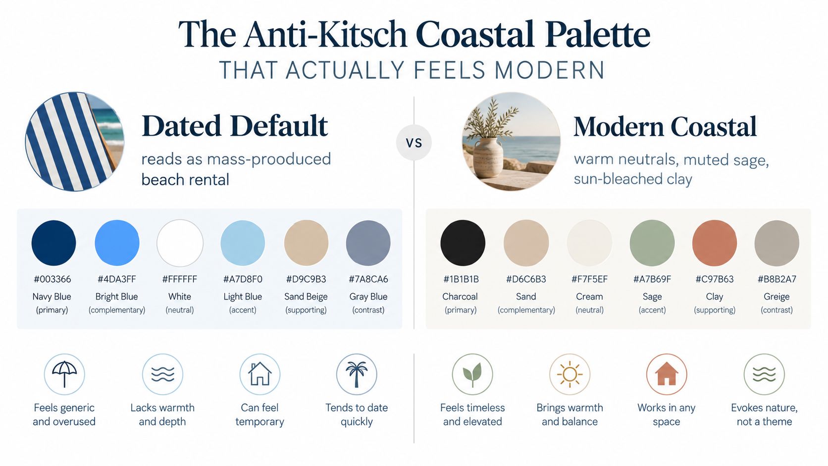
Before you browse artwork, find three or four colors already present in your space. A beige sofa might give you sand. A timber floor might provide driftwood brown. A faded green cushion could become sea glass or muted sage. A rug with rust-colored detail may give you the terracotta note that makes a pale seascape feel considered rather than icy.
Use those colors as a filter:
Interior guidance also favors neutral backdrops and repeating artwork colors in nearby textiles or accessories. You'll find a useful explanation of this approach in this guide to choosing paint colors for your home.
The best test is brutally simple: if the print would disappear into a Hamptons gift shop, keep looking. A polished coastal room can include a recognizable beach scene, but the image should have atmosphere, texture, or an unusual palette. A hazy horizon, a close study of dune grass, a heavily textured abstract, or a warm golden-hour coastline will usually age better than a perfectly centered turquoise wave.
Coastal style should feel lived-in, not themed. Let the art suggest salt air and open space. Don't make it explain the entire vacation.
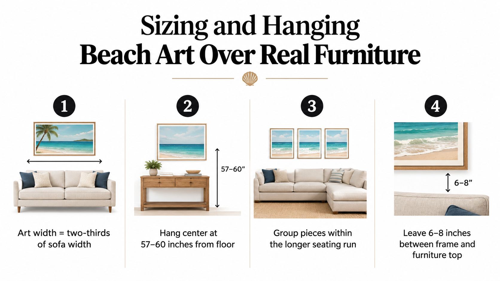
A wide sofa with a tiny beach print above it creates an awkward gap, while an oversized canvas hung too high feels detached from the seating. In living rooms, beach art usually fails because the scale is wrong, not because the image lacks charm.
Measure the furniture before you shop. Above a sofa, console, or sectional, make the artwork or grouped arrangement roughly 60% to 75% of the furniture width, a proportion supported by this large canvas sizing guide. A two-thirds arrangement is the safest midpoint when you are deciding between sizes.
The sofa is the visual anchor. Center one artwork over the sofa, even when the sofa sits slightly off-center on the wall. With a sectional, align the art with the longer seating run or the main conversation area. Do not automatically center it on the entire wall.
Leave roughly 6 to 8 inches between the sofa back and the bottom of the frame. That gap keeps the artwork connected to the seating without making the arrangement feel crowded. More space can make a modest piece look undersized, while a narrow gap makes the wall feel cramped.
For a standalone piece on an open wall, place the center around 145 to 150 cm from the floor. Above furniture, adjust toward the seated viewer's eye level. The right height supports the room's human scale instead of treating an empty wall as the only reference point.
A ceiling higher than nine feet can support a taller artwork and a slightly higher center point. The piece still needs enough visual weight for the room. Do not push a normal-sized print upward to fill a tall wall. Increase the artwork's height or create a vertical arrangement instead.
Measure first, then compare living room wall art collections for arrangements suited to the furniture. Shopping before measuring is how a room ends up trying to accommodate the artwork.
The format should follow the furniture and architecture. A trend may convince you that a gallery wall is the answer, but a long sofa often needs horizontal rhythm, while a compact seating area may need one confident focal point.
| Format | Best For | Minimum Wall Width | Watch Out For |
|---|---|---|---|
| Single statement piece | Smaller living rooms, one focal seat, or a clean sofa wall | Match the furniture beneath it | A piece that's too small will look accidental |
| Diptych or panoramic seascape | Long sofas, media consoles, and low horizontal furniture | Enough width for the full arrangement plus breathing room | Uneven spacing can make the split look clumsy |
| Gallery wall | Larger rooms with generous uninterrupted wall space | At least 6 feet | Too many small pieces can create clutter |
A single statement work suits a room with restrained furniture, limited wall space, or one obvious focal point. Pick a seascape with a strong horizon, a textural dune study, or an abstract built around the room's existing colors. The artwork should still relate proportionally to the furniture below it, rather than filling the wall just because the wall is empty.
A panoramic seascape works especially well above a long sofa or media console. Its horizontal shape reinforces the furniture's length and gives the eye an easy path across the wall. A diptych can create a similar effect with more rhythm, but keep the gap between panels deliberate and consistent.
Gallery walls need negative space. If the wall is broken by windows, a doorway, a thermostat, or a tall lamp, a crowded arrangement will look pieced together. Use this format when you have at least 6 feet of usable wall width and enough surrounding space for the composition to read as one unit.
The pieces don't need to be identical. One coastal photograph can sit beside a muted abstract, a botanical study, a shoreline sketch, or a textured neutral work. The collection should feel collected, not like a set purchased in one click. For more material options, look through beach canvas wall art, but let the room determine whether canvas, paper, or a mixed arrangement makes sense.
Material changes the personality of beach art. A canvas wrap makes a painterly seascape feel relaxed and tactile. A framed print gives photography or graphic coastal art more structure. Neither is automatically better. The right choice depends on the image and the level of formality in the room.
For soft brushwork, hazy horizons, and abstract water, choose a canvas wrap. A 1.5-inch deep wrap creates a clean edge and a subtle shadow line without requiring a decorative frame. It works particularly well in rooms with linen, rattan, timber, and other relaxed materials.
Framed prints offer more control over the final look:
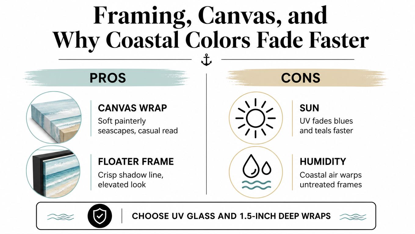
Sunlight is especially unforgiving to beach palettes. Sand, pale blue, coral, and sea foam depend on subtle tonal transitions, so fading or yellowing can change the entire mood of the piece. Expert print guidance recommends UV-resistant, pigment-based or giclee-style inks with protective coatings over standard dye-based printing, and some archival canvas systems are marketed for decades-long display. Lower-grade dye inks can show noticeable fading within about a year in sunlit spaces, as discussed in this review of canvas print materials and fade resistance.
Use UV glass or acrylic for framed prints, especially on walls receiving strong direct light. Keep artwork away from direct southern or western exposure when possible, or rotate especially delicate pieces to less exposed walls.
Humidity matters too. Untreated frames can warp in damp conditions, and condensation can affect paper and backing materials. A suitable protective finish, stable framing materials, and sensible placement will preserve both the artwork and the calm palette that made you choose it.
A coastal gallery wall should contain more than pictures of the ocean. If every piece shows a wave, sailboat, shell, or palm tree, the arrangement stops looking personal and starts looking like a display assembled around a single theme.
Start with one anchor piece. It might be a large seascape, a shoreline photograph, or an abstract with a strong sand-and-sea palette. Pull one color thread from that work, then repeat it in two or three smaller pieces. The repeated color can appear as a tiny sage brushstroke, a rust-colored botanical detail, or the warm wood of a frame. The connection should be visible, but it shouldn't be identical.
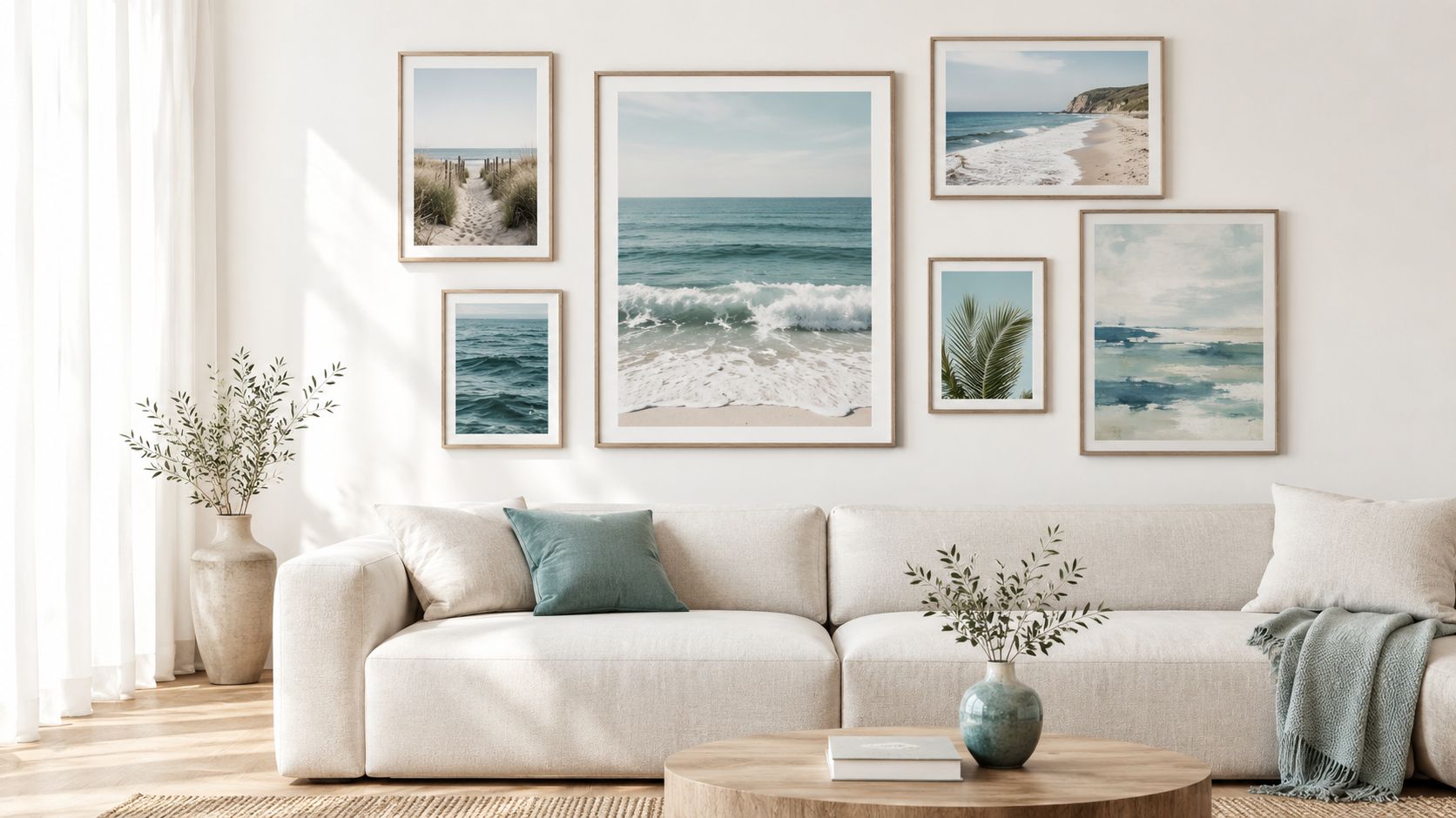
Use varied visual styles to keep the wall refined:
The personal item matters more than another decorative beach symbol. It breaks the pattern and makes the arrangement feel gathered over time. If you want canvas as the common thread, compare canvas wall art for coastal homes, then mix the final selection with at least one different texture or frame treatment.
Lay everything on the floor before touching the wall. Begin with the largest piece, position the supporting works around it, and keep approximately 2 to 3 inches between frames so the group feels connected without becoming a solid block. Measure the center line of the whole arrangement against the furniture below it, not the center of the largest frame.
Step back from the layout repeatedly. Check it from the doorway, from the sofa, and from the room's main walking path. A gallery wall should look balanced from real-life viewing positions, not only from the spot where you arranged it on the floor.
The final check should be practical, not emotional. You don't need to fall in love with a frame in isolation. You need to know whether the artwork will support the room once it's surrounded by furniture, light, and everyday movement.
Run through this list before drilling:
Don't let the artwork dictate the whole room. Let the sofa establish the width, let the existing palette establish the color direction, and let the light determine the protection it needs.
The piece earns its nail hole when it feels beachy but not themed, hangs at the right height, and repeats at least one color already living in the room. If it passes those tests, stop browsing and hang it.
Jessie's Home offers artist-made canvas wall art and gallery-quality photo prints across coastal, abstract, botanical, and other styles, with ready-to-hang formats for living rooms and other spaces. Visit Jessie's Home to browse coastal pieces by subject and style, then choose the format that fits your furniture before you commit to the wall.

Explore the beauty of modern landscape art and how to choose prints that transform your home. From trends to room-by-room styling tips, this guide covers it
Explore the beauty of modern landscape art and how to choose prints that transform your home. From trends to room-by-room styling tips, this guide covers it

Learn how to choose and style beach wall art for living room spaces — from coastal palettes and framing to scale, grouping, and avoiding kitsch.
Learn how to choose and style beach wall art for living room spaces — from coastal palettes and framing to scale, grouping, and avoiding kitsch.

Abstract Painting for Living Room. Learn how to choose the perfect abstract painting for your living room with our guide on scale, color, placement, and styling
Abstract Painting for Living Room. Learn how to choose the perfect abstract painting for your living room with our guide on scale, color, placement, and styling


