Your wishlist is empty.
Secure Payment
30 days return

You've found the wall. The sofa is in place, the room has its rhythm, and a large painting is leaning nearby while you decide whether it will bring everything together or overwhelm the space. A rolling green hill may look perfect online, yet feel flat in a dim bedroom. An expressive, textured canvas may appear dramatic in a showroom, then become the quietest and most welcoming object in your living room.
Choosing modern scenery art is less about filling an empty wall than about deciding what you want that wall to do. The right piece can soften a busy room, introduce a sense of distance, or give a work area a visual pause. Once you understand how scenic art uses subject, composition, material, and light, you can choose with the confidence of a curator rather than relying on guesswork.
Stand in front of that canvas for a moment. If it shows Tuscan hills, a misty shoreline, or a city softened by rain, ask yourself whether you're looking at a place or at an artist's interpretation of a place. That distinction matters. Modern landscape art isn't merely a pretty view. It's a conversation between the natural world and the artist's choices about color, shape, texture, atmosphere, and omission.
A traditional pastoral painting might present fields, trees, livestock, and a calm sky in a recognizable, carefully ordered scene. A modern art movement can keep the recognizable hills while flattening perspective, exaggerating earthy colors, breaking the horizon into blocks, or using thick marks to suggest rather than describe a forest. The subject remains an outdoor view, but the artist's response becomes equally important.
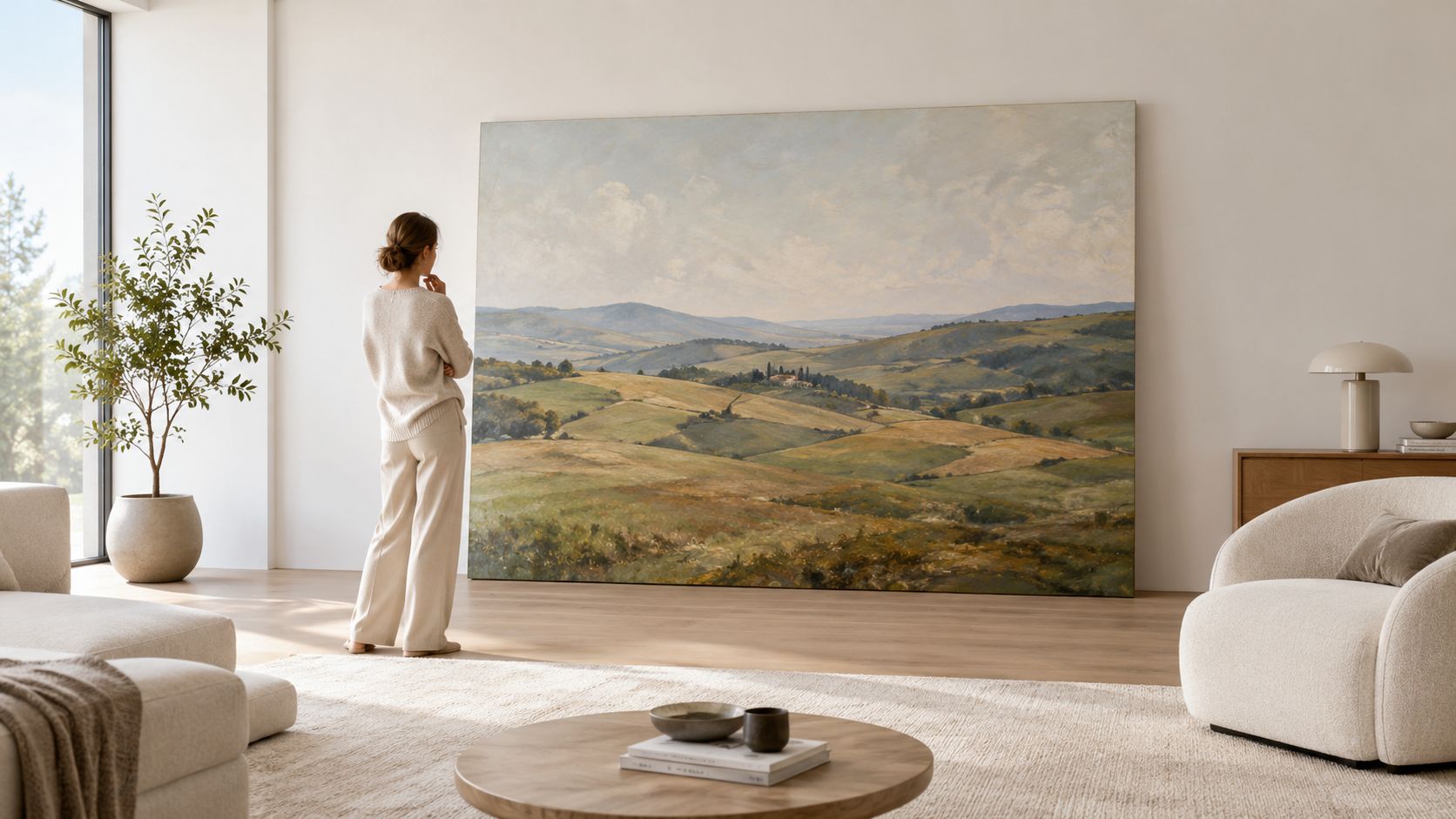
Painting of nature scenes became especially important in the nineteenth century, as naturalistic depictions of the land expanded during industrialisation and urbanisation. The Impressionists then used these depictions to challenge established ideas about brushwork, light, and visual experience. Later, the category grew beyond rural scenery. It began to include urban and industrial subjects, unusual materials, and works made directly in the landscape by land artists, as Tate's historical overview of landscape painting describes.
That history helps explain why the genre feels both familiar and fresh on a contemporary wall. You may choose a realistic national park vista, a simplified coastal composition, or a textured work that barely names its location. Each can still function as scenery art if it explores our relationship with space, weather, terrain, or the feeling of being outdoors.
In a home, the painting also becomes an emotional anchor. A blue-grey horizon can create visual quiet behind a bed. A warm, energetic hillside can make a neutral living room feel more personal. If you're comparing options, browse modern canvas wall art with your room's mood in mind, not just the image's subject.
The useful question isn't “Will this match my furniture?” Ask instead, “What should I feel when I see this every day?” That answer will guide the style, scale, and palette more reliably than a trend label.
Modern scenery art has never followed a single straight path. In the nineteenth century, artists increasingly treated nature as a serious subject for close observation, especially as industrial growth and expanding cities changed people's relationship with open land. Impressionism shifted attention toward fleeting light, visible brushwork, and the sensation of seeing rather than the strict reproduction of every detail.
That change still affects the way contemporary outdoor scenes are made and chosen. A painting can suggest a bright afternoon through a few carefully placed color relationships. It can turn a familiar shoreline into a field of horizontal marks. It can leave parts of the scene quiet so the viewer completes the image mentally.
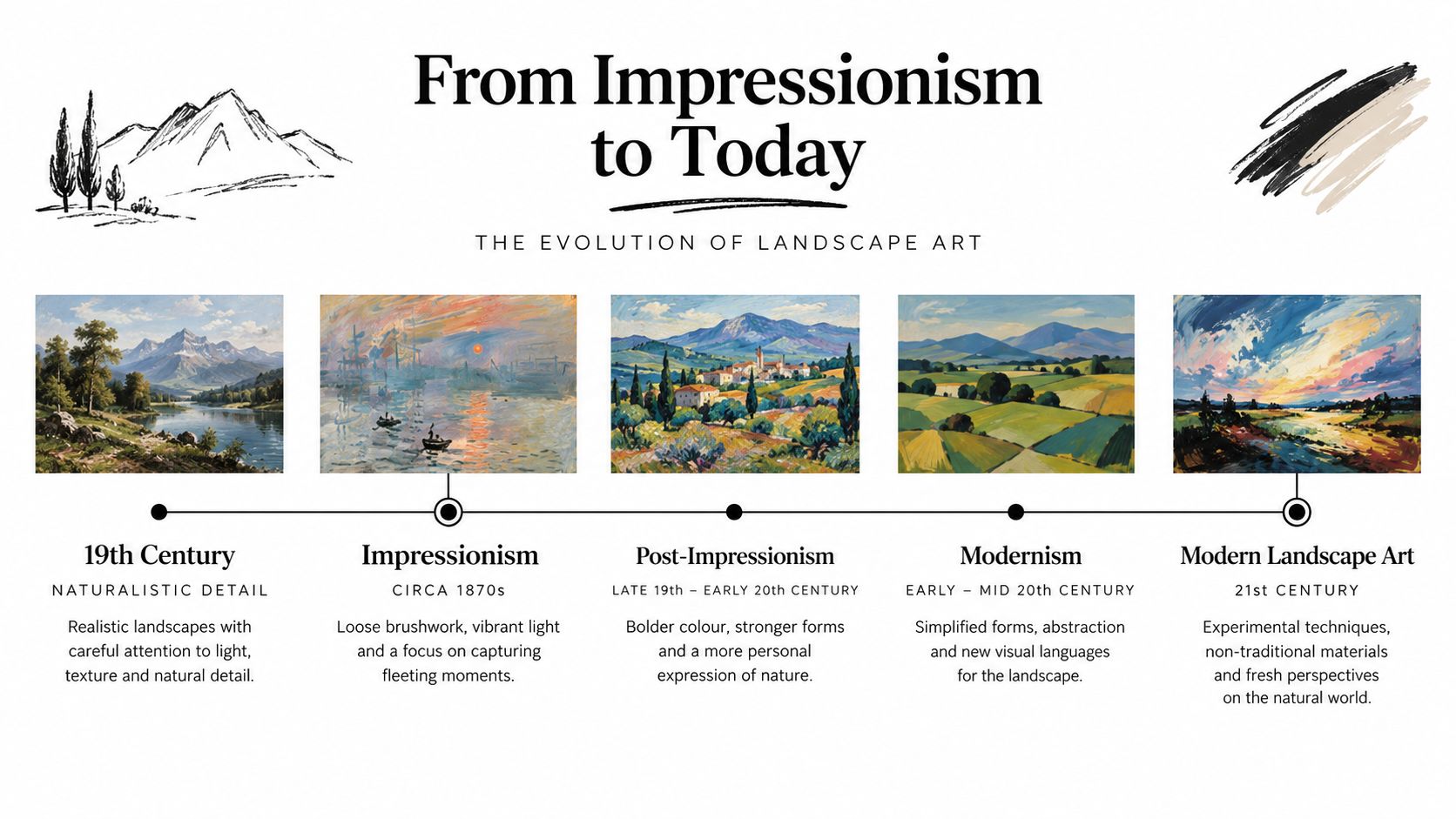
A large computational study in PNAS examined 14,912 landscape paintings by 1,476 painters, spanning roughly 1500 to 2000 CE, and found that preferred compositional proportions changed systematically over time, as reported in this summary of the landscape-painting study. The finding offers a useful perspective for home designers. Composition in painted scenery isn't a fixed formula inherited unchanged from one generation to the next.
Artists have continually adjusted the balance between sky and ground, foreground and distance, detail and openness. Those decisions affect how a painting occupies a room. A work with a high horizon may feel grounded and architectural. A broad sky can create breathing space above a low console. A concentrated cluster of trees or buildings can give a large wall a strong visual centre.
The expansion continued in the second half of the twentieth century. Artists embraced urban and industrial environments, while land artists made work directly in fields, deserts, and other outdoor settings. The canvas was no longer the only place where nature could be interpreted. The environment itself could become the material, subject, and setting.
That shift gives today's buyers permission to move beyond the predictable pastoral scene. A modern outdoor scene might refer to a coastline through layered pigment, to a city through geometric blocks, or to a woodland through a restrained field of green and charcoal. It may feel abstract at first glance and become more legible as you spend time with it.
A useful way to look: Don't ask whether a contemporary landscape copies nature accurately. Ask what it has noticed about nature that you hadn't noticed before.
This lineage also explains why a fresh-looking piece can sit comfortably in a traditional home. The frame, furniture, and architecture may be classic, while the artwork carries a newer approach to light or abstraction. Modernity often comes from the artist's way of seeing, not from the absence of recognizable subject matter.
A painting can be recognizable from across the room, emotionally suggestive, or almost entirely built from color and texture. Buyers often use the word “painting” for all three, but each style behaves differently on a wall. Understanding the distinction prevents you from choosing a dramatic image for a room that needs calm, or a delicate atmospheric work for a wall that requires structure.
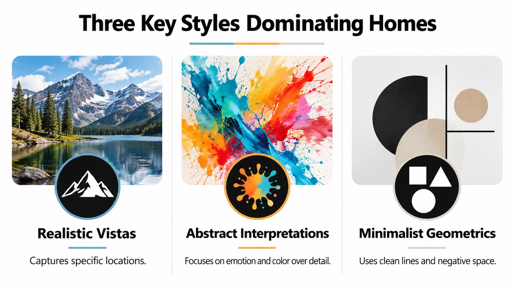
These works preserve the identity of a specific place. You may see a mountain range, a desert road, a national park, or a coastal horizon with enough detail to recognize the scene. Realistic views suit rooms where you want the art to provide a visual view, especially when the architecture has clean lines and the furnishings are restrained.
Look closely at the distance between elements. A convincing vista usually creates depth through overlapping landforms, changes in scale, and shifts in tone. If your room already contains patterned upholstery or highly detailed accessories, choose a realistic piece with a relatively quiet palette so the wall doesn't compete with everything below it.
Abstracted vistas keep the memory of a place while reducing literal information. A band of ochre may stand for a field. A vertical mark may suggest a cypress tree. A dark shape beneath a pale sky may evoke a valley without describing every rock and branch.
This style works well when you want the painting to connect colors across a room rather than announce a precise destination. It can also help a small space feel less visually crowded because the eye reads broad shapes before it searches for detail. Choose the emotional temperature carefully. Rust, clay, and muted gold bring warmth, while blue, sage, and soft grey tend to create a quieter impression.
Atmospheric scenes make light, surface, and mood the subject. They may show fog, rain, dusk, or a distant horizon through softened edges and layered marks. Texture-forward pieces add physical interest, allowing the wall to change as daylight moves across the surface.
A useful compositional principle is the 80/20 rule, described in research on focal concentration in visual composition. About 80% of the detailed handling can be concentrated in 20% of the composition, usually around the focal point, while secondary areas remain simplified. In a home, that concentration helps the painting read quickly from across the room and in a smaller digital preview, while rewarding closer inspection with richer detail.
Stand at the far side of the room, then move close to the artwork. From a distance, identify the dominant shape first. Up close, notice whether the surface reveals brushwork, grain, raised pigment, or subtle transitions. If both views offer something worthwhile, the piece is likely to hold your attention after the initial purchase.
For a broader selection of recognizable and abstracted subjects, explore landscape canvas wall art. Before choosing, decide whether you want the artwork to describe a place, establish a mood, or provide a tactile focal point.
A beautiful scene can fail when its scale, brightness, or emotional tone ignores the room around it. Choose the artwork as you would choose a chair or lamp. Consider what the room asks you to do, how much wall it offers, and how daylight will interact with the surface.
A living room usually benefits from a piece that can hold attention without making conversation feel restless. A wide vista above a sofa can echo the furniture's horizontal line, while an abstracted field can add movement to a room built from rectilinear forms.
Bedrooms need a gentler visual register. Look for softened contrast, restrained marks, and colors that won't feel demanding by evening. A misty shoreline, pale mountain range, or quiet tonal abstraction can create a sense of visual rest without turning the room into a themed retreat.
Home offices can handle more structure. A distant road, layered hills, or simplified cityscape may offer the eye a place to travel during a break from the screen. Avoid placing highly intricate work directly behind a monitor if it creates distraction during video calls.
A dark wall can intensify a pale atmospheric piece, while a light wall gives a bold abstract more breathing room. If the room is narrow, a horizontal scene can reinforce its width, but a vertical work may better balance a tall stairwell or high-ceilinged entry.
You can compare canvas wall art for modern homes while keeping the room's function and measurements beside you. The strongest choice is rarely the most impressive image in isolation. It's the one that makes the entire room feel more intentional.
The surface changes the conversation between artwork and room. A canvas print tends to feel softer and more physical, while a photo print presents detail with a cleaner, flatter visual surface. Neither is automatically superior. The right choice depends on whether you want the scene to feel like an object, a window, or a carefully reproduced image.
Canvas has a woven surface that can gently break up an image and reduce the slickness associated with a glossy photograph. On a painting, that texture can support painterly brushwork, atmospheric transitions, and earthy color fields. It also gives the work a more relaxed relationship with casual interiors, where the art needs to feel inviting rather than overly formal.
A stretched canvas has physical depth as well. The frame or stretcher structure moves the artwork slightly away from the wall, creating a small shadow line around its edge. That detail can make a large piece feel finished without requiring an elaborate outer frame.
Premium cotton-blend canvas, solid wood framing, fade-resistant inks, and a protective UV coating are useful production details to look for when you want a ready-to-hang work designed for long-term display. Ask how the canvas is stretched, whether the edges are finished, and whether the coating changes the surface sheen.
A photo print is often the better choice when sharp detail matters most. Fine branches, layered rock, architectural edges, and subtle photographic tonal changes can appear crisp on a smooth paper surface. A photo print may also suit a more formal room, especially when mounted, matted, or framed behind glazing.
The trade-off is visual temperature. A highly smooth surface can read as more photographic and less tactile, while glass or a glossy finish may introduce reflections near windows and lamps. A matte photo surface can reduce glare, but it may soften the sensation of depth compared with a highly detailed glossy print.
| Consideration | Canvas print | Photo print |
|---|---|---|
| Surface | Woven, softly textured, and tactile | Smooth, precise, and image-focused |
| Room character | Casual, warm, or painterly | Clean, formal, or photographic |
| Best visual strength | Atmosphere, broad marks, and material presence | Fine detail, crisp edges, and tonal clarity |
| Framing approach | Often works as a finished stretched piece | May benefit from a frame, mount, or glazing |
| Light concern | Usually less reflective than glossy surfaces | Surface choice matters greatly near windows |
Think about the distance from the main seating position. If viewers will stand close to the work, texture becomes part of the experience. If the painting will be seen from across an open-plan room, strong shapes and clear tonal separation may matter more than the subtle difference between materials.
Mass-produced décor can fill a wall quickly, but it often gives you little sense of how the image came into being. Artist-made work carries decisions that remain visible in the result, from the pressure of a palette knife to the choice to leave a section quiet. Those details give a scene a distinct character that repeated decorative imagery often lacks.
The argument for artist-made art isn't that every handmade piece will suit every room. It's that the making process gives you something meaningful to evaluate. You can look for a coherent point of view, a deliberate surface, and materials chosen to support the artwork rather than merely reduce production cost.
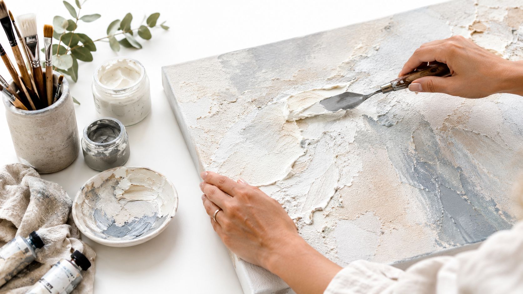
A hand-finished surface can catch light differently throughout the day. Raised paint may make a cloudy sky feel more active, while scraped pigment can suggest dry grass or weathered rock. These effects don't need to be dramatic. Small variations can stop a large neutral wall from feeling visually flat.
The choice also connects to a wider design conversation. Current design commentary describes a 2026 renaissance for abstracted scenes, earthy palettes, and unconventional placements, with demand connected to eco-conscious materials and art that creates calmer spaces in homes and offices, as discussed in this design coverage of current art trends. The appeal is practical as well as fashionable. A tactile, atmospheric piece can bring the feeling of nature indoors without requiring literal botanical imagery.
Independent coverage of nature-inspired wall art also points toward interest in tactile finishes, eco-conscious materials, and calmer environments across residential, hospitality, and office settings, as outlined in this trade discussion of nature-inspired wall art. That doesn't mean sustainability should be treated as a marketing label. Look for clear information about the materials, the frame, the inks, and the artist or studio behind the work.
Before you buy: Ask who made the piece, how it was produced, what protects the surface, and whether the materials suit the room where you'll display it.
Supporting an independent artist can make the artwork feel connected to a real creative practice rather than an anonymous catalogue. Museum-quality production also matters because a thoughtful image deserves a surface and structure that won't distract from it. You're choosing not only a view, but an object with a story, a maker, and a place in your daily surroundings.
The most successful modern art choices begin with a feeling and end with a practical decision. You identify the mood, study the light, measure the wall, and select a style that can live comfortably with the room's function. The artwork then becomes more than a coloured rectangle. It gives the space a sense of direction.
Trust the response you have before you start analysing every detail. If a quiet horizon makes you exhale, take that reaction seriously. If a textured hillside brings warmth to a cool room, let it do that work. For practical help with placement and installation, this guide to picture hanging for Melbourne homes offers useful hanging considerations that apply well beyond one city.
You don't need to create a perfect gallery wall on the first attempt. Choose one piece that reflects how you want to live, give it enough space to breathe, and let the room adjust around it.
Jessie's Home offers artist-made canvas wall art and gallery-quality photo prints, including outdoor and natural subjects produced on premium materials for residential and professional spaces. Browse Jessie's Home by room, style, subject, or place, then use your wall measurements and lighting notes to choose a piece that feels at home.

Explore the beauty of modern landscape art and how to choose prints that transform your home. From trends to room-by-room styling tips, this guide covers it
Explore the beauty of modern landscape art and how to choose prints that transform your home. From trends to room-by-room styling tips, this guide covers it

Learn how to choose and style beach wall art for living room spaces — from coastal palettes and framing to scale, grouping, and avoiding kitsch.
Learn how to choose and style beach wall art for living room spaces — from coastal palettes and framing to scale, grouping, and avoiding kitsch.

Abstract Painting for Living Room. Learn how to choose the perfect abstract painting for your living room with our guide on scale, color, placement, and styling
Abstract Painting for Living Room. Learn how to choose the perfect abstract painting for your living room with our guide on scale, color, placement, and styling


