Your wishlist is empty.
Secure Payment
30 days return

You've found the canvas. It's leaning against the living-room wall, looking promising in the shop and strangely uncertain at home. Is it too large for the sofa, too quiet for the room, or just the wrong kind of bold? Choosing an abstract painting for a living room can feel permanent, but the decision becomes much easier when you start with how the room is used rather than with a trend or a colour swatch.
Abstract art works best when it gives the room a visual anchor. Like a well-placed coffee table or a substantial rug, it helps the surrounding furniture feel intentional. The aim isn't to make every colour match. It's to choose a piece that supports the room's mood, scale, and daily rhythm.
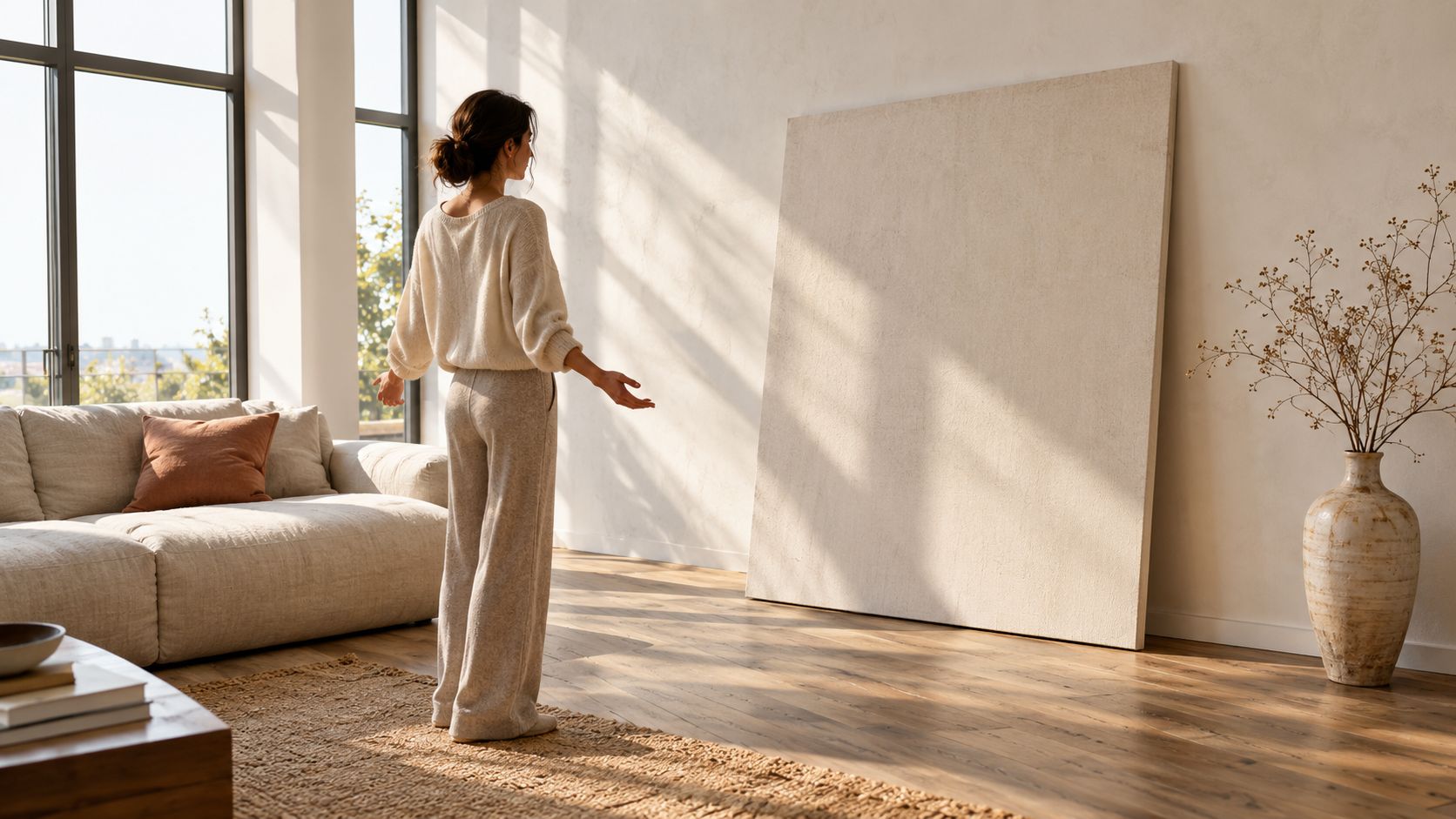
A homeowner might begin with a sofa, rug, and coffee table that all feel right, then reach the blank wall and lose confidence. A large canvas rests on the floor while someone holds it against the wall, steps back, tilts their head, and wonders whether the room needs more colour or less. That hesitation is common because art doesn't fill space. It changes how the entire seating area is read.
A successful abstract painting acts like an architectural anchor. It gives the eye a place to land, then connects the sofa, lighting, textiles, and accessories around it. A room with pale furniture and simple shapes may need a painting with movement and contrast. A room already filled with patterned cushions and busy shelving may benefit from a quieter composition with broad forms and restrained colour.
Abstract painting became a foundational interior-design language during the early twentieth century. The Bauhaus movement gained momentum in 1919, and Abstract Expressionism later brought bold colour, gesture, and composition into homes during the 1940s and 1950s, as described in this history of decorating with abstract art. That long development helps explain why abstract work can sit comfortably in modern, contemporary, minimalist, and eclectic interiors.
Unlike a literal scenery painting or photograph, an abstract piece doesn't dictate one specific story. It gives you room to respond to shape, texture, colour, and movement. That flexibility makes it useful in a social room, where the artwork needs to support conversation rather than dominate every glance.
The category is also substantial rather than marginal. The global wall art market was valued at USD 66.89 billion in 2025, while the abstract segment was projected to account for 30.49% of the market in 2026, according to wall art market data from Fortune Business Insights. Those figures describe the wider market, not a guarantee that every abstract piece will suit your home, but they show how firmly abstract work sits within contemporary wall decor.
Stylist's principle: Choose abstract art for the feeling and visual role you want in the room, not because the label “modern” seems safe.
Stand at the main entrance and observe what already commands attention. Is it the fireplace, a view, a television, a sculptural light, or the sofa itself? Your painting should either reinforce that focal point or create balance somewhere the room currently feels empty.
Ask three practical questions:
A large, expressive painting may suit a room built for entertaining, while a softened composition may work better where people read, rest, or spend long evenings. Abstract art isn't automatically the right answer, but it becomes a strong choice when its visual language matches the room's behaviour.
Browse a curated range of living-room wall art with that role in mind. Don't ask only whether you like the painting in isolation. Ask whether it can hold the wall, support the furniture, and still feel right when the room is being used.
A beautiful abstract painting can look weak when it's undersized and oppressive when it's oversized. Scale determines whether the artwork feels attached to the furniture or stranded on the wall, so measure before you shop.
Start with the furniture beneath the painting. Measure the width of the sofa, console, sideboard, or mantel. A common living-room rule places the artwork at about two-thirds of the furniture width, with 15–20 cm of clearance above the furniture and the centre of the piece around 145–150 cm from the floor, according to this living-room wall art placement guide.
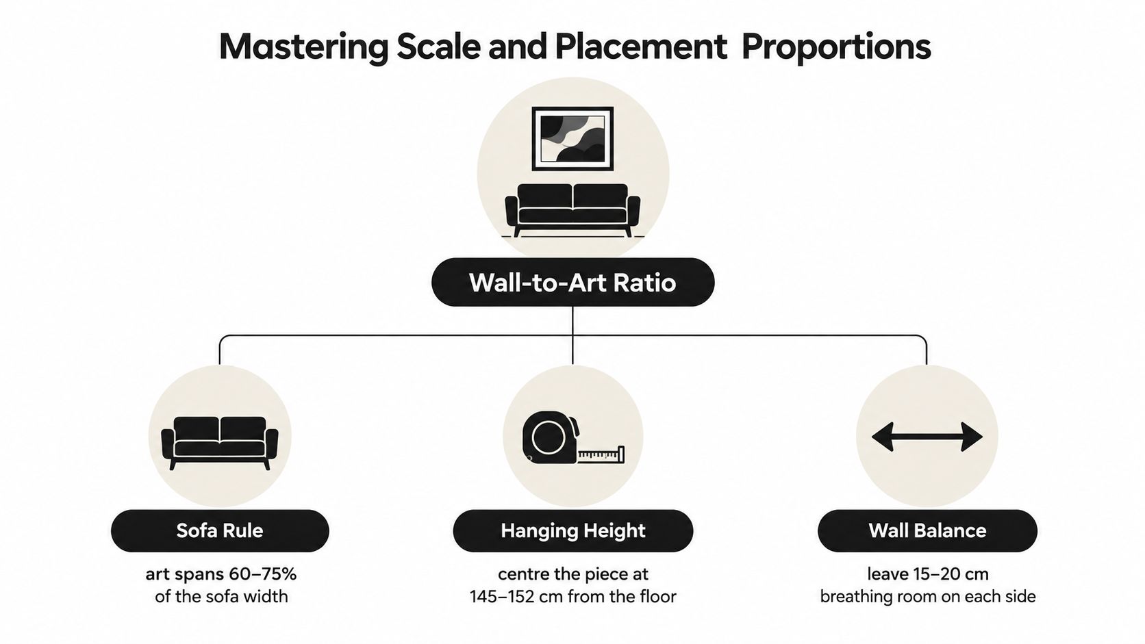
Furniture anchors a room because it has physical weight. Art needs a similar relationship to the objects below it. If a sofa is broad and low but the painting is a small rectangle floating high above it, the seating zone can feel visually unfinished. A correctly scaled canvas creates a bridge between the wall and the sofa, almost like an unseen vertical column.
Use this sequence:
A horizontal canvas usually reinforces the width of a sofa. A vertical composition can add height beside a fireplace, in a narrow corner, or above a slim console. Two smaller works can create a similar visual span when a single large piece isn't practical.
Eye-level placement prevents the painting from becoming disconnected from the room. In a typical seating arrangement, the centre should sit around 145–150 cm from the floor, but the furniture below still matters. Leave 15–20 cm between the lower edge of the frame and the top of a sofa or console so the piece feels attached without appearing cramped.
Tall furniture requires a visual adjustment. If the upper edge of a sideboard is high, use the clearance rule first and then check whether the artwork's centre still feels comfortable. The centre may sit higher than it would on an empty wall, but the painting shouldn't be pushed toward the ceiling just to fill vertical space.
A painting should feel like it belongs to the furniture below it, not like it was placed wherever the wall hook happened to land.
Tape is more useful than instinct at this stage. Cut paper to the artwork's intended size, attach it to the wall, and leave it in place while you move around the room. Sit on the sofa, walk through the doorway, and check the view from adjacent spaces. This catches errors that a straight-on inspection can miss.
Under-scaling happens when a small piece is placed above a wide sofa or on a large empty wall. The painting may be attractive, but the room gives it no visual support. You can solve the problem with a larger work, a diptych, or a carefully arranged group of smaller pieces.
Over-scaling happens when a broad canvas reaches into doorways, blocks architectural details, or visually presses down on the sofa. Large art can be powerful, but it needs breathing room and a clear wall plane. The aim isn't maximum size. It's a proportion that makes the seating area feel settled.
Colour should support the way people behave in the living room. A gathering space can handle warmth and animated contrast, while a reading corner may benefit from quieter blues, greens, and softened neutrals. The right abstract painting doesn't merely repeat the curtains. It helps decide whether the room feels sociable, restful, grounded, or lively.
A useful starting point is the 60-30-10 colour distribution. Interior colour planning often assigns roughly 60% to a neutral base, 30% to a secondary colour, and 10% to an accent, a framework discussed in this guide to choosing art through colour psychology. Treat it as a diagnostic tool rather than a rigid decorating law.
Look at the largest surfaces first. Walls, flooring, and the sofa often establish the neutral base. Curtains, a rug, or an accent chair may provide the secondary colour. Smaller cushions, ceramics, books, and accessories usually contribute the accent notes.
Then compare the painting's colour behaviour with the room:
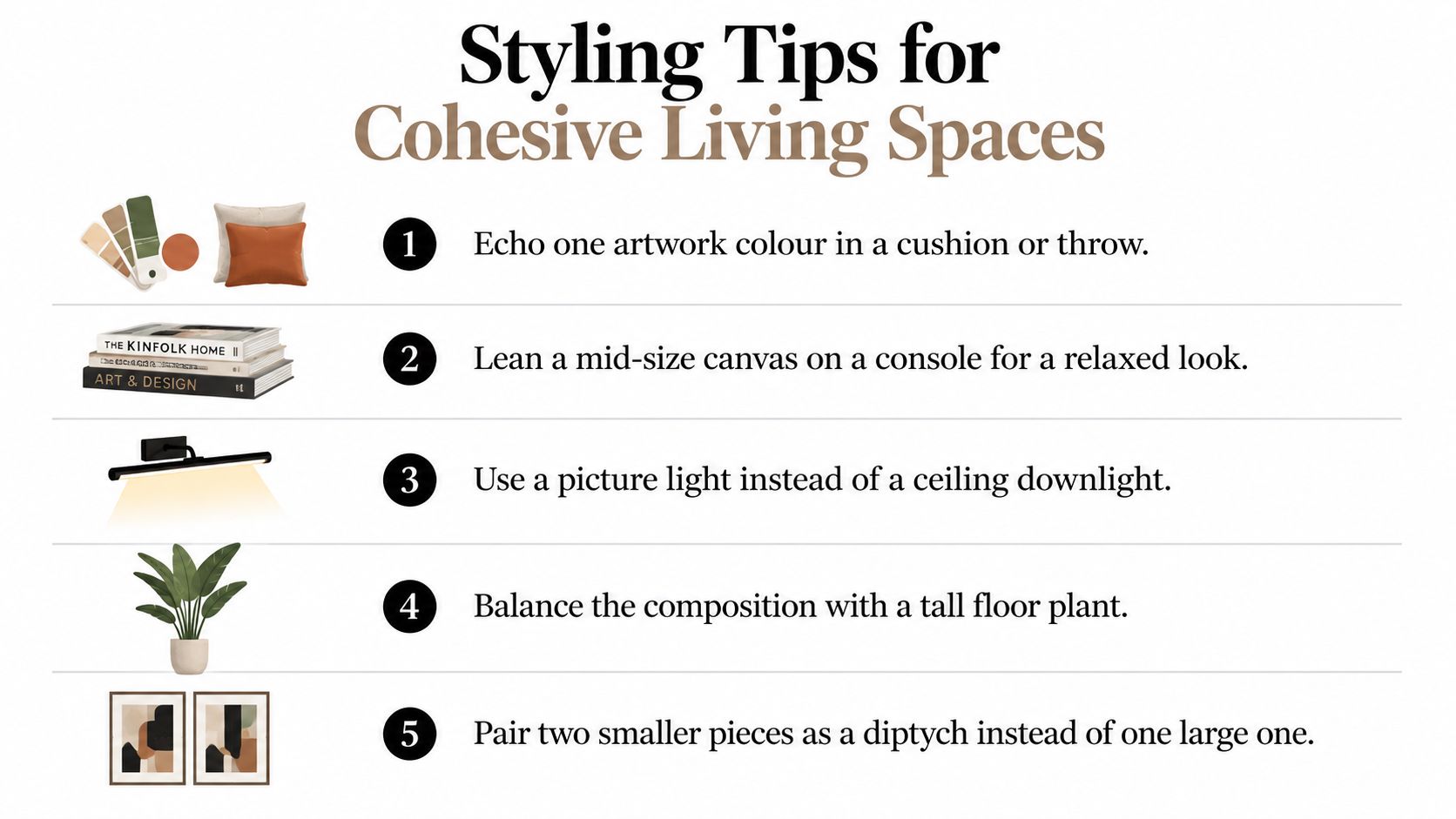
A painting doesn't need to contain every colour in the room. Choose one colour to echo, then allow the artwork to introduce a related shade or a controlled contrast. For instance, a muted terracotta mark might relate to a leather chair without matching it exactly. A deep green field can connect with a plant or rug while remaining visually richer than either.
Natural light changes how abstract colour is perceived throughout the day. A warm painting can become more intense in direct afternoon sun, while a dark blue or green composition may appear heavier in a dim corner. Test a digital image or sample print near the intended wall at different times before committing to a dominant palette.
Consider the finish as well. Glossy surfaces reflect lamps and windows, which may add liveliness but create distracting glare. Matte surfaces usually offer a quieter reading, though deep colours can appear more subdued under weak lighting.
Colour check: If the painting is the room's strongest accent, let the rest of the accessories repeat small details from it rather than competing with its entire palette.
For a deliberately colourful interior, colourful abstract canvas wall art can provide a starting point, but the same assessment still applies. First decide whether the room needs warmth, calm, or contrast. Then choose the intensity that supports that purpose.
The same abstract composition can feel relaxed, polished, rustic, or formal depending on how it's presented. A frameless stretched canvas has a different visual weight from a canvas enclosed in oak. Before choosing a finish, consider the room's traffic, cleaning habits, sunlight, and existing materials.
| Presentation | Visual effect | Practical considerations |
|---|---|---|
| Stretched canvas | Soft, contemporary, and relaxed | Works well when the image should feel broad and uninterrupted |
| Floating frame | Adds a slim shadow gap around the canvas | Creates definition without covering the artwork's edges |
| Traditional frame | More finished and architectural | Can connect the painting with timber, metal, or other framed pieces |
| Framed print | Structured and versatile | Suits gallery walls and rooms with a more collected character |
A floating frame is useful when you want the canvas to remain the central feature while giving it a clear boundary. The small separation between frame and artwork creates depth. Its weakness is that the shadow gap can highlight uneven walls or poor installation.
A traditional frame gives stronger visual structure. Wood can warm a pale room, black can sharpen a graphic composition, and a slim metallic finish can relate to lighting or hardware. The frame may also make the piece feel more formal, so use it when the room already has architectural definition or a curated gallery sensibility.
For high-traffic homes, look for a stable canvas support, secure hanging hardware, and a protective surface treatment. Premium cotton-blend canvas, fade-resistant inks, and a UV coating can help preserve colour and clarity, particularly where the artwork receives strong daylight. Keep the painting away from direct heat and avoid placing it where furniture or doors can strike the frame.
Material repetition creates cohesion, but exact matching can make a room feel staged. If the painting has a warm timber frame, repeat that warmth in a side table or shelving rather than searching for an identical wood grain. If the artwork is frameless, use woven cushions, a textured rug, or a tactile throw to provide the softness the frame would otherwise contribute.
A broader look at how fabric, texture, and surface contribute to interior atmosphere is available in this fabric advice from Pandemonium Millinery. The principle applies to art styling too. Smooth, flat surfaces needn't fill the whole room when a few tactile materials can add depth around them.
You can explore canvas wall art in different presentations, then compare each option against the room's furniture and lighting. The most suitable finish is the one that supports the painting's character while remaining practical for the way your household lives.
Hanging the right painting is only the beginning. A living room feels finished when the artwork communicates with the objects around it, including the rug, cushions, plants, shelves, and lighting. Think of the composition as a conversation. The painting may speak first, but nearby materials should answer without shouting.
If the painting is expressive, keep the wall beneath it relatively calm. A low sofa, simple console, or uncluttered mantel gives the artwork room to breathe. Place only a few objects below it, and vary their heights so the arrangement doesn't form a rigid horizontal line.
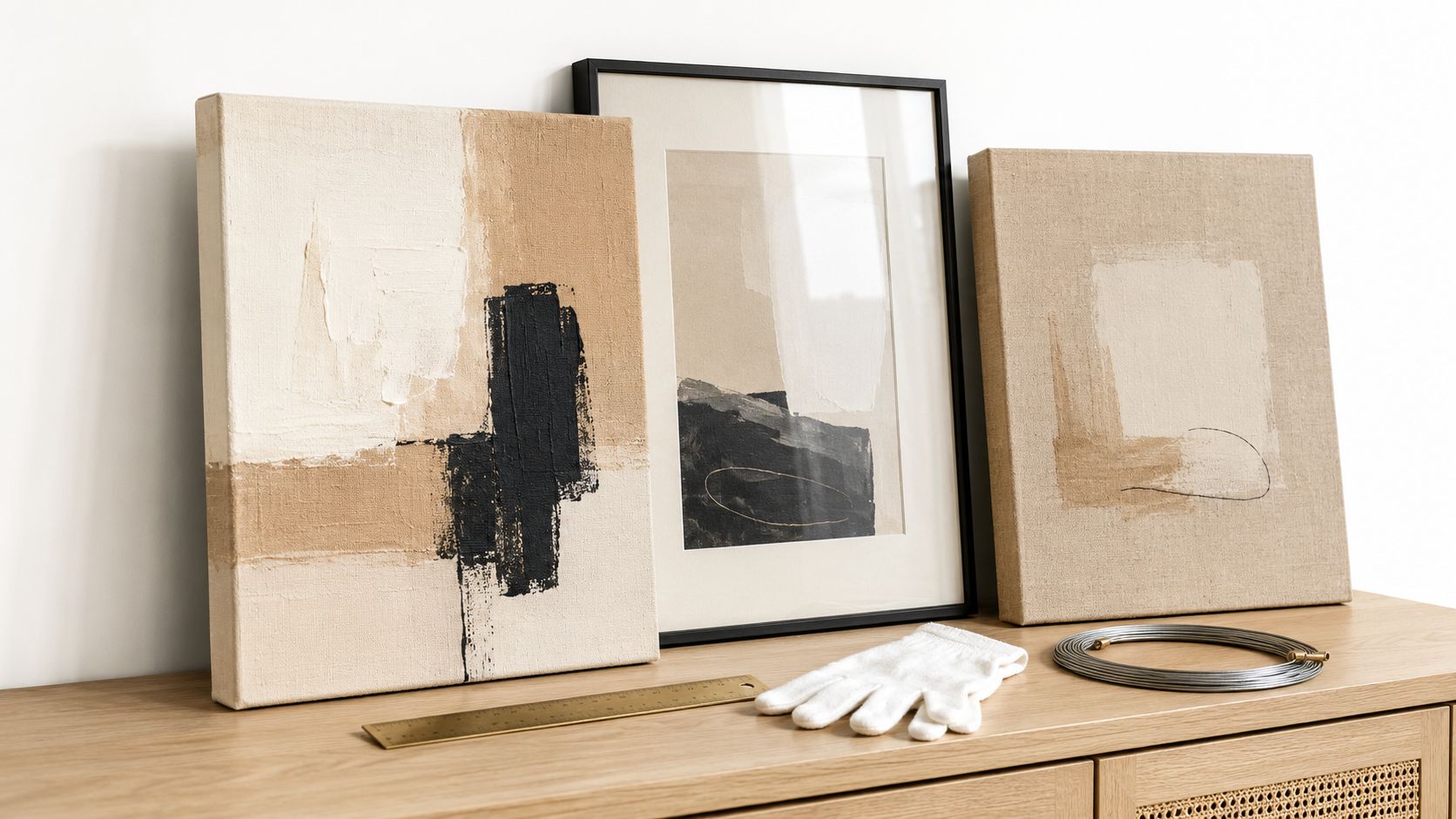
A corner can support a more relaxed treatment. Lean a medium canvas on a console or shelf, then layer a small object in front without hiding the main composition. This approach suits renters and anyone who wants to adjust the room without drilling immediately into the wall.
A gallery wall requires a different kind of discipline. Choose one connecting feature, such as a repeated frame finish, related neutral backgrounds, or a shared accent colour. Mix the abstract work with a photograph, line drawing, textile, or small mirror, but keep the group tied together by spacing and visual weight.
A bold painting can look isolated when everything around it is flat. Add contrast through a nubby throw, a woven basket, a ribbed ceramic lamp, or a rug with a subtle pattern. These elements echo the physical richness of the artwork without copying its shapes.
Lighting deserves its own decision. A picture light can create a focused pool of illumination and make the painting feel intentional, while a ceiling downlight may cast glare across the surface. Test the angle at night and check the painting from the sofa, where reflections are most noticeable.
Use plants carefully. A tall floor plant can balance a composition on one side of the sofa, particularly when the painting occupies the other side. Keep leaves from covering the artwork, and choose a plant form that complements rather than imitates the painting's marks.
This short visual guide offers a useful demonstration of styling ideas for abstract wall art:
The room should still feel comfortable when the artwork isn't being admired. Leave enough open surface for daily use, keep walkways clear, and resist filling every blank wall. Cohesion comes from relationships between a few considered elements, not from decoration placed everywhere.
The belief that abstract art is too busy for a small living room comes from confusing visual complexity with physical scale. A crowded composition can overwhelm a narrow space, but a well-proportioned large painting with broad forms and a controlled palette may make the room feel more unified. Several small competing pieces can create more visual interruption than one confident canvas.
Start by identifying the room's dominant activity. The same living room may host lively gatherings, quiet reading, children's play, remote work, and television viewing, so choose the artwork for the behaviour you want to support most often.
A social living room can carry more movement. Look for gestural marks, warm earth tones, or energetic colour relationships that give the eye something to explore without presenting a literal subject. High-saturation pieces can work well where the furniture and walls are otherwise restrained, because the painting provides the room's strongest moment of personality.
Keep the surrounding accessories simpler. If the canvas has several intense colours, repeat only one in a cushion or vase. Guests should be able to move through the room without encountering a visual competition between the painting, patterned rug, television, and shelves.
A reading-focused room benefits from a calmer composition. Soft gradients, organic forms, restrained contrast, and cooler blues or greens can help the wall recede rather than demand constant attention. Earth tones also suit this setting when they are muted and supported by natural materials.
Texture can provide interest without visual noise. A tactile abstract surface, linen-like finish, or gently layered composition may reward close viewing while keeping the overall mood settled. Current trend reporting points toward oversized, earth-tone, and textured abstract pieces for 2026, alongside buyer interest in art that feels personal and calming, as noted in this coverage of colour-field abstract art. This is a projected trend direction, not a requirement for every home.
A family room needs resilience as well as beauty. Choose a finish that can tolerate regular movement nearby, and place the artwork where furniture, toys, or bags won't brush against it. If the room doubles as a work zone, avoid a composition so high-contrast that it competes with concentration during the day.
A balanced design can divide the room emotionally. Use a more animated painting near the social seating area and quieter visual elements near the desk or reading chair. Flooring has a similar role in defining how different zones feel, so comparing materials in a collection such as Art Select flooring from Flacks Flooring can help you consider the relationship between the artwork, floor tone, and everyday use.
Large art can make a small room feel more deliberate because it reduces scattered visual decisions. Choose one piece that relates clearly to the sofa or main wall, then allow the surrounding area to remain open. A pale background, restrained palette, or broad shape can preserve airiness, while a dark or highly saturated work will create a stronger focal point.
The decision framework is simple: match scale to the wall, palette to the room's energy, and complexity to the way people use the space. Abstract art performs best when it isn't forced to be everything at once. It can energise a gathering room, quiet a reading corner, or bring cohesion to a family space, provided the painting has a clear job.
Jessie's Home offers artist-made abstract canvas wall art and gallery-quality photo prints in styles suited to living rooms, including contemporary and geometric compositions. Visit Jessie's Home to browse by room or style, compare pieces for your wall, and choose artwork that supports the way you live.

Explore the beauty of modern landscape art and how to choose prints that transform your home. From trends to room-by-room styling tips, this guide covers it
Explore the beauty of modern landscape art and how to choose prints that transform your home. From trends to room-by-room styling tips, this guide covers it

Learn how to choose and style beach wall art for living room spaces — from coastal palettes and framing to scale, grouping, and avoiding kitsch.
Learn how to choose and style beach wall art for living room spaces — from coastal palettes and framing to scale, grouping, and avoiding kitsch.

Abstract Painting for Living Room. Learn how to choose the perfect abstract painting for your living room with our guide on scale, color, placement, and styling
Abstract Painting for Living Room. Learn how to choose the perfect abstract painting for your living room with our guide on scale, color, placement, and styling


