Your wishlist is empty.
Secure Payment
30 days return

A blank wall can make an otherwise finished room feel strangely unfinished. You may have the sofa, rug, lighting, and cushions in place, yet the wall still needs something, preferably an artwork that adds personality without competing with everything around it. That's where black and white line art earns its place.
Its appeal comes from restraint. Instead of relying on photographic detail or a broad color palette, it uses black marks, white space, contour, and rhythm to suggest a face, botanical shape, body, or abstract idea. The result can feel quiet and architectural, or warm and visibly handmade, depending on the character of the line.
This guide treats black and white line art as a spectrum rather than a single look. You'll see how to distinguish ultra-clean minimal pieces from textured hand-drawn work, choose the right mood for each room, and avoid the common mistake of buying artwork that's too small for its wall. You'll also learn how frames, grouping, materials, and print quality affect the final impression.
For a curated starting point, browse line art canvas wall art, then use the ideas below to choose a piece that feels intentional in your home.
Black and white line art has a surprisingly deep history. One of the oldest known line drawings was discovered in Blombos Cave in South Africa and dated to about 73,000 years ago, showing that line-based visual communication existed long before writing systems and organized civilizations. MakeLineArt's history of line art traces that enduring language from prehistoric marks through modern illustration.
The format also survived because it works well in practical settings. Black ink on white paper was economical and highly legible, so line drawings became central to books, newspapers, engravings, technical illustrations, and other printed materials. Before photography and halftone printing were widely available, artists used hatching and stippling to create the impression of tone. The overview of line art on Wikipedia explains how printing technology helped establish black-and-white line work as a familiar visual system.
In a modern room, that history translates into flexibility. A single black contour can sit comfortably beside pale oak, while a more expressive drawing can soften a room filled with stone, metal, and straight edges. Unlike a colorful painting, line art often supports the existing palette instead of demanding that you redesign it around the artwork.
A useful way to think about it: color tells you where to look first, while line tells you how to look.
The practical decisions are straightforward once you separate them. First, identify the artwork's line character. Next, match that character to the room's mood. Finally, check the frame, size, and placement so the piece has enough presence to be seen without overwhelming the furniture below it.
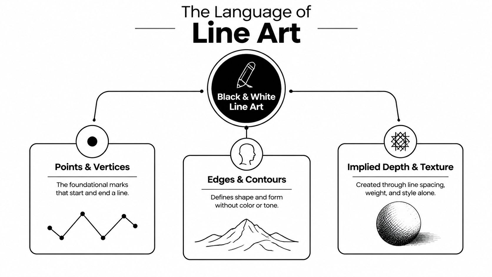
Line art communicates through points, contours, edges, and implied texture, rather than through a full range of color and continuous shading. It resembles handwriting. A familiar person's handwriting can feel hurried, elegant, playful, or controlled even when the words themselves are simple. Line drawings work in much the same way. Line weight, direction, spacing, and movement carry the personality.
A contour drawing might describe a shoulder with one uninterrupted curve. An abstract piece might use intersecting lines to create tension. A botanical illustration can rely on a central stem, repeated leaf shapes, and a few interior marks to suggest volume. Your eye completes what the artist leaves out.
White space isn't an empty leftover around the drawing. It gives the subject room to breathe and helps each mark remain readable. A sparse face drawing with generous white space can feel serene, while the same subject surrounded by dense hatching may feel dramatic or intimate.
High contrast makes this relationship immediate. Black marks stand clearly against a white ground, so the artwork can remain legible from across a room and still reward closer viewing. That's one reason this format continues to suit wall décor, where viewers often see a piece from several distances.
A thin stroke has nowhere to hide. In a colorful image, a small softness at an edge may blend into neighboring tones. In black-and-white line art, a jagged edge can make the entire piece look careless.
For printed work, publishing guidance recommends at least 600 dpi for simple line art and 1200 dpi for detailed line art. Peachpit's print guidance also notes that printer-native resolution helps preserve hard edges and fine strokes. Screen-printing guidance similarly emphasizes high-resolution preparation, with 600 to 1200 dpi commonly used and 720 pixels per inch cited for some workflows. The UMBC bitmap screen-printing guide explains why low-resolution line art can look jagged when edge smoothing is absent.
When you inspect a print, look for clean curves, consistent detail, and edges that remain deliberate at close range. Those qualities make simplicity look refined instead of unfinished.
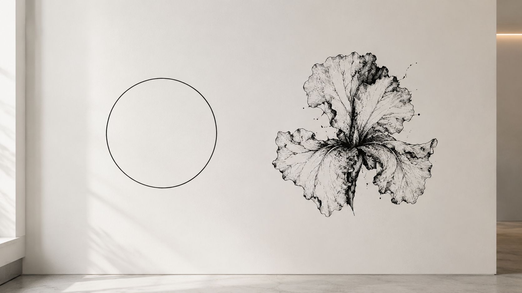
Not every black-and-white line drawing belongs to the same minimalist category. At one end, you'll find ultra-clean work with precise curves, even line weight, and generous open space. At the other, you'll find visibly human marks, slight wobble, uneven pressure, cross-hatching, and paper-like texture.
The clean end suits rooms that already have visual variety. A thin botanical outline above a sleek console can calm a busy entryway. A geometric face drawing in a black frame can reinforce a modern interior with glass, polished metal, and simple furniture. The danger appears when every surrounding surface is also smooth, pale, and controlled. Without warmth from fabric, wood, or irregular objects, ultra-clean line art may read as cold or interchangeable.
Hand-drawn texture changes the temperature. A slightly uneven contour beside a linen headboard feels more relaxed than a perfectly calibrated outline. Cross-hatching can echo the grain of wood, the veining of stone, or the loose weave of a textile. Those marks give the eye something tactile to follow, even when the artwork itself remains monochrome.
Recent 2026 art-trend forecasts describe a movement away from “AI-perfect” visuals toward naïve, imperfect, and tactile work, while wall-art coverage continues to position minimalist monochrome line art as a modern-interior staple. Printful's wall-art trend coverage presents these directions as parallel rather than mutually exclusive.
That tension is useful. You don't have to choose between sterile precision and messy expression. Look at the room first:
For a restrained starting point, explore minimalist canvas wall art, then compare pieces by line character rather than subject alone. Ask whether the artwork's surface feels like a quiet pause or a human gesture. The most current choice is often the one that balances the room's existing level of polish.
The same drawing can feel restful in one room and severe in another. Room function, surrounding texture, and viewing distance change how the artwork speaks.
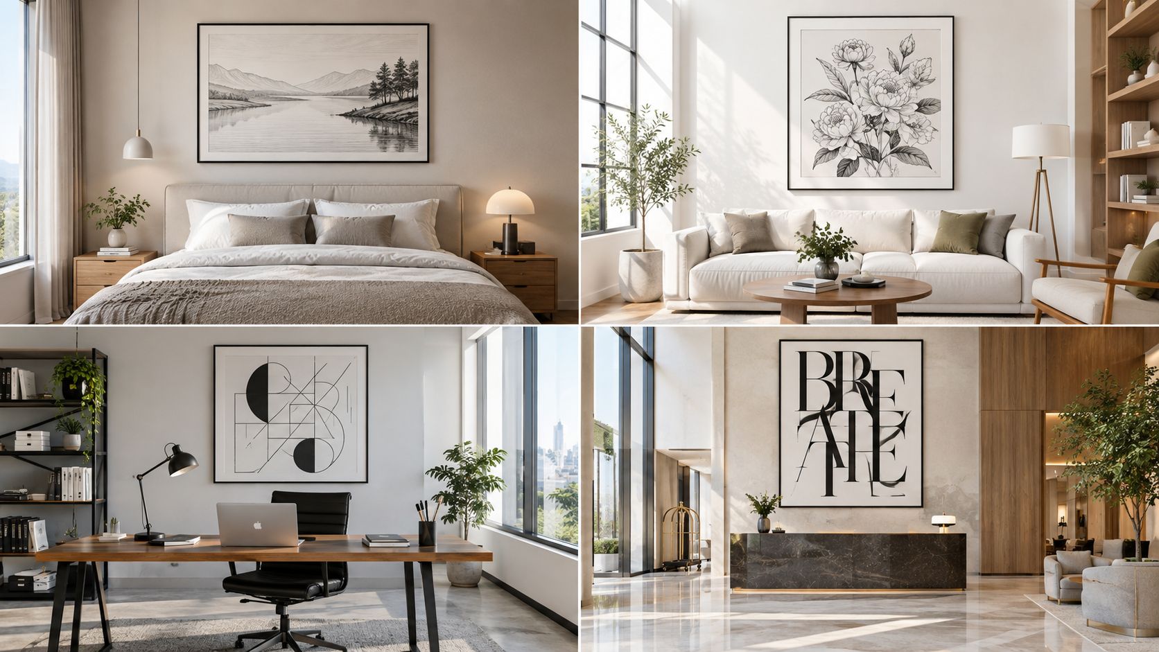
A bedroom usually asks for visual quiet. Place a botanical contour, a reclining figure, or a simple abstract form above a linen headboard. Choose a lighter line and enough white space that the artwork doesn't create a busy focal point directly opposite the bed.
Natural materials keep the monochrome palette from feeling stark. Pale timber, cotton bedding, woven baskets, and soft lighting give a clean drawing a gentler setting.
A living room can handle more graphic energy. A large abstract line piece above a sofa may echo the architecture of the space, while a pair of related drawings can create rhythm across a longer wall. In a colorful room, black and white line art acts as a visual pause between patterned upholstery, plants, and accessories.
If the room already has strong black details, such as a coffee table base or window frames, repeat that tone in the artwork or frame. The repetition makes the piece feel connected instead of randomly placed.
A creative office can support more visible process. Look for energetic contours, overlapping forms, or hatching that suggests movement. A disciplined geometric drawing may suit a clinic or administrative workspace better, where the artwork should add character without distracting from a calm environment.
For broader guidance on balancing subject, palette, and room proportions, the William Tucker Art design guide offers a useful companion resource.
A short visual reference can help you compare these moods in real interiors:
A hotel lounge, restaurant, or entryway needs art that reads quickly but doesn't feel generic. A bold abstract figure can make an arrival zone memorable. A sequence of botanical drawings can bring continuity to a corridor or dining area.
Scandinavian rooms generally favor open space and controlled linework. Boho rooms can absorb rougher marks, organic subjects, and tactile frames. Transitional interiors often benefit from a balanced drawing, neither starkly geometric nor heavily rustic. For ready-to-hang options across different home settings, browse canvas wall art for modern homes and judge each piece against the textures already present.
A beautiful drawing can still disappoint if it's too small for the wall. Thin lines have visual delicacy, so an under-scaled piece may disappear above a sofa, bed, or console instead of creating a clear focal point.
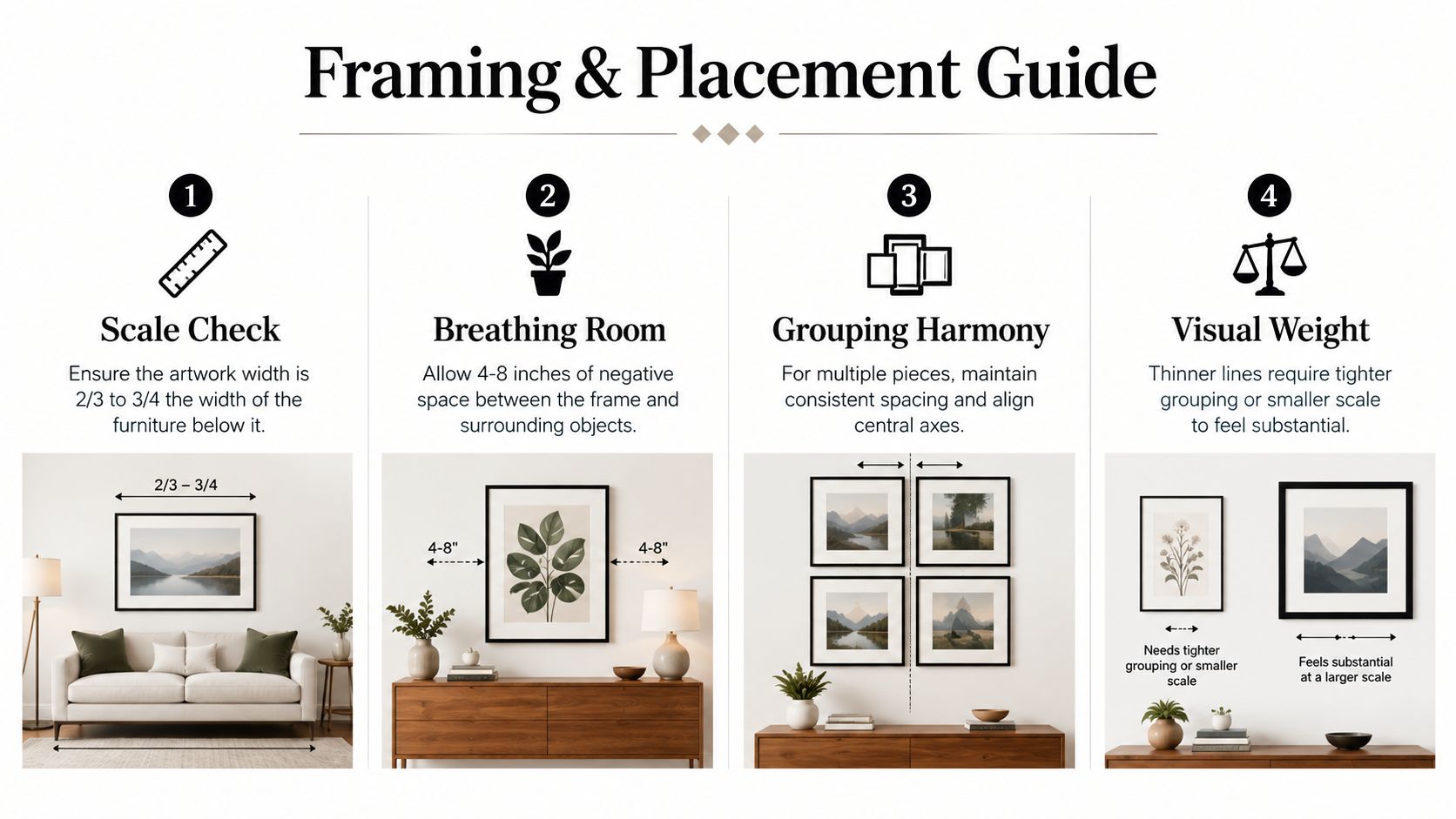
Start with the furniture below the artwork. The composition should feel anchored to that object, not stranded in the middle of a broad wall. A useful proportional guide is to choose artwork with a width around two-thirds to three-quarters of the furniture beneath it, as shown in the framing infographic below.
A narrow black frame sharpens a clean drawing and repeats the artwork's strongest mark. A pale wood frame softens a precise piece and makes it more comfortable beside natural materials. A white frame can nearly disappear, allowing the lines to float, but it may lack enough contrast on a pale wall.
Matting matters too. A generous white mat extends the negative space and gives a sparse composition room to breathe. If the drawing already contains a lot of open area, a large mat can make the whole piece feel calmer. If the artwork is highly detailed, a narrower mat may keep it from becoming visually distant.
Practical rule: If you notice the furniture first and the artwork only after searching for it, the piece probably needs more scale, stronger grouping, or a darker frame.
A diptych can turn two modest drawings into one wider visual statement. Keep the relationship clear by choosing a shared subject, similar line weight, or matching frame treatment. For a gallery grouping, align a central axis or a strong horizontal edge so the arrangement feels designed rather than scattered.
Marketplace trend reporting identifies recurring demand around standard formats such as 12×16 and 16×20, with seasonal buying peaks in Q4 and Q1–Q2. LiveWellCraft's wall-art trend specifications provides that context, but room scale should still guide your decision. Smaller formats work well on narrow walls, beside shelving, or in clusters. Larger walls and longer furniture usually need a single broader piece or a carefully assembled group.
Black and white line art rarely clashes with a room just because the room has color. Its limited palette lets it act as a bridge between unrelated elements, especially when you repeat small details around it.
Use three simple moves:
A colorful sofa can sit beneath monochrome art if the frame and surrounding accessories connect the two. A patterned rug may benefit from a quiet line drawing above it, because the artwork gives the eye a place to rest.
Use line art alone when the room already has enough pattern or when you want a serene focal point. Pair it with a color print when the wall needs stronger energy, or with photography when the room needs a clearer sense of place. In a warm, texture-rich interior, choose hand-drawn marks. In a sleek, edited room, choose cleaner contours and let the frame provide definition.
Choose the feeling first, then the subject. Decide whether the room needs calm, movement, softness, structure, or a visible human touch. That answer will point you toward the right end of the minimal-to-textured spectrum.
Before buying, check three details:
Black and white line art stays adaptable because it relies on form instead of a temporary color trend. Renters can use it to personalize a blank wall, homeowners can move it between rooms, and gift shoppers can choose a subject without needing to know every detail of the recipient's palette.
Select the piece that feels personal, not merely safe. Then hang it where the main contours meet your eye naturally, so the artwork connects with the room the moment you enter.
Jessie's Home offers artist-made canvas wall art and gallery-quality photo prints, including minimalist, botanical, abstract, and other styles that can complement a black and white line-art arrangement. Visit Jessie's Home to explore ready-to-hang pieces and find artwork that gives your wall a more personal finish.

Discover how black and white minimalist art transforms any room with calm, contrast, and timeless style, plus tips on prints, framing, and placement.
Discover how black and white minimalist art transforms any room with calm, contrast, and timeless style, plus tips on prints, framing, and placement.

Discover watercolor abstract art techniques, learn how prints differ from originals, and get styling tips for your home. A complete guide for wall art lovers.
Discover watercolor abstract art techniques, learn how prints differ from originals, and get styling tips for your home. A complete guide for wall art lovers.

Explore the beauty of modern landscape art and how to choose prints that transform your home. From trends to room-by-room styling tips, this guide covers it
Explore the beauty of modern landscape art and how to choose prints that transform your home. From trends to room-by-room styling tips, this guide covers it


