Your wishlist is empty.
Secure Payment
30 days return

You've opened three browser tabs, saved a dozen abstract canvases, and somehow feel less certain than when you started. One piece looks calm, another feels dramatic, and a third seems perfect online but strangely loud beside your sofa. That hesitation is normal. Abstract wall art decor doesn't give you a literal subject to match, so you need a different way to judge it.
The good news is that you don't need an art-history degree or a perfectly styled home. You need a few practical checks: understand how the artwork communicates, identify the visual energy you like, assess scale and light, then inspect the materials and maker behind the image. The right piece won't merely fill an empty wall. It'll give the room a feeling that still makes sense after the trend cycle moves on.
Start with the room, not the shopping page. Stand where you'll usually see the artwork and note what the wall already has to work with: the width of the sofa or console, the wall color, nearby textures, and the direction of natural light. A quick photo of the space can reveal proportions that are easy to miss while you're standing inside it.
Next, describe the mood you want in ordinary language. Quiet and grounded, bright and optimistic, architectural and precise, and loose and expressive are more useful starting points than searching for “something modern.” Your description will narrow the field before color and size begin competing for attention.
Practical rule: Choose the feeling first, then choose the palette and format that can create it.
Save only pieces that pass three early tests:
If you're starting from a blank wall, browse Jessie's Home's abstract canvas wall art collection as a way to compare restrained, geometric, colorful, and more expressive directions in one place. Don't add an item to your cart only because it matches a cushion. Ask whether its lines, balance, and atmosphere suit the way you use the room.
A useful shortlist contains a few distinct options, not many near-duplicates. Compare them as physical objects: imagine the frame edge, the canvas depth, the viewing distance, and the lighting at night. That shift turns abstract art from an intimidating category into a design decision you can explain.
Abstract art works a little like pure music. A song can feel tense because of rhythm, warm because of its tone, or spacious because of its pauses, even when nobody is singing a story. Abstract art creates a similar response through line, shape, color, texture, scale, and movement, rather than relying on a recognizable person, scenic view, or object.

That doesn't mean abstract work has no meaning. It means the meaning isn't locked to one literal interpretation. A sweeping dark shape might suggest a storm to one viewer and a graceful architectural form to another. Both responses can be valid because the artwork communicates through relationships between visual elements.
Look at shape first. Rounded forms often soften a composition, while sharp angles can create tension or structure. Then follow the lines. Horizontal movement may feel settled, vertical marks can add lift, and diagonal gestures often create energy. Color changes the emotional temperature, while empty areas give the eye somewhere to rest.
Texture adds another layer. Thick painted marks, visible grain, and raised details can make a piece feel tactile and handmade. Smooth, clean fields tend to read as more controlled. Neither approach is automatically higher quality. The question is whether the surface supports the mood you want and whether the maker has produced it intentionally.
Abstract wall art decor has roots in a major artistic transformation that began in the early 1900s. Wassily Kandinsky moved toward increasingly nonrepresentational painting, while Kazimir Malevich and Piet Mondrian helped establish forms of pure abstraction during the same decade. Tate identifies the period around 1910 to 1920 as foundational, and Kandinsky's Cossacks, dated 1910 to 1911, demonstrates the shift from recognizable subjects toward expressive lines, simplified forms, and large areas of color. These historical details are discussed in this background on abstract art's development.
Because abstract work isn't tied to one object, it can adapt as your room changes. A blue composition might support a coastal palette now, then continue to work after you replace a rug or repaint the walls. That flexibility is one reason abstract art suits living rooms, offices, hospitality spaces, and healthcare environments where a literal image may feel too specific.
Still, adaptability doesn't mean every abstract piece will work everywhere. A dense, high-contrast composition may demand attention in a room meant for rest. A very pale work may disappear against a light wall. If you want to compare a wide range of approaches before choosing, these unique abstract prints can help you identify which visual language keeps drawing you back.
The best test is simple: spend time with the artwork without trying to name it. Notice where your eye lands first, where it travels next, and whether the composition leaves you comfortable or restless. That response is useful information, not a sign that you're missing the “correct” interpretation.
Abstract styles have distinct personalities. Treat them as search filters rather than strict art-school categories. You're not required to choose one style forever, but recognizing the dominant character of a piece makes online browsing much easier.
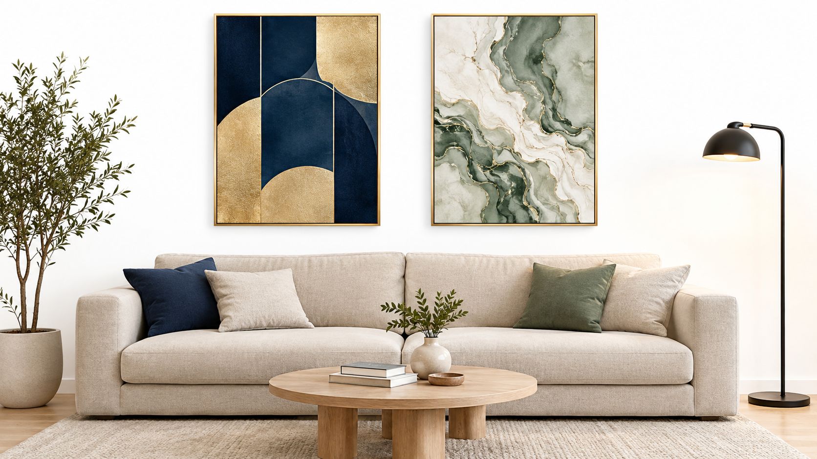
Geometric work relies on circles, blocks, grids, stripes, and carefully balanced edges. It suits rooms with clean-lined furniture, but it can also bring order to a softer space filled with curved upholstery and woven materials. Choose it when you want clarity, structure, and a composed focal point.
The trade-off is that strict geometry can feel visually firm. If your room already contains strong patterns, look for a design with more open space or a limited palette. For a focused starting point, explore Jessie's Home's geometric canvas wall art, then compare the artwork's structure with your furniture lines.
Gestural work shows movement through brush marks, drips, sweeps, scraped surfaces, or layered color. It brings emotional energy and often looks more relaxed than a carefully measured composition. This is a natural choice for a neutral room that needs warmth, motion, or a sense of human touch.
The drawback is visual intensity. Several energetic pieces can make a small room feel crowded, especially when they share strong contrast. Let one painterly work lead, then keep the surrounding accessories quieter.
Minimalist pieces reduce the visual vocabulary to a small number of shapes, tones, or marks. They can create spaciousness in a bedroom, entryway, workspace, or room with many architectural details. A nearly monochromatic composition doesn't have to be boring. Subtle changes in texture, edge, and value can give it depth.
The challenge is scale. A delicate piece may lose authority on a broad wall, while a large pale canvas can become a powerful quiet anchor. Judge it from the doorway, not only from the close-up product image.
Organic abstraction uses softened contours and shapes that may suggest plants, bodies, stones, or terrain without depicting them directly. Color-field compositions make broad areas of color do much of the work. Both approaches can bridge contemporary rooms and more traditional furnishings.
Use this quick comparison while browsing:
| Style | The room feels | Works well when | Watch for |
|---|---|---|---|
| Geometric | Ordered and considered | Furniture has clear lines | Too much rigidity |
| Gestural | Lively and expressive | A quiet room needs movement | Excessive visual noise |
| Minimalist | Calm and spacious | You want restraint | Losing impact at the wrong scale |
| Organic or color-field | Warm and atmospheric | You want softness without literal imagery | Colors looking flat under poor light |
Your favorite style may change by room. A structured composition can focus a home office, while a softer painterly piece may feel more welcoming above a bed. Choose according to the room's job, not a rule that says one home must speak in only one visual dialect.
A beautiful canvas can still fail if it's too small, too high, or too intense for its setting. The practical goal is balance. Your artwork should feel connected to the furniture beneath it while retaining enough presence to act as a focal point.
For art above a sofa, bed, sideboard, or console, a reliable rule of thumb is to look for a total artwork width of roughly two-thirds of the furniture below it. This isn't a law. A deliberately narrow piece can work in a minimal room, and a broad gallery arrangement can suit a large sectional. The guideline avoids the common mistake of placing a small canvas above a substantial piece of furniture.
Measure the usable wall area before shopping. Include the frame in the final dimensions, leave comfortable space around lamps and shelves, and remember that a diptych or triptych should be measured as one visual group. If you're choosing several small works, lay their paper equivalents on the wall with painter's tape first.
For height, aim for the center of the artwork around 57 to 60 inches from the floor, adjusting for the people who use the room and the furniture below. Above a sofa, the lower edge needs enough breathing room to avoid collisions with heads and cushions, but it shouldn't float far above the furniture. In a gallery wall, align the overall group rather than measuring every frame independently.
Placement rule: Center the composition at viewing height, then adjust for the furniture and the people who actually live with it.
Matching the artwork to the room's exact colors can make the result feel overly coordinated. Instead, choose a relationship. A muted canvas can soften a room with dark wood. A concentrated rust, blue, or green accent can connect separate objects without copying them. Black marks can echo window frames, hardware, or lighting fixtures and give a colorful piece a visual anchor.
Think in terms of dominant, supporting, and accent tones. The artwork can reinforce the room's main color, introduce a secondary note, or provide the small contrasting element that makes existing colors more noticeable. If the furniture is already busy, a limited palette usually works better than another source of competing pattern.
Color also changes how large or active a wall feels. Research on interior optical effects identifies intensity as a factor in perceived width, narrowness, and depth. High-saturation or strongly contrasting abstract compositions can make a wall feel more visually active, while lower-contrast palettes generally support a quieter reading. Review the findings in this research on color perception in interiors.
Digital images are useful for narrowing choices, but they can't reproduce your wall, bulbs, windows, or viewing distance perfectly. Compare the artwork under daylight and artificial light, preferably at full intended scale or from the position where you'll usually see it. A canvas that feels softly layered on your screen may look flat in shadow, while a vivid composition can become dominant beside a bright window.
Check glare as well as color. Glossy finishes, glass, and direct spotlights can create reflections that hide subtle marks. Aim lights toward the wall rather than concentrating a hot beam on one area, and use curtains or blinds where daylight is strong.
For rooms above a television, a single wide canvas can calm the wall, while a balanced group can distribute attention around the screen. These above TV gallery wall ideas are useful when you're weighing one focal piece against a more modular arrangement.
If your room needs a clear color accent, compare a range of colorful abstract canvas wall art against the actual sofa, rug, and wall paint. Save a phone photo of each contender beside the room's key materials. The strongest option is usually the one that supports the space without shouting over it.
Two canvases can display similar colors and still be very different purchases. Long-term value comes from the combination of artist intent, material quality, production transparency, and care requirements. A low-priced image may solve an empty-wall problem today, but replacement becomes frustrating when the colors shift, the frame twists, or the listing gives you no clear information about what you bought.
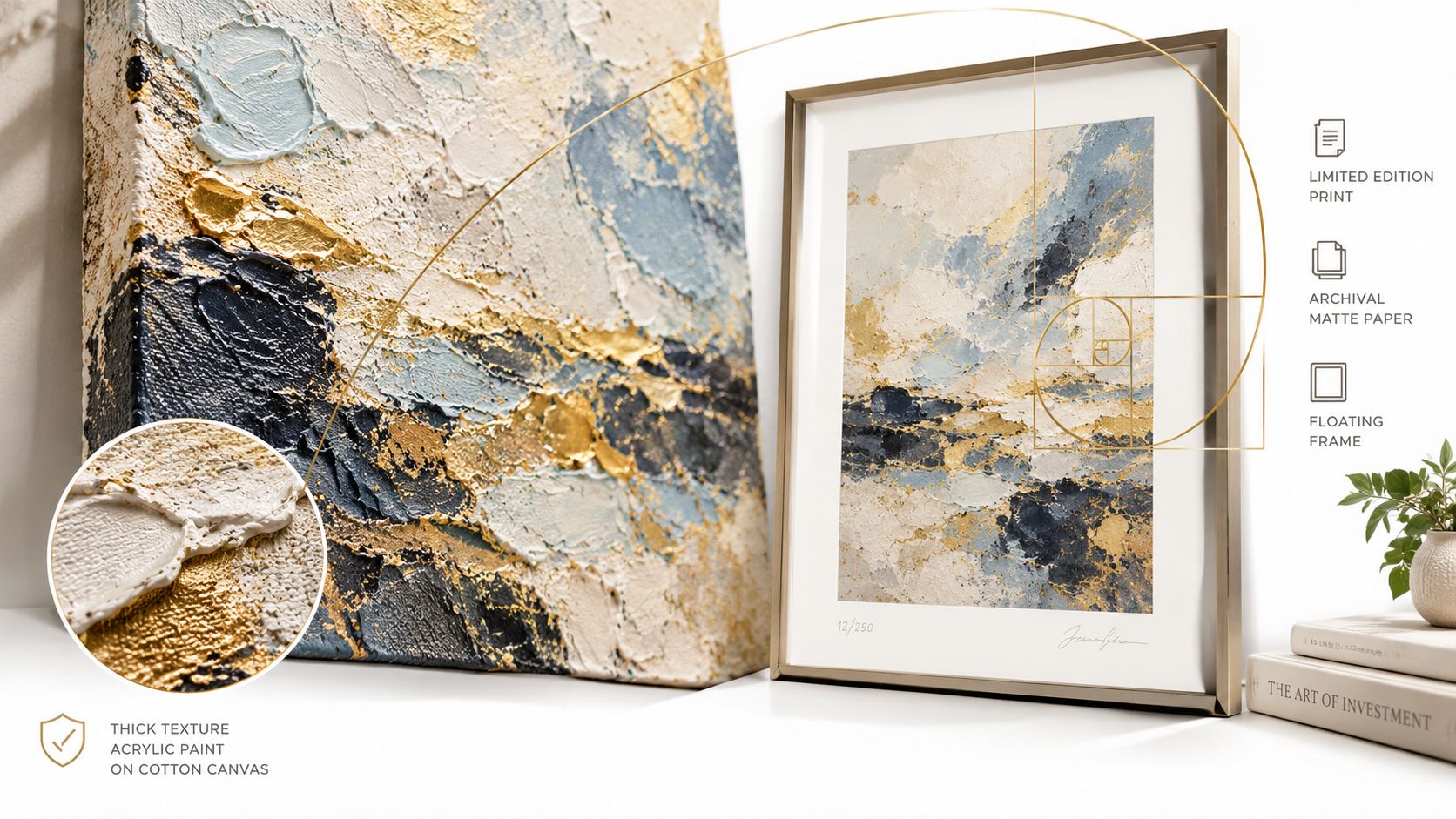
Archival inks are intended to resist premature color change when paired with suitable materials and conditions. A cotton-blend canvas gives the image a textured, textile-like surface, while a solid wood frame provides a stable support behind the canvas. A UV-reducing protective finish helps limit the effect of light, although it doesn't make artwork permanently fade-proof.
Ask practical questions before buying:
AI-assisted and mass-produced images aren't automatically unusable. They can offer accessible styling options, particularly when a buyer needs a specific palette or size. The trade-off is that visual similarity alone doesn't tell you about originality, artist compensation, source-image rights, or disclosure. If you care about human authorship, look for a named maker, an explanation of the creative process, and honest language about reproduction.
Light exposure is a primary technical risk because fading is cumulative and irreversible. Conservation guidance places many acrylic, oil, and tempera works at a maximum of about 200 lux and 75 microwatts per lumen of UV, while more sensitive colorants may require approximately 50 lux and 30 microwatts per lumen. Direct daylight should be avoided, and the conservation guidance is available through this museum resource on light and UV exposure.
In a home, that means using blinds or curtains near windows, avoiding unfiltered UV-emitting lamps, and choosing low-UV lighting aimed at the wall rather than a concentrated hot spot. When a seller provides lightfastness information, look for documented testing such as the ISO 105-A01 Blue Wool framework, which ranks durability from BW1, the most fugitive, to BW8, the most stable.
Treat the artwork as a real object when you move house. Photograph the front and back, protect corners, keep the surface from rubbing against packing materials, and follow a specialist Home Removals Sydney packing guide if you're transporting a larger framed piece. Good materials matter, but careful handling and sensible placement determine how well those materials perform.
Choosing abstract wall art decor becomes much easier when you stop asking whether a piece is objectively “good” and start asking whether it performs the right job in your room. Does it create the mood you want? Does its scale respect the furniture? Does the color remain comfortable in daylight and after dark? Can the seller explain who made it and how it was produced?
The strongest choices usually pass four checks. You understand the visual language enough to describe what attracts you. You can name the style's personality, whether that's ordered geometry, loose brushwork, minimal restraint, or organic softness. You've tested the size, viewing height, and lighting instead of trusting a product thumbnail. And you've looked beyond the image to inspect canvas, inks, framing, finish, artist attribution, and care.
Abstract art doesn't need to illustrate your life. It can hold a memory through color, bring energy to a quiet room, or give you a shape and rhythm you enjoy seeing each morning. That personal response is more durable than matching a short-lived trend.
Choose the piece that makes the room feel more like yours, then hang it at the scale and height that let it breathe. A blank wall isn't asking for a random decoration. It's giving you space to add a feeling with intention.
Jessie's Home offers artist-made abstract canvas wall art and gallery-quality photo prints on premium cotton-blend canvas, with fade-resistant inks, solid wood frames, and protective UV coating options. Browse the collection, compare styles and sizes for your room, and visit Jessie's Home to find a piece that feels personal and ready to hang.

Unlock the secret to choosing the perfect abstract wall art decor. Our guide explains styles, scale, and placement to transform any room. Find your piece today.
Unlock the secret to choosing the perfect abstract wall art decor. Our guide explains styles, scale, and placement to transform any room. Find your piece today.

Discover how to pick, place, and style art with cat themes across your home. Covers popular styles, room-by-room placement, and mixing feline art
Discover how to pick, place, and style art with cat themes across your home. Covers popular styles, room-by-room placement, and mixing feline art

Discover how black and white minimalist art transforms any room with calm, contrast, and timeless style, plus tips on prints, framing, and placement.
Discover how black and white minimalist art transforms any room with calm, contrast, and timeless style, plus tips on prints, framing, and placement.


