Your wishlist is empty.
Secure Payment
30 days return

You're probably here because you've found a polar bear painting you like, but you're hesitating. It feels striking, calm, maybe a little haunting. You can picture it above a sofa or in an entryway, but you're not sure whether it will read as elegant wildlife art, winter decor, or a quiet statement about the Arctic.
That hesitation makes sense. Polar bears paintings carry more meaning than a lot of animal art does. The subject is visually simple, a pale animal against snow, ice, water, or dark sky. But the effect on a room can swing in very different directions depending on the style, the scale, and the setting around it.
A good polar bear painting doesn't just fill a blank wall. It changes the emotional temperature of the space. It can make a room feel grounded, reflective, crisp, gentle, or more design-conscious than it did before. Once you know how to read those signals, choosing one gets much easier.
You walk into a room with a lot going on. Books stacked sideways. A textured rug. A brass lamp. Then your eye settles on the palest shape in the room, a polar bear against ice or water. The effect is a little like adding one clear note to a layered song. It brings order without asking for attention.
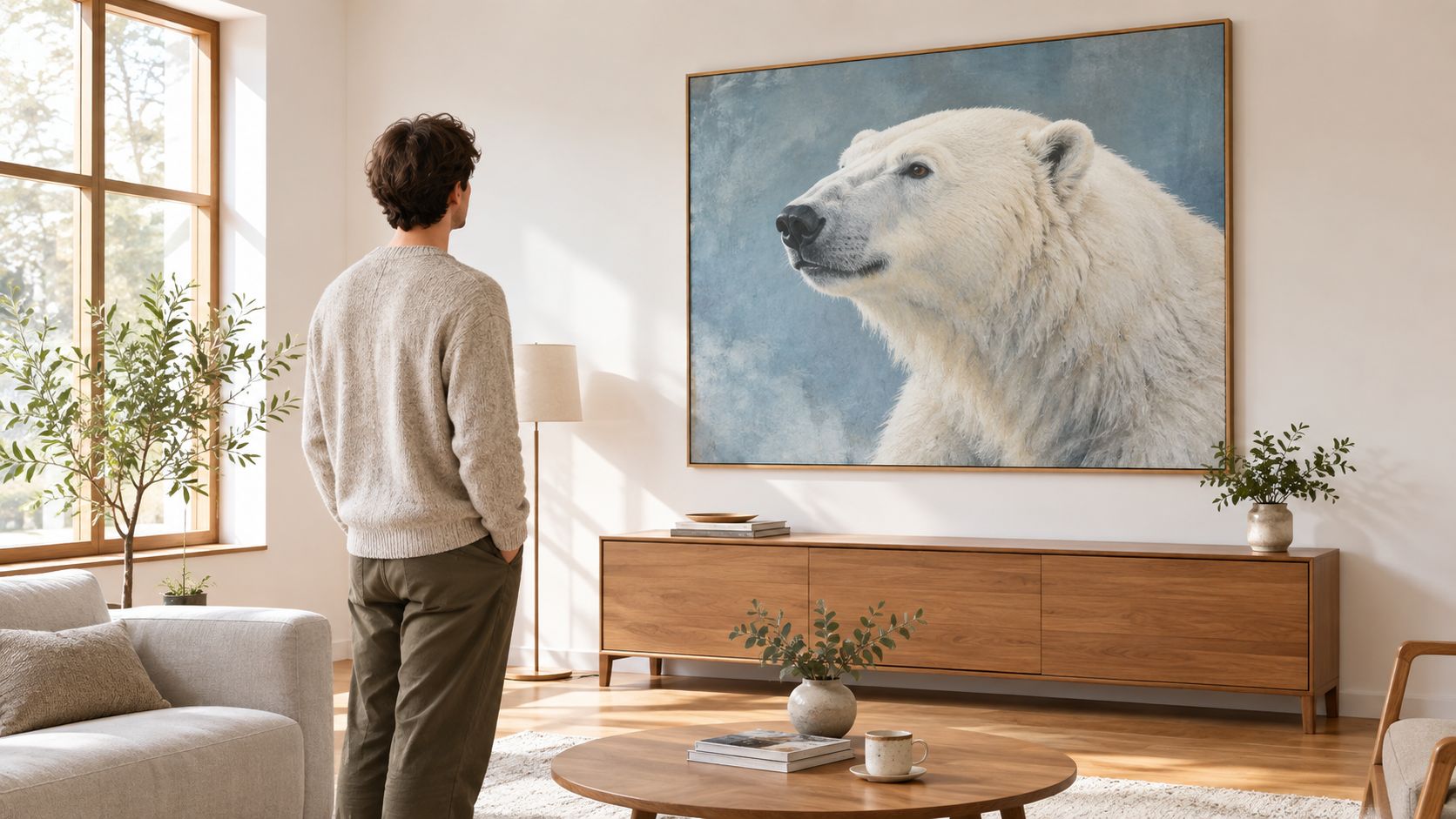
That balance explains part of their appeal. Polar bear paintings often feel dramatic and restrained at the same time. The subject has visual contrast built in, pale fur, dark eyes, open space, cold light, but the overall mood usually stays calm. In decorating terms, that means the piece can become a focal point without making the room feel busy.
Polar bears have held artists' attention for a very long time. They appear in ancient Arctic carving traditions, where makers worked in materials such as bone, ivory, and soapstone and often showed hunting, movement, and close observation of animal life, as described in this history of polar bears in art.
That long history changes how the subject reads on a wall. A polar bear painting carries more than snow and wildlife imagery. It brings traces of survival, storytelling, distance, and human curiosity about the far North.
European artists later picked up the subject through exploration, collecting, and Arctic travel narratives. By the nineteenth century, polar bears appeared in paintings that treated them as more than animals alone. They could suggest danger, remoteness, power, or the point where human control runs out. Landseer's Man Proposes, God Disposes is one famous example of that shift in meaning.
A room picks up on those associations, even when no one says them out loud.
You do not need an art history degree to feel this. You feel it the same way you feel the difference between linen and velvet before you know the textile terms. One feels crisp and spare. The other feels heavy and rich. Polar bear art works in a similar way. Its history gives it a certain emotional texture.
That is why these paintings often read differently from other animal art. A deer can feel rustic. A horse can feel traditional or sporty. A polar bear often suggests quiet endurance, distance, and a kind of self-possession. Put one in a room, and the space can start to feel more reflective, more architectural, or more intentionally pared back.
For someone choosing art for a home, this matters. You are not only picking an image that matches the sofa. You are choosing whether the room should whisper calm, solitude, resilience, or awe. Polar bear paintings stay compelling because they do both jobs at once. They give you a strong visual anchor, and they carry a deeper atmosphere with them.
Knowing when you like a piece is easy, but explaining why can be harder. With polar bear art, that's usually because the subject stays the same while the visual language changes. The fastest way to choose well is to spot the style first.
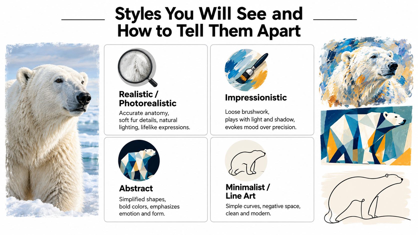
These works aim for believable anatomy, natural light, and fur that looks soft rather than outlined. You'll usually notice careful shadow shifts in the coat and a background that feels like an actual place, not just a white backdrop.
A simple test helps. Ask whether the bear feels observed or invented. If the shoulders, paws, and head weight feel convincing, you're likely looking at realism.
There's also an art-historical wrinkle here. In the 19th century, many polar-bear paintings were based on sketches from captive animals rather than field observation, and that changed the visual record by allowing artists to paint solitary bears, courting pairs, and less violent scenes with more behavioral variation, according to this study on polar bear imagery and captivity. Realistic paintings today still benefit from that shift toward closer observation.
This style softens edges and favors mood over precision. You'll see visible brushstrokes, broken color, and fur suggested with texture instead of mapped hair by hair. These pieces often feel warmer and more atmospheric in a home.
If realism says, “Here is the bear,” impressionism says, “Here is the feeling of seeing the bear.”
A quick spotting trick: stand back and see whether the image resolves at a distance. If the brushwork looks loose up close but comes together from across the room, that's usually painterly or impressionistic work.
Later in the section, it helps to watch style in motion and compare how artists simplify form:
Abstract pieces reduce the bear to shape, silhouette, or a field of cool and warm tones. Sometimes the animal is barely there. A sweep of white, a curved back, a dark eye mark, and your brain fills in the rest.
Stylized or illustrative work is different. It usually keeps the bear recognizable but flattens the image into cleaner lines, stronger outlines, or simplified color blocks. These pieces tend to sit comfortably in modern homes because they behave well with graphic furniture, black accents, and minimal styling.
Here's the easiest way to sort the two:
If you've ever said, “I like polar bears, but I don't want my room to look theme-y,” you're probably looking for stylized or abstract art rather than strict realism.
A polar bear on a wall is never just a polar bear. The pose, color palette, background, and scale all shape the message. Two paintings can feature the same animal and say opposite things.
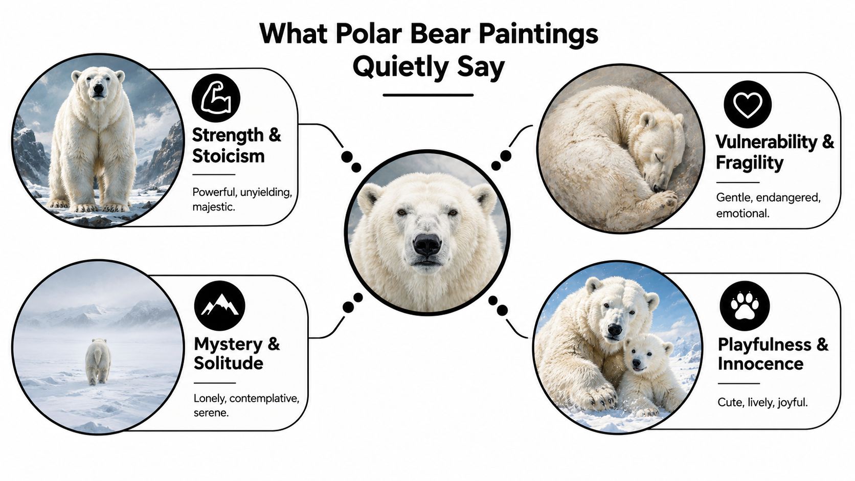
A frontal bear with a level gaze usually reads as strength. If the composition is clean and the body fills much of the frame, the room often feels more anchored. This works well in spaces that need visual confidence, like a den, office, or formal living room.
That doesn't mean aggressive. A calm, centered bear can bring steadiness without feeling heavy.
A lone bear crossing open ice sends a different signal. Low horizons, muted grays, soft blues, and lots of negative space make the room feel quieter and more reflective. This kind of image often works in bedrooms or reading corners because it leaves mental breathing room.
Practical rule: If the background feels as important as the animal, the painting will usually read as contemplative rather than commanding.
This is also where modern environmental meaning enters the picture. The IUCN Polar Bear Specialist Group gives a most recent consensus estimate of about 26,000 polar bears worldwide, with a 95% confidence interval of 22,000 to 31,000, in its status report. The same report notes a 2021 estimate of 618 bears in the Western Hudson Bay subpopulation, down from 842 in 2016, a decline of about 27% in five years, and that kind of decline shapes how many viewers now read polar bear imagery, especially when the composition emphasizes isolation.
There's also a difference between cute winter imagery and more credible wildlife imagery. Educational art content often stresses details like fur texture, not-quite-pure-white coloration, and believable Arctic settings such as the Northern Lights, as discussed in this polar bear painting lesson focused on accuracy cues. For buyers, that creates a useful question: do you want the piece to feel decorative, or do you want it to carry some observational authority?
Another layer is ecological meaning. Educational material commonly links polar bears to the Arctic ecosystem and dependence on sea ice, yet often stops short of explaining how that changes the mood of an interior, a gap highlighted in this teaching resource on polar bears and the Arctic. In a home, hospitality setting, or office, that subtext can matter. Some rooms benefit from it. Others may feel better with a softer, less loaded interpretation.
The room should decide more than the subject does. A polar bear painting can look perfect in one space and oddly stiff in another, even when the art itself is beautiful. What changes is how the room uses it.
In a bedroom, softer is usually better. Think muted backgrounds, gentler poses, or even a more abstract bear form that reads as calm texture from the bed. If the piece stares directly at you from across the room, it can feel more alert than restful.
A living room can handle more narrative. Full-body portraits, larger scenes, or painterly Arctic scenes tend to work well because people spend time there looking around. The art has space to be noticed gradually.
For a home office, a single-bear portrait or pared-back graphic piece often works best. It gives the wall structure without turning the room into a wildlife showcase.
An entryway is different. You see the art quickly, often while moving. That favors pieces with a strong silhouette, higher contrast, or a vertical composition that reads fast.
Where people naturally slow down is where polar bear art tends to shine. Over a console table, at the end of a hallway, above a mantel, beside a staircase landing. Those are visual pause points.
Use these cues:
A painting doesn't need to dominate the room. It needs to meet the room at the right volume.
Scale matters too. As a practical decorating rule, artwork often looks balanced when it spans roughly two-thirds of the width of the furniture beneath it. If you're hanging above a sofa, bed, or console, that guideline helps prevent the piece from looking adrift. For the actual install step, this framed artwork placement guide is useful because it breaks down spacing and placement in a clear, room-by-room way.
Once you know the look you want, format becomes the next decision. Many buyers default to price first and regret it later. A polar bear image changes character depending on whether it's printed on canvas, paper, metal, or acrylic.
Canvas adds softness and surface texture. That's especially flattering for wildlife and snowy scenes because it takes the edge off crisp whites and gives the image a more painterly presence. In a living room or bedroom, that often feels warmer than a slick print behind glass.
Unframed gallery-wrapped canvas tends to look relaxed and contemporary. A floating frame tightens it up and makes it feel more architectural.
If you want to browse examples in that format, Jessie's Home offers a range of canvas wall art that shows how different subjects shift once they're printed on textured canvas rather than smooth paper.
Paper prints usually deliver sharper detail. If the artwork relies on fine fur detail, delicate sky transitions, or a more photographic finish, paper can preserve those nuances very well. Framed behind glass, it also gives a more formal look that suits offices, dining rooms, or traditional interiors.
The trade-off is glare. In bright rooms with many windows or lamps, reflective glazing can compete with pale Arctic imagery.
If you're comparing local production options before ordering, a guide to local poster printing for Vancouver can help you think through poster-scale paper output and framing logistics in practical terms.
| Format | Best For | Trade-Off |
|---|---|---|
| Canvas print | Living rooms, bedrooms, relaxed interiors, painterly wildlife art | Less razor-sharp than paper, quality depends on stretching and frame build |
| Paper print | Detailed images, formal rooms, easy custom framing | Glass can reflect light and mute the image from some angles |
| Floating framed canvas | Modern spaces that need a finished look | Usually costs more than an unframed wrap |
| Matted and framed paper | Traditional interiors, offices, galleries of smaller works | More parts to coordinate, frame choice matters a lot |
| Large statement piece | Big walls, lobbies, above sofas or beds | Requires careful measuring and stronger hanging hardware |
| Smaller paired prints | Hallways, layered gallery walls, tighter spaces | Less impact if the wall needs a true focal point |
A few smaller decisions matter too:
The easiest way to avoid buyer's remorse is to make the decision in order. Many do it backward. They fall for the image first, then try to force it into the room. It works better when the wall leads.
Measure the actual display zone, not just the full wall. Account for the sofa, headboard, console, trim, sconces, and nearby shelves. What remains is your true art space.
Then ask three questions:
If you're shopping by theme and want a narrower starting point, a collection of bear canvas wall art can help you compare poses, palettes, and composition styles before you decide on one final direction.
Many people get tripped up here. They ask whether they want a mother and cub, a solitary bear, or a snowy background. That's secondary. Start with the room feeling.
If you can't decide between two pieces, the better one is usually the one that matches the room's mood faster.
North-facing rooms often benefit from warmer undertones. South-facing rooms can handle icier palettes without feeling cold. If your light changes dramatically through the day, avoid judging a piece from a tiny screen image alone.
Before you check out, confirm the print medium, frame depth, hanging method, and return policy. Those practical details don't sound romantic, but they're what keep a beautiful choice from becoming an annoying one.
This question comes up constantly because people assume realism is the more serious choice. It isn't always. Sometimes it's the louder choice.
Realistic polar bear art has weight. It can feel observant, grounded, and emotionally immediate. In a study, library, den, or larger living room, that gravitas can be exactly right. The room gets a focal point with presence.
Realism also works well when the rest of the space is simple. If your furniture lines are clean and the palette is restrained, a detailed wildlife image can add richness without clutter.
Stylized art is often easier to live with. It asks less from the viewer every single day. Instead of saying, “Look at this animal,” it says, “Let this shape and mood become part of the room.”
That's useful in bedrooms, hallways, guest rooms, and minimalist interiors where too much detail can feel visually busy. A line-based, geometric, or loosely painted bear can still carry the spirit of the subject without turning the wall into a literal Arctic scene.
If you want to compare that approach against more detailed work, browsing realism canvas wall art can help clarify how much visual information you enjoy living with.
Don't ask which style is more accurate. Ask which style serves the room.
A detailed piece rewards close looking. A stylized piece supports atmosphere. If the wall is seen from across the room, or only in passing, simpler often wins. If the wall is a destination, detail can shine.
The best choice is usually the one that feels right from the doorway, not the one that sounds most impressive on paper.
A good polar bear painting often starts with a small pause. You notice it before you fully understand why. The pale shape, the quiet background, the sense of cold air or distant light. It doesn't just decorate. It settles the room.
That's the test worth trusting. Not whether the piece seems trendy, and not whether someone else styled a similar one beautifully online. What matters is whether the painting fits the life of your room.
Keep your checklist simple.
Look at the room first. Decide what that space needs from its wall art. Rest, focus, welcome, gravity, softness, or conversation.
Then narrow the piece by function:
A wintery polar bear piece can be timeless if it's chosen for form, mood, and placement rather than novelty. That's why the best ones don't feel seasonal after a few weeks. They feel composed.
Measure twice. Sit with the image for a day if you need to. If a preview or sample is available, use it. Once the practical boxes are checked, trust your reaction. A well-chosen Arctic subject can anchor a space for years.
Jessie's Home offers artist-made canvas wall art and gallery-quality prints that make this kind of decision easier, especially if you're trying to balance mood, scale, and a polished finish. If you're ready to compare wildlife pieces, room-friendly formats, and styles that feel at home rather than overly themed, visit Jessie's Home.

Discover how black and white minimalist art transforms any room with calm, contrast, and timeless style, plus tips on prints, framing, and placement.
Discover how black and white minimalist art transforms any room with calm, contrast, and timeless style, plus tips on prints, framing, and placement.

Discover watercolor abstract art techniques, learn how prints differ from originals, and get styling tips for your home. A complete guide for wall art lovers.
Discover watercolor abstract art techniques, learn how prints differ from originals, and get styling tips for your home. A complete guide for wall art lovers.

Explore the beauty of modern landscape art and how to choose prints that transform your home. From trends to room-by-room styling tips, this guide covers it
Explore the beauty of modern landscape art and how to choose prints that transform your home. From trends to room-by-room styling tips, this guide covers it


