Your wishlist is empty.
Secure Payment
30 days return

You've just unboxed a new print and placed it against the wall, waiting to see whether it belongs above the sofa or in the reading nook. The colors look rich, the details are crisp, and the paper or canvas feels substantial. Then a practical question appears: will it still look this good after years of sunlight, changing humidity, and ordinary life at home?
That question gets harder because “museum quality” appears on product pages with little explanation. A useful answer doesn't begin with the label. It begins with the print's ink, substrate, resolution, protective finish, framing, and display environment. Once you understand those parts, you can assess museum quality art prints with the same calm attention a curator gives to materials in a gallery.
A museum-quality print isn't defined by one universal industry badge. The phrase usually refers to the permanence and durability standards used for photographic and fine-art prints, especially their ability to resist the environmental conditions that cause visible deterioration.
The International Organization for Standardization has developed several relevant standards for print stability. These include ISO 18936:2012 for heat stability, ISO 18937:2014 for light stability, ISO 18941:2011 for ozone gas fading stability, and ISO 18946:2011 for humidity-fastness ranking. ISO also published ISO/PAS 18940-1:2023, which sets out test methods and analysis procedures for evaluating image permanence in digital photographic reflection prints. ISO's print-permanence standard shows why “museum quality” should mean more than attractive colors on opening day.
Think of a print as living in a small ecosystem. Light can alter colorants, heat can accelerate chemical change, ozone can contribute to fading, and humidity can affect both the image layer and the paper or canvas beneath it. A durable print must therefore withstand several kinds of stress, not just one laboratory condition.
Practical rule: Treat “archival” as a prompt to ask what was tested, on which material, with which ink, and under what display assumptions.
This distinction matters for everyone, including artists and prints for TikTok creators who want digital artwork to become physical work rather than remain confined to a screen. A strong reproduction preserves the character of the image while giving the buyer useful information about how it was produced.
The same principle applies whether you're choosing a textured canvas for a dramatic living room or browsing canvas wall art for a quieter space. The material specification should support the visual intention.
Permanence is affected by the entire system. Ink and paper may perform well together in controlled conditions, but direct sun, moisture, poor framing, or unsuitable storage can change the outcome. A print can be made with excellent materials and still suffer if its environment works against them.
That's why reputable sellers often use broad longevity language rather than promising a precise expiration date. The meaningful question isn't just “How many years will it last?” It's “How resistant is this print to the conditions where I'll display it?”
A fine-art print is only as durable as its weakest physical component. The image may be beautifully prepared, but a thin substrate, unstable ink, or inadequate protection can compromise the finished piece.
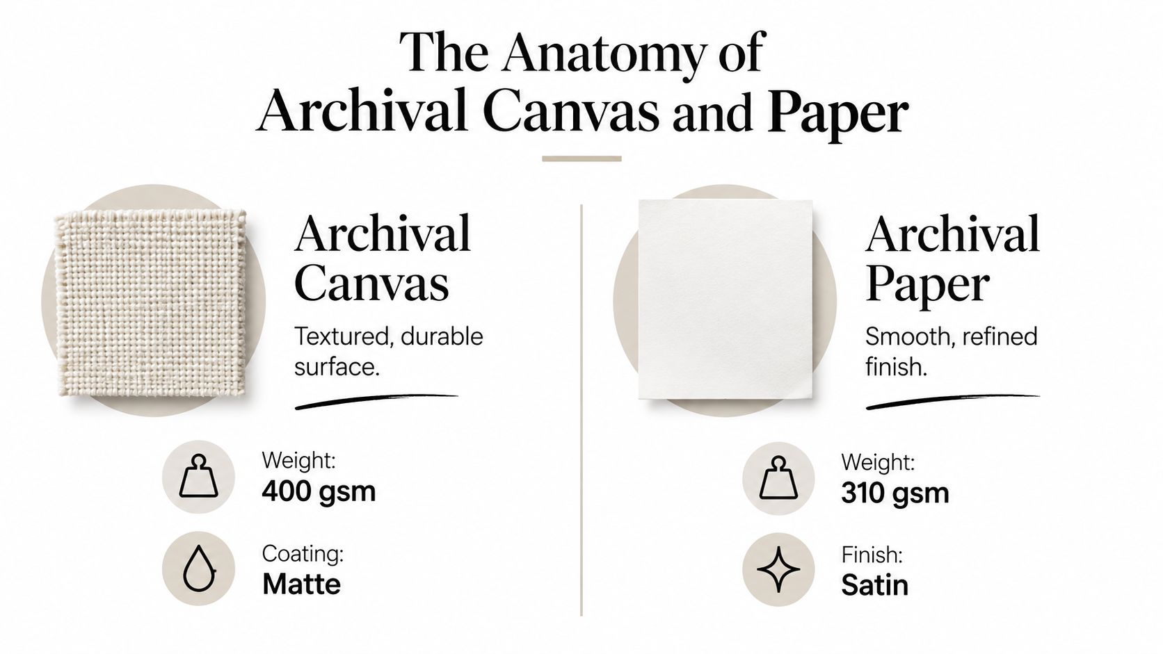
Archival canvas has a woven surface that gives an image physical presence. Its texture can soften a photographic effect and complement painterly work, expressive abstraction, and large wall compositions. Canvas also works naturally with gallery-wrapped presentation, where the image extends around the edges of a wooden stretcher frame.
Archival fine-art paper offers a more precise, sheet-based presentation. Cotton rag and cellulose-based papers can provide a refined surface for delicate linework, subtle tonal transitions, and images where the paper's texture should remain understated. Matte paper can reduce reflections, while a satin surface may provide a gentle balance between detail and glare control.
Neither material is automatically superior. The right choice depends on the image, the intended scale, the room's lighting, and whether you prefer a tactile textile surface or the formal character of a framed sheet.
Archival pigment inks use suspended pigment particles rather than relying on dye dissolved directly into liquid. In practical terms, this can support color accuracy, tonal range, and long-term stability when the ink is paired with a compatible archival substrate and displayed appropriately.
Dye-based consumer inks can look vivid when new, but fine-art workflows commonly choose pigment systems because they're designed for more stable long-term presentation. The paper chemistry matters just as much. Acid-free, pH-neutral, lignin-conscious materials reduce the risk of yellowing, embrittlement, and acid-related damage within the paper itself.
A useful way to judge a product description is to look for the complete chain:
A protective UV coating can reduce the effect of ultraviolet exposure, but it doesn't make direct sunlight harmless. Solid wood framing also helps provide a stable structure, especially for stretched canvas, yet the frame can't compensate for an unstable print surface.
A museum-quality print begins with translation. The printer must convert a detailed image file into a physical surface while retaining edges, gradients, and shadow information. Careful color management and precise ink placement determine whether that translation looks smooth in a frame or shows banding and lost detail.
For giclée and museum-grade output, a practical benchmark is an expanded pigment system with at least 8 ink channels, output of 1,440 DPI or higher, and a source file prepared at 300 DPI. Giclée printing guidance from Giclée UK explains how these specifications can support smoother gradients, reduced banding, and finer detail.
DPI describes how the printer places droplets. The source file's pixel density determines how much visual information exists at the intended size. A high-resolution printer cannot restore detail missing from the original file, just as fine brushwork cannot repair an incomplete sketch.
Fine droplet control lets the printer build gradual transitions instead of visible steps in a sky, skin tone, misty vista, or deep shadow. Multiple ink channels also give the system more color and neutral options, supporting smoother tonal modeling.
The word giclée describes a printing approach, not a complete quality guarantee. Ask about the printer, ink set, paper profile, source resolution, and quality-control process. These details reveal more than the label alone. The same questions apply when choosing made-to-order custom canvas wall art.
Print permanence depends on interacting conditions, including light exposure, humidity, pollutants, ink chemistry, substrate, and framing. A print that performs well in a dim room may face greater stress beside a bright window, so a single lifespan claim can mislead.
Wilhelm Imaging Research's 2011 preservation paper noted that no single predictive ISO print-permanence standard yet existed for stating exactly how long a particular print would last. The Wilhelm preservation reference helps explain why responsible sellers describe expected performance conditionally rather than promising one universal lifespan.
Independent preservation guidance offers narrower benchmarks. ISO 18902 addresses storage materials, while the Photographic Activity Test is identified as ISO 18916. Permanence-oriented paper guidance also commonly refers to pH 7.5 or higher, an alkaline reserve of at least 2%, and lignin content below 1%.
These standards do not make a print indestructible. They provide a disciplined way to compare materials and assess how a work may respond to real conditions in a home.
The word “archival” is useful, but it's not enough. A responsible purchase connects the material claims to the room where the print will hang.
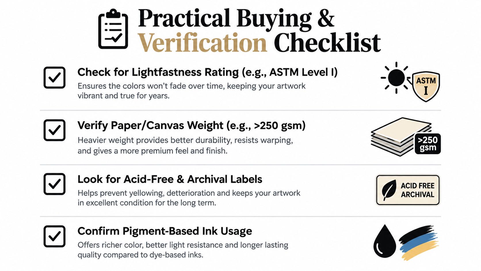
Before you buy, look for clear answers to these questions:
A useful fine art print shop guide can help you compare vendors, but you should still inspect each seller's own specifications.
Light exposure is often the deciding factor. Avoid placing valuable paper or canvas where strong direct sunlight falls across the image for long periods. UV-filtering glazing can reduce ultraviolet exposure, but it won't erase the effects of heat, visible light, or poor ventilation.
Humidity deserves equal attention. Bathrooms, kitchens with heavy steam, damp basements, and walls beside condensation-prone windows can create conditions that stress paper, canvas, coatings, and frames. Choose a more stable location when possible, and allow air to circulate around the framed work.
A museum-quality material still needs a museum-minded display decision.
Finally, request a physical sample when available, or study close-up images of the surface. Look for smooth gradients, clean edges, preserved shadow detail, and a finish that won't create distracting glare in your room.
“Worth it” means different things to different buyers. For a homeowner, the value may come from living with an image that still feels intentional after years on the wall. For a designer or hospitality buyer, consistent color, dependable construction, and framing flexibility can matter more than resale potential.
Museum-quality materials support that kind of long-term value because they reduce the need to replace decor when fading, yellowing, or structural wear changes the appearance. They also give you more freedom in choosing scale and presentation. A carefully made canvas can create a substantial focal point without the fragility of an unprotected sheet, while a framed fine-art paper print can suit a more formal setting.
Prints and multiples generated about $526 million from 198,198 lots globally in 2025, representing 23% of fine-art auction transactions worldwide, with sales up 11% year over year, according to MyArtBroker's print-market commentary. Those figures describe the auction market, not the guaranteed resale value of a print purchased for a home.
The more useful lesson is qualitative. Buyers and collectors increasingly look beyond a signature. Condition, freshness, proof status, provenance, and image hierarchy can influence how a print is perceived, while transparent pricing and a compelling image help establish confidence.
That distinction protects everyday buyers from a common mistake. A museum-quality print can be a wise purchase because it offers beauty, durability, and presentation quality. It doesn't need to become an appreciating asset to justify the premium.
Think about the cost of living with an object rather than replacing it. A well-made print can remain part of a room's identity through a move, a renovation, or a change in furniture. It can also serve as a meaningful gift or provide a polished visual anchor in an office, clinic, restaurant, or guest space.
Buy for the image first, then verify the production quality. That order keeps emotional connection at the center while ensuring the physical object can support years of enjoyment.
A print can leave the studio in excellent condition and still age differently in a bright living room, a humid bathroom, or a room with unstable temperature. Archival describes materials and processes chosen to resist deterioration under suitable conditions. It does not make the artwork immune to every environmental threat.
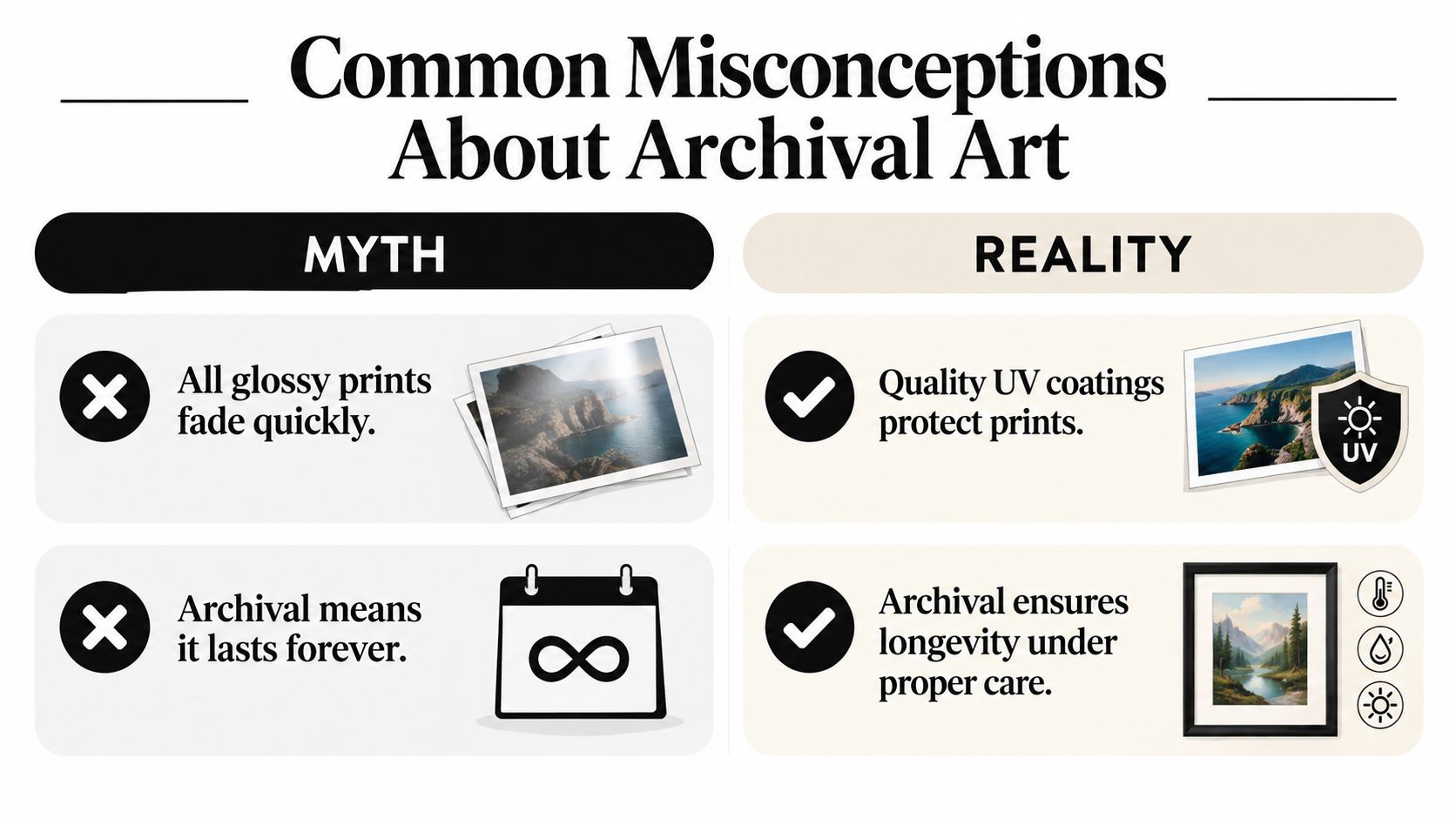
Gloss does not determine permanence by itself. A glossy or satin surface may use a stable pigment system and protective finish, while a matte print may deteriorate sooner if its materials are unsuitable or it receives harsh light.
The practical questions are ink chemistry, substrate, coating, glazing, and exposure. A glossy finish can reflect a window or lamp, making the image harder to view. That is a presentation issue, not evidence that the print will fade quickly.
Display conditions continue to affect every print. Testing frameworks examine separate pressures, including light, heat, ozone, and humidity, rather than reducing permanence to one universal lifespan. No single ISO standard predicts an exact lifespan, so broad longevity claims must be read in context.
A print beside a sunny window faces different stress from one displayed behind suitable glazing in stable indoor conditions. Damp air can affect paper, canvas, coatings, and adhesives, while heat and pollutants can increase material stress. Good manufacturing lowers these risks. Careful placement lowers them further.
Preservation is a partnership: the printer controls the materials and process, while the owner controls the environment.
Handling matters too. Clean hands, careful storage, suitable backing, and protection from moisture help retain the qualities you paid for. The clearest definition of archival art is made for long-term stability when cared for properly, not a promise of permanence under every condition.
Start with placement. Keep canvas away from persistent moisture, radiators, steam, and strong direct sunlight. Leave enough surrounding space for the work to breathe visually, and use secure hardware suited to the frame's size and weight.
Dust canvas gently with a clean, soft, dry cloth or a suitable soft brush. Don't spray household cleaner onto the image, and don't press hard against the fabric. If a mark appears, contact the seller or a professional conservator before trying a home remedy.
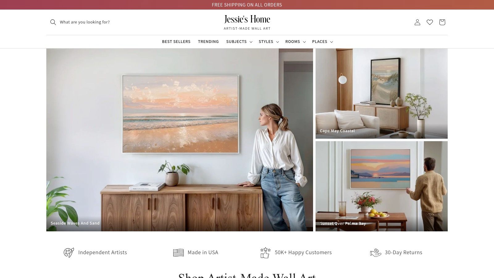
For styling, choose the wall before choosing the final size. A wide sofa may call for a horizontal format or a coordinated grouping, while a narrow entry wall may suit a vertical botanical or skyline. Keep the surrounding palette in mind, but don't match every color exactly. A repeating undertone, such as warm earth, coastal blue, or charcoal, can connect the artwork to the room without making it feel overplanned.
Jessie's Home offers artist-made canvas wall art and gallery-quality photo prints on premium cotton-blend canvas, using vibrant, fade-resistant inks, hand-stretching pieces over solid wood frames, and applying a protective UV coating. Its collections include abstract, skyline, botanical, Pop Art, minimalist, coastal, wildlife, and seasonal subjects, so buyers can browse by style, room, subject, or place. You can explore canvas wall art for modern homes when you want ready-to-hang work for a contemporary interior.
The brand's approach illustrates the complete system discussed here. The canvas, ink, frame, and coating each contribute to the finished object, while the owner's placement and care determine how well that system performs over time.
A short visual guide can also help you think through proportion, materials, and placement before ordering.
Choose museum quality art prints by examining the full production chain, not just the marketing label. Browse Jessie's Home for artist-made canvas pieces built with archival-minded materials, protective coatings, and ready-to-hang framing, then select a work that gives your room lasting color, character, and personal meaning. Visit Jessie's Home to find a piece for your living space, office, hospitality project, or next thoughtful gift.

Discover how black and white minimalist art transforms any room with calm, contrast, and timeless style, plus tips on prints, framing, and placement.
Discover how black and white minimalist art transforms any room with calm, contrast, and timeless style, plus tips on prints, framing, and placement.

Discover watercolor abstract art techniques, learn how prints differ from originals, and get styling tips for your home. A complete guide for wall art lovers.
Discover watercolor abstract art techniques, learn how prints differ from originals, and get styling tips for your home. A complete guide for wall art lovers.

Explore the beauty of modern landscape art and how to choose prints that transform your home. From trends to room-by-room styling tips, this guide covers it
Explore the beauty of modern landscape art and how to choose prints that transform your home. From trends to room-by-room styling tips, this guide covers it


