Your wishlist is empty.
Secure Payment
30 days return

You've found the perfect print, carried it from room to room, and now you're standing in front of a blank wall with a pencil, a tape measure, and far too much doubt. Hang it too high and the room feels disconnected. Hang several pieces with uneven gaps and the arrangement looks accidental. The good news is that how to arrange wall art becomes much simpler when you stop treating every frame as a separate decision.
The reliable approach is to plan the artwork as a single visual block. That block might be one canvas, a pair of prints, or a full gallery wall. Once you measure its center, width, and spacing as one composition, you can create a display that feels grounded, balanced, and personal without chasing rigid perfection.
The blank-wall gamble usually starts with the wrong question. Instead of asking where each nail should go, ask where the center of the complete artwork arrangement should sit. A single frame and a gallery wall follow the same principle: viewers should encounter the composition at a comfortable eye level.
The widely used benchmark is the 57-inch rule. Place the vertical center of a frame or complete arrangement about 57 inches from the floor to align it with average eye level, a standard widely associated with museum-style hanging. Some guidance broadens the range to 57 to 60 inches, while a room with unusually tall proportions may suit a center around 60 to 62 inches to preserve the relationship between the art and the architecture. These adjustments are outlined in Mixtiles' guidance on hanging wall art.
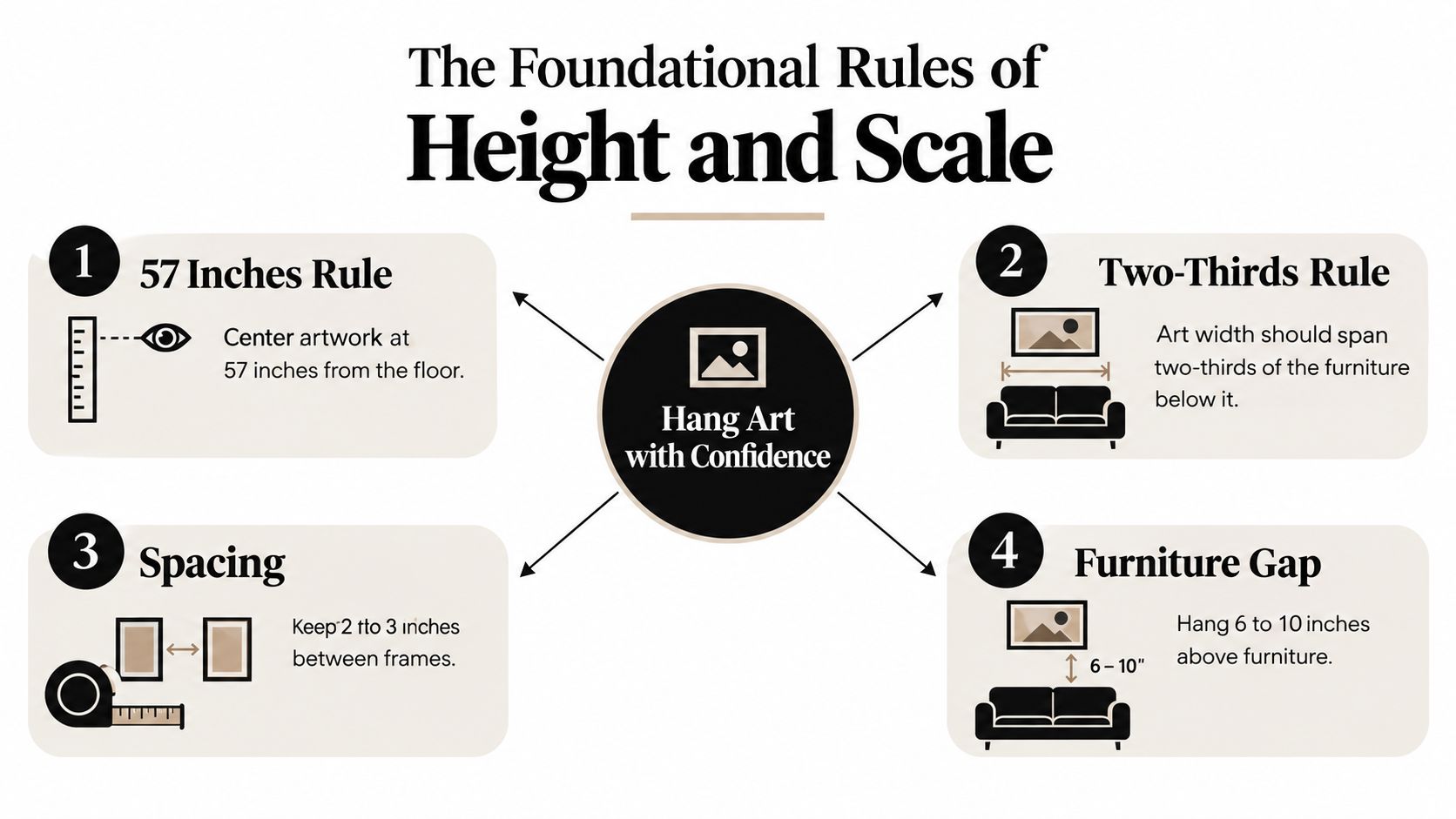
For one picture, finding the center is straightforward. Measure the frame's full height, divide it visually in half, and position that midpoint at your chosen eye-level mark. For multiple pieces, first arrange the frames on the floor, then identify the midpoint of the entire outer boundary. The top of the highest frame and the bottom of the lowest frame define the block, not the center of each separate piece.
This distinction changes the result. If you center every frame individually, the top and bottom edges will wander and the group may appear to climb or sag. If you center the composition, the arrangement reads as one deliberate object.
Practical rule: Mark the center of the visual block on the wall before marking any hook positions.
A tall ceiling doesn't automatically mean the artwork belongs near the ceiling. Raising the center slightly can help a large room feel proportionate, but the display still needs to relate to the people using the space. In most homes, eye level should be your starting point, not the ceiling height.
The arrangement also needs enough width to relate to the furniture below it or to the open wall around it. A practical method is to make the complete visual block roughly 60% to 75% of the furniture or open wall width, with the center of the block near 57 inches, or 145 centimeters, from the floor. The same planning approach recommends consistent gaps of about 2 to 4 inches, or 5 to 10 centimeters, between frames. See the measurement method in this step-by-step artwork hanging guide.
For a curated starting point, browse canvas wall art by orientation and subject before you measure. The right scale often becomes obvious when you compare the artwork's proportions with the wall and furniture together.
A single statement piece has to carry the room's visual focus on its own. Above a sofa, bed, console, or sideboard, it must relate to the furniture, suit the wall's proportions, and provide enough presence without making the room feel crowded. Treat the artwork and the furniture beneath it as one visual block, then judge the block from the main seating and circulation areas.
Start by measuring the furniture or architectural feature below the artwork. Aim for the piece to occupy roughly 60% to 75% of that width. This gives a painting enough authority above a sofa or console while preventing the furniture from looking undersized. The measurement applies to the artwork itself when one piece is used. Leave more surrounding wall visible if the room already contains strong textures, patterned upholstery, or decorative objects.
The vertical relationship matters more than the unused wall above the piece. Allow 6 to 12 inches between the top of the furniture and the bottom of the frame. That gap keeps the artwork connected to the sofa, bed, console, or sideboard instead of making it appear suspended. The range is covered in wall-art placement guidance from Mixtiles.
Measure from the highest usable point of the furniture. Use the sofa back, console top, or upper edge of the headboard as your starting point. Measuring from the floor can produce a technically centered piece with a disconnected lower edge, especially when the furniture is low or unusually deep.
Mark the proposed frame with painter's tape before making any holes. Stand at the room's normal viewing distance and check the complete visual block. If the 57-inch center rule conflicts with the furniture gap, protect the connection between the artwork and the furniture first. A modest adjustment above or below eye level usually looks better than an oversized empty band between the two.
Match the artwork's orientation to the wall and furniture. A wide sofa usually suits a horizontal canvas, while a narrow console may work better with a vertical piece when the wall rises higher than it extends. The goal is proportion, not a forced match.
Use the taped outline to assess breathing room around the frame. A small artwork on a broad wall may need a ledge, companion object, or larger anchor. A large canvas on a narrow wall often needs simpler styling below it, with enough empty space to keep the composition calm. Current 2026 interiors also make room for texture mixing, such as canvas, timber, plaster, or woven materials, but varied surfaces need breathing room so the statement piece remains clear.
Check the view from the sofa, doorway, and other normal positions, not only from directly beneath the frame. Center the artwork over the console when a window or doorway interrupts the wider wall. Visual balance should guide the final position, while the measurements keep the decision consistent.
A successful gallery wall starts with a feeling, not a frame count. Before choosing layouts, decide whether the room should feel orderly, collected, relaxed, graphic, or layered. That decision determines whether you need a tight grid, a loose salon arrangement, or a modular display that can change over time.
Choose one anchor piece first. It might be the largest frame, the strongest color, a family photograph, or a canvas with a distinctive subject. Place that piece near the visual center of the arrangement, then let the surrounding works support it rather than compete with it.
A functional residential gallery wall often contains 5 to 15 frames, while highly polished arrangements have averaged 9 frames in reader feedback from one 2026-style roundup. The same source reports that layouts with fewer than 4 or more than 18 frames were rated less successful, which reinforces the practical value of balanced density. These figures and spacing observations appear in The Decor Note's gallery-wall layout roundup.
Lay the frames on the floor in front of the wall, using the same orientation they'll have when hung. Begin with the anchor, then place larger supporting pieces beside or below it. Add smaller works where the composition needs visual weight, but avoid filling every open pocket just because space remains.
Keep the arrangement flexible. Current design coverage increasingly favors displays that combine framed prints with texture, open wall space, picture ledges, textiles, or ceramic elements. A textile can soften a row of rigid frames, while a ledge lets you change the artwork without creating a new set of holes.
Use paper templates when the floor layout feels right. Trace each frame onto kraft paper, label the template, and tape the pieces to the wall. This method exposes awkward tangents, crowded corners, and gaps that looked acceptable from above but feel wrong at eye level.
A gallery wall should look collected, not accidentally accumulated.
The trending wall art collection can help you compare subjects and visual styles while you're building a shared palette. You don't need identical frames or matching images. Repeating one color, line quality, material, or subject detail is usually enough to make varied pieces feel related.
A grid creates order through aligned edges and repeated spacing. It works well in offices, dining rooms, and modern interiors where geometry is part of the design language. A salon arrangement allows different sizes and orientations, but it still needs a stable outer boundary and deliberate intervals.
A modular arrangement offers another option. Place a larger piece on a picture ledge with smaller frames layered in front, or combine a framed print with a sculptural wall object. This approach introduces depth and makes seasonal rotation easier, especially in rooms where you want the display to evolve without rehanging the whole wall.
Use the following video as a visual companion while you plan your templates and anchor piece.
A gallery wall becomes easier to judge when you treat the artwork as one visual block rather than a collection of separate frames. The eye notices uneven negative space quickly, even when the frames themselves differ in style. Photographs, drawings, canvases, sculptural objects, and textured pieces can share one display, provided the gaps follow a clear logic.
Set the spacing before you refine the styling. Small frames generally need tighter spacing, while larger works need more breathing room so the composition does not feel crowded. The commonly used ranges are about 1.5 to 2 inches for small frames, 2 to 3 inches for medium-to-large arrangements, and up to 3 to 4 inches for very large or intentionally loose displays. The guide to hanging wall decor provides practical guidance for measuring and placing artwork with precision.
| Layout Style | Frame Size | Recommended Gap |
|---|---|---|
| Tight grid | Small frames | 1.5 to 2 inches |
| Structured arrangement | Medium to large frames | 2 to 3 inches |
| Relaxed salon display | Very large frames | 3 to 4 inches |
A tight grid depends on repetition. Keep the horizontal and vertical gaps identical, then align the frame edges carefully. If the outer dimensions vary, establish one consistent top edge, baseline, or center line before hanging. Texture mixing can work in a grid, but the repeated spacing must carry enough order to balance different materials and finishes.
A salon arrangement allows more variation, not random gaps. Keep the intervals within a reliable range across the visual block, then let the outside edges form a natural, slightly irregular boundary. The display will feel relaxed because the differences are controlled. A looser 2026-inspired arrangement also benefits from deliberate breathing room, especially when framed art sits beside woven pieces, reliefs, or other dimensional objects.
Three templates organize mixed frames reliably:
Tape the outer boundary and every frame position before drilling. Mark each hanging point on the paper template, then transfer those marks to the wall. Keep the gap visible in the taped mock-up, since the empty space is part of the design rather than leftover wall.
Move away from the wall after taping the complete arrangement. Check it from the doorway, the main seat, and the room's side angle. A block can be technically centered yet feel heavy on one side because of a dark frame, saturated image, or thicker object. Shift the visual weight, not merely the frame count, until the composition feels settled.
Measurements establish order, but the room determines how much visual activity it can comfortably hold. A bedroom, living room, hallway, and office all need different levels of contrast and movement. The same wall-art rules can produce completely different results depending on the room's purpose.
A bedroom usually benefits from an arrangement with breathing room, restrained contrast, and a clear focal point. Recent trend coverage highlights oversized single anchors, neutral palettes, and consistent spacing, with soothing warm beige, soft gray, olive green, and sand tones appearing as calming alternatives to heavily packed gallery walls. These color and composition directions are discussed in Mixtiles' wall-art trend coverage.
Above a headboard, a single oversized botanical, abstract, or horizontally oriented piece can create calm more effectively than a crowded collection. If you use two prints, treat them as one block and keep their shared center aligned with the bed. Their combined width should relate to the headboard rather than to the entire bedroom wall.
Choose low-noise imagery for the sleep zone. Soft gradients, quiet scenery, tonal botanicals, and limited palettes give the eye somewhere to rest. Repeating the bedding's warm neutral or muted green in the artwork creates cohesion without requiring a matching frame.
A living room often has more social energy, stronger furniture groupings, and a larger wall surface. It can support a salon-style display, a varied collection of photography, or a bold abstract anchor. Use color and scale to direct attention toward the seating area, not toward an isolated corner.
Above a sofa, start with the whole seating width and plan the artwork block in relation to it. A dynamic gallery can combine portrait and horizontal frames, but the outer shape should still feel intentional. Keep the larger or darker pieces near the central structure of the arrangement, then use lighter works to create visual release around them.
A living room is also a good setting for texture mixing. Pair framed canvas with a picture ledge, a woven wall hanging, or a ceramic element, but repeat a detail so the mix feels designed. For more room-specific options, browse living room wall art by subject and orientation.
A hallway works best when the art responds to the direction of movement. Align a sequence along a consistent centerline, or use repeated frames to create rhythm. Keep the display easy to read as people pass instead of placing delicate details where they'll be hidden by doors or corners.
In an office or creative space, a tighter grid can reinforce focus, while a looser display can make the room feel more personal. Use the architecture as a guide. A narrow wall favors a vertical stack or column, while a broad uninterrupted surface can carry a horizontal block.
Most wall-art problems aren't caused by a lack of taste. They come from measuring the wrong reference point, judging the arrangement too close to the wall, or treating every frame as an independent object. Correct the composition before you blame the artwork.
A large gap between the furniture and the frame breaks the visual connection. Move the artwork down until the lower edge sits within the practical 6-to-12-inch furniture gap described earlier. If the frame then seems too low relative to the room, check the complete relationship from the main seating position before raising it.
A frame can also float because it's too narrow. If the artwork doesn't carry enough horizontal presence for the sofa, bed, or console, add a companion piece or choose a broader anchor. Expanding the collection isn't always the answer. Sometimes a more suitable scale solves the problem with less clutter.
This happens when someone marks the midpoint of every frame instead of the midpoint of the entire composition. The individual pieces may each sit at a reasonable height, yet the gallery wall develops an uneven top or bottom edge.
Take the pieces down and rebuild the outer boundary. Find the center of that boundary, then reposition the templates as one block. The centerline belongs to the arrangement.
Inconsistent spacing makes a carefully chosen collection look unfinished. Small changes become especially visible in a grid, but even a salon wall needs a dependable rhythm.
Measure the gaps between the outer edges of the frames, not between the artwork inside them. Frame thickness, mats, and different mounting depths can create optical confusion, so use the front edges that viewers see. Low-adhesive painter's tape can hold template edges in place while you compare the spacing from across the room.
Filling every open area doesn't necessarily make a gallery wall feel complete. A crowded arrangement can overpower furniture, compete with architectural details, and leave the room without a visual pause. Remove one piece and reassess before adding another.
Design check: If your eye can't find a quiet place to rest, the wall probably needs less, not more.
Finally, inspect the installation itself. Use hardware suited to the wall surface and the weight of the frame, and test that each hanging point sits securely before you commit to the final placement. Level the artwork from the front, then view it from the room's normal sightlines. Your home should reflect your style, so use the measurements as a dependable framework rather than a substitute for judgment.
Jessie's Home offers artist-made canvas wall art and gallery-quality photo prints in styles ranging from abstract and botanical to skyline and minimalist work. Visit Jessie's Home to find a piece or coordinated grouping, then use the visual-block method to choose the right scale and spacing for your room.

Discover how black and white minimalist art transforms any room with calm, contrast, and timeless style, plus tips on prints, framing, and placement.
Discover how black and white minimalist art transforms any room with calm, contrast, and timeless style, plus tips on prints, framing, and placement.

Discover watercolor abstract art techniques, learn how prints differ from originals, and get styling tips for your home. A complete guide for wall art lovers.
Discover watercolor abstract art techniques, learn how prints differ from originals, and get styling tips for your home. A complete guide for wall art lovers.

Explore the beauty of modern landscape art and how to choose prints that transform your home. From trends to room-by-room styling tips, this guide covers it
Explore the beauty of modern landscape art and how to choose prints that transform your home. From trends to room-by-room styling tips, this guide covers it


