Your wishlist is empty.
Secure Payment
30 days return

A big flower painting works best as a singular focal point with breathing room, rather than competing with busy patterns. The tradition behind this choice reaches back over 400 years, from independent flower pieces in the Netherlands to modern, wall-filling interpretations.
You've probably stood in front of a large empty wall with a sofa, a tape measure, and too many competing ideas. A floral canvas seems like the obvious answer, but the wrong one can make the room feel crowded, while the right one can give the entire space a sense of direction.
The key distinction is simple. A statement painting is one composed artwork that commands attention. A mural is intentionally designed across a wall-sized surface, while wallpaper uses a repeating pattern, as explained in this practical comparison of floral murals and wallpaper. Both can be effective, but they create a different visual experience from a single big flower painting.
Most rooms don't need more decoration. They need one strong decision.
A big flower painting acts almost like an architectural element. It establishes the room's visual center, gives furniture something to relate to, and sets the emotional temperature before anyone notices the smaller accessories. A large peony, magnolia, or abstract blossom can make a neutral room feel expressive without adding another patterned rug, sculptural lamp, or crowded shelf.
That effect comes from scale contrast. A small floral print asks to be discovered. An oversized bloom announces itself from across the room. The subject remains familiar, but its size makes it immersive rather than merely decorative.
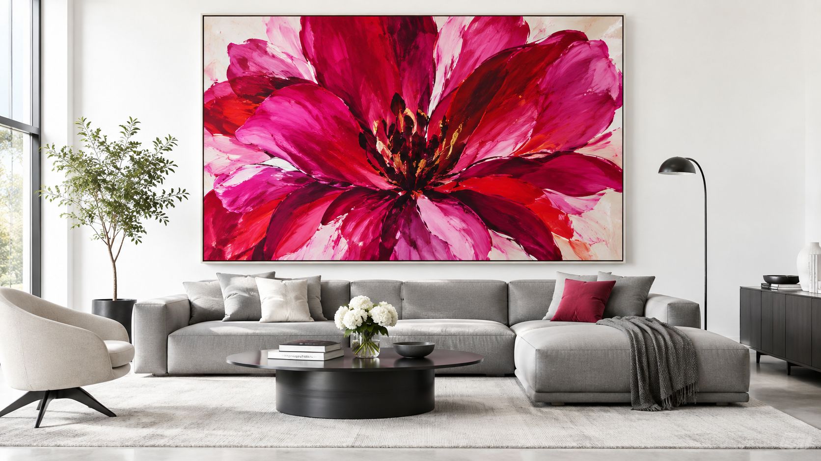
The independent flower painting has a documented lineage of over 400 years, originating in the Netherlands in the early 1600s before evolving into modern large-scale interpretations (Dutch and Flemish flower pieces). That history matters because floral art has never been limited to cheerful decoration. It has carried ideas about abundance, beauty, mortality, trade, collecting, and visual precision.
A contemporary oversized floral continues that tradition by making the flower the subject, not a background motif. Hang it where the room naturally gathers attention, usually above a sofa, bed, sideboard, or reception console. Then allow the surrounding wall and furniture to support it.
Practical rule: If the painting is meant to be the star, don't give it a chorus of equally loud accessories.
A painting usually has a singular composition, intentional focal movement, and enough visual variation to reward close viewing. Wallpaper repeats. A mural extends across the architecture and often responds to doors, corners, windows, or other fixed features.
That doesn't make murals or wallpaper inferior. It means they need different styling. For guidance on arranging multiple panels without losing cohesion, the Lucas Furniture & Mattress triptych guide offers useful context on treating grouped artwork as one visual unit.
Choose the big flower painting when you want a deliberate pause in the room. Keep nearby walls calmer, reduce competing patterns, and let negative space make the artwork feel considered rather than accidental.
Size should be the first buying decision, not the last detail you check after falling in love with an image.
Start by measuring the wall area that will remain visible. Exclude windows, doors, sconces, radiators, and any furniture that interrupts the usable field. A painting can be technically large and still look weak if its width bears no relationship to the sofa or console beneath it.
Use painter's tape to mark the proposed outer edges directly on the wall. Stand where you normally sit, then view the outline from the room's main approach. This reveals problems that a product thumbnail won't show, especially when the composition is dark, dense, or visually heavy.
Use this practical sequence:
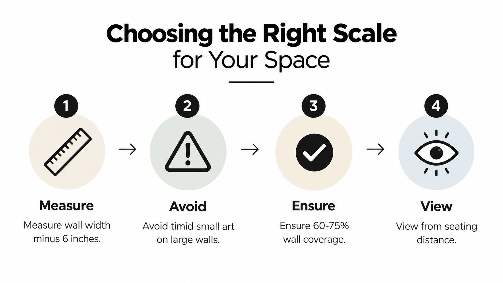
Don't choose a modest canvas because the wall is intimidating. Small art on a broad wall often looks like an afterthought, while a properly scaled piece gives the furniture below it visual stability. If the wall is narrow, a vertical floral composition can create height. If the furniture is wide and low, a horizontal arrangement or broad close-up bloom usually feels more grounded.
Measured enlargement matters, too. Botanical-art guidance recommends multiplying source dimensions deliberately and preserving scale relationships during reproduction, because changing the output size can distort the intended proportion cues (botanical art scale guidance).
For a room with generous proportions, browse living room wall art by orientation and subject, then compare the listed dimensions with your taped wall outline. Don't rely on the room photograph alone. A staged image can make a canvas appear smaller or larger than it will in your home.
Leave visible wall around the artwork. That empty margin is not wasted space. It separates the flower from the architecture and gives the eye a clean route into the composition.
A floral painting doesn't need to match the sofa. It needs a controlled relationship with the sofa.
Pull the palette apart before you buy accessories. Identify the dominant field color, the main petal or botanical color, and the smallest high-impact accent. In a painting of coral flowers with deep green leaves and a warm cream background, the cream may guide the wall color, green may appear in a cushion or plant, and coral may be repeated only once in a lamp, throw, or small ceramic object.
That method creates color echoing without turning the room into a themed set. Repeating every color at equal intensity makes the room feel busy. Repeating one or two tones at lower saturation creates continuity.
The background often determines whether the big flower painting feels calm or aggressive. A pale ground works well with light upholstery, natural wood, and restrained textiles. A dark ground can look refined against linen, walnut, aged brass, or warm gray, but it needs enough surrounding light to retain detail.
Don't automatically pair a vivid floral with vivid furniture. Let the artwork carry the strongest saturation, then choose supporting pieces in softened versions of its colors. A blue-green in the leaves might become a dusty teal cushion. A pink petal might become a muted rose accent, not another hot-pink object.
Recent market coverage describes a move toward moody, tonal, and restrained floral art, away from busy, sugary patterns and toward immersive painterly styles suited to contemporary interiors (floral wall artwork trend coverage). That direction is especially useful if your room already has strong architecture or premium materials. A tonal floral can add drama without introducing visual noise.
North-facing rooms often benefit from warmer floral grounds and earthy petals. Sunlit rooms can handle cooler blues, violets, or deep greens without becoming flat. Check a sample or image of the artwork in both daylight and evening lamp light before committing, because gloss, texture, and dark pigment can change character after sunset.
For a sleek room, explore canvas wall art for modern homes alongside your existing upholstery and flooring. The point isn't to copy the display photograph. It's to find a piece whose palette gives you a clear, workable design direction.
The frame changes the message. A raw-edge canvas feels relaxed and gallery-like, while a fitted frame makes the same floral image feel more formal and finished.
A gallery-wrapped canvas works well when the artwork has a strong edge-to-edge composition and your room leans contemporary, organic, or minimalist. The image continues around the sides, so there's no visual interruption from a mat. Choose this option when you want the flower to feel expansive and close to the wall.
A framed print offers sharper boundaries. A slim black frame can add structure to a loose botanical composition. Natural oak softens a dramatic floral and suits rooms with timber, linen, and woven materials. A substantial traditional frame can work in a classic interior, but don't pair an ornate frame with an already elaborate floral unless you want a deliberately theatrical result.
| Format | Best choice for | Watch out for |
|---|---|---|
| Raw-edge canvas | Minimalist, relaxed, contemporary rooms | Can look unfinished if the edges are poorly presented |
| Floating frame | Modern interiors that need definition | Too much contrast can compete with the petals |
| Framed print | Formal, transitional, or traditional settings | A heavy mat can reduce the artwork's immersive scale |
| Textured or 3D floral art | Rooms that benefit from tactile light and shadow | Texture needs side lighting and physical clearance |
Textured and three-dimensional floral art can make a wall feel more immersive because raised surfaces catch light differently from flat ink. Use it where the viewer can approach the work, not where glare or constant touch will become a problem.
For outdoor or covered spaces, material selection matters even more. A visual guide to metal outdoor art ideas can help you compare durable dimensional approaches, although indoor canvas and framed paper remain better suited to controlled interiors.
Before ordering, inspect the edge treatment, hanging hardware, surface finish, and frame depth. The best display method is the one that strengthens the flower's composition while staying visually quiet.
A neutral living room is the easiest place to see why a big flower painting works. Start with a calm sofa in gray, oatmeal, or warm white, then place one substantial floral above it with enough width to connect visually to the seating. Add a low table, one textured throw, and a restrained rug. The artwork supplies the movement, so the rest of the room doesn't need to compete.
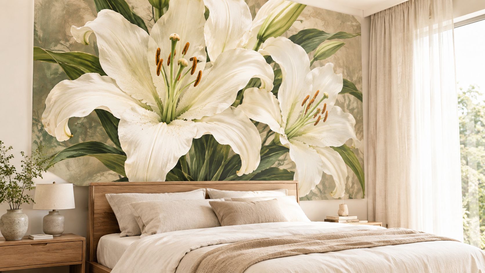
In this arrangement, keep the wall behind the artwork visually simple. A plain painted surface gives the petals room to read as a composition, while a busy wallpaper can make the painting look like another layer of pattern. Use a cushion or vase in one quiet color drawn from the leaves, then stop.
A bedroom can take a darker floral because the room already supports intimacy. Choose a painting with a deep ground, tonal petals, or shadowed foliage. Place it above the bed or on the opposite wall, then repeat one subdued color in the bedding rather than matching the entire image.
Use warm bedside lighting from the side, not a bright ceiling fixture aimed directly at the surface. That preserves depth in the petals and avoids turning a dark painting into a reflective black rectangle. Keep the nightstands edited. The artwork should remain the dominant visual event.
The same approach can work in a boutique hotel, restaurant, clinic, or office reception area. A single botanical statement can add warmth and a nature-led feeling without the maintenance of living plants. In hospitality settings, choose a surface that can be cleaned safely and mount it where luggage, chairs, or passing traffic won't strike the frame.
For a tactile example of how floral themes can extend beyond the wall without copying the artwork, consider the Blushing Ivy flower collection. Keep those supporting references small and functional. The painting remains the anchor.
A professional space needs even more restraint than a home. Use one oversized floral behind a reception desk or in a waiting area, then repeat its palette through upholstery or signage details. Avoid surrounding it with a grid of unrelated prints. The aim is welcome and orientation, not visual clutter.
The most common error is treating a statement floral like a finishing accessory. Buyers choose the painting last, place it on whatever wall remains, and then add nearby objects until the blank space disappears. That approach reverses the correct order.
Install the artwork first. Let the furniture support it, and resist filling every surrounding surface.
Eye level is a useful starting point, but furniture changes the calculation. Above a sofa or bed, the lower edge needs to feel connected to the object beneath it, not suspended near the ceiling. Stand in the room and assess the relationship from the main seating position before drilling.
A canvas that sits too high creates a gap that reads as accidental. A canvas that sits too low can feel physically intrusive. Tape the outer dimensions and live with the outline for a day if you're uncertain.
Don't place a gallery wall around a large floral because the adjacent wall feels empty. The big flower painting already provides scale, movement, and subject matter. Add only what the room needs for function, such as a lamp, plant, or carefully chosen object.
You also don't need bright colors to create impact. Current direction favors moody, tonal, and restrained florals, which can look more mature in contemporary, transitional, and hospitality interiors. A dark plum flower, olive foliage, or cream-on-charcoal composition may create stronger atmosphere than a loud multicolor bouquet.
Direct sun can alter how colors appear and may accelerate fading, while overhead glare can flatten texture. Use curtains, blinds, or carefully positioned lighting where needed. For a glossy print, check reflections from the sofa and doorway. For textured work, use angled light to reveal the relief without producing harsh highlights.
Finally, inspect the wall before installation. A statement painting exposes crooked furniture, uneven hanging, and messy cables. Clean up the supporting view so the artwork looks intentional from every practical angle.
A successful big flower painting purchase starts before you browse. Make the wall, furniture, light, and frame part of the decision from the beginning.
Use this checklist:
Georgia O'Keeffe's large-scale floral work, developed from the mid-1920s through the 1950s, redefined floral painting by enlarging natural subjects until they filled the picture plane, creating an immersive composition. That same principle guides a well-styled home: let one familiar natural subject become large enough to organize the room.
Browse floral canvas wall art only after you know the wall dimensions and the atmosphere you want. Choose the piece that can stand alone, then give it the space, light, and quiet surroundings it needs.
Jessie's Home offers artist-made canvas wall art and gallery-quality prints, including botanical and floral pieces suited to living rooms, bedrooms, offices, and hospitality spaces. Visit Jessie's Home to compare floral styles, formats, and room-focused options before choosing the statement piece for your wall.

Stylish game room wall decor ideas with real tips on themes, durable materials, lighting, and layouts. Practical advice for renters and homeowners.
Stylish game room wall decor ideas with real tips on themes, durable materials, lighting, and layouts. Practical advice for renters and homeowners.

Learn how to hang picture rail securely and style it perfectly. Get step-by-step installation tips, weight limits, and display ideas for your canvas art.
Learn how to hang picture rail securely and style it perfectly. Get step-by-step installation tips, weight limits, and display ideas for your canvas art.

Learn how to choose the right prints for bedroom walls — sizing, mood, framing, placement above the bed, and care tips. Practical guidance for every room.
Learn how to choose the right prints for bedroom walls — sizing, mood, framing, placement above the bed, and care tips. Practical guidance for every room.


