Your wishlist is empty.
Secure Payment
30 days return


You're standing beside your desk, looking from a blank wall to an airplane photograph on your laptop. On-screen, the wings look crisp and the sky feels enormous. But will that same image look purposeful above the desk, or turn into a pale rectangle once you hang it?
An aircraft photograph can give an office or den a focal point without introducing another color into the room. The appeal isn't necessarily nostalgia. You might like the sweep of a wing, the orderly geometry of a hangar, or the feeling of open space beyond a crowded work surface.
The useful question is what you want to notice first. A close view of an engine asks you to study machinery. A distant aircraft surrounded by sky gives you somewhere to rest your eyes. A runway scene brings a stronger sense of place, with the airplane belonging to a wider working environment.
This workspace shows how aviation imagery can sit alongside everyday furniture rather than require a themed room.
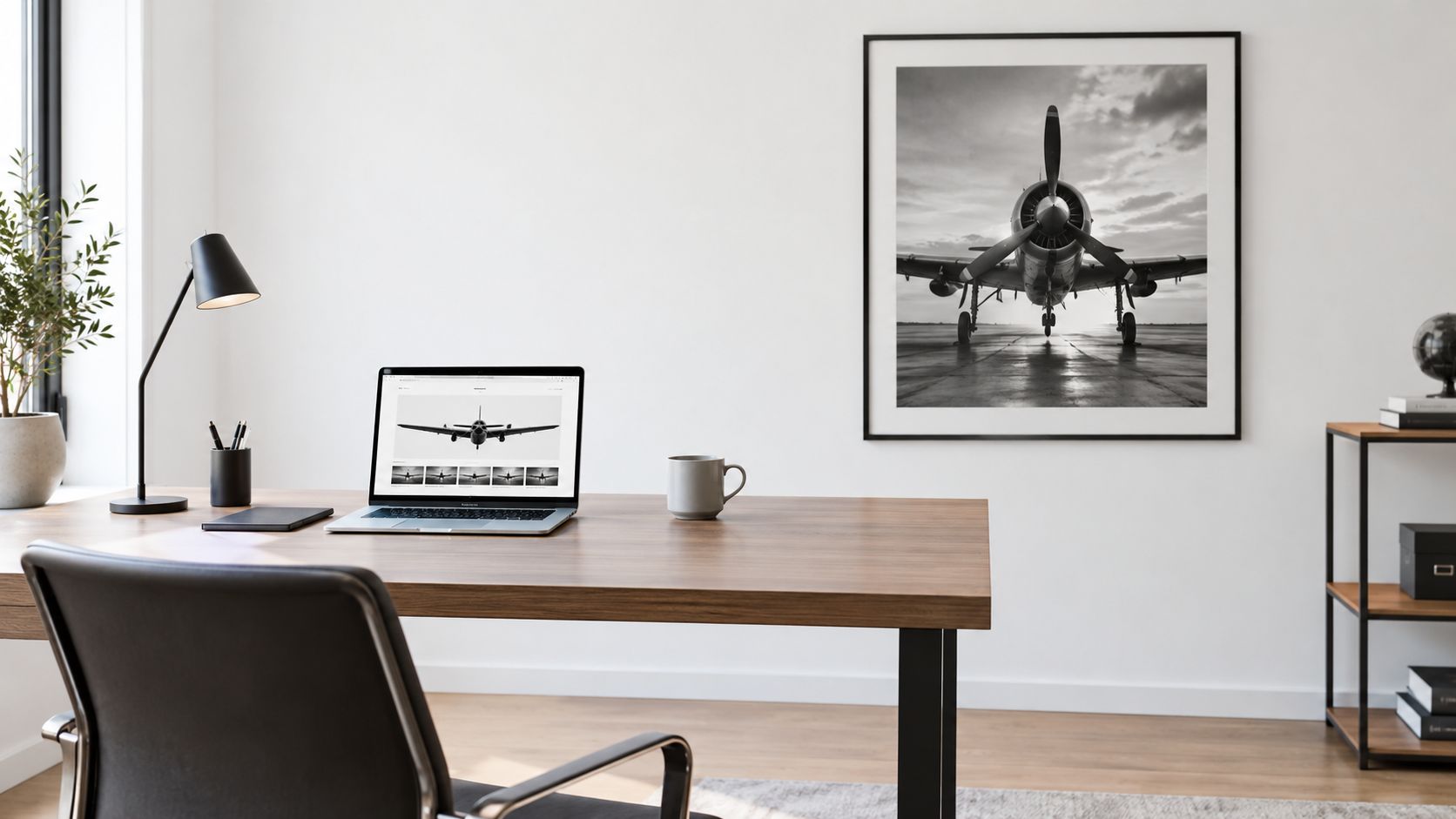
Monochrome aviation art isn't a single look. Documentary realism might preserve surface detail, ground equipment, and an ordinary sky. A dramatic fine-art treatment might simplify the surroundings until the aircraft becomes almost an abstract shape.
Neither approach is automatically more impressive. For a desk surrounded by books and paperwork, I'd consider an uncluttered composition. For a den with plain upholstery and broad, empty walls, a more detailed airport scene could provide welcome complexity.
When browsing airplane black and white wall art, separate your affection for the subject from your judgment of the photograph. You can love an aircraft and still decide that a particular crop won't suit your wall. That distinction makes choosing much easier.
Tonal separation means being able to distinguish the aircraft from its surroundings through differences in lightness and darkness. A white fuselage can disappear into bright cloud. A dark aircraft can merge with a runway, storm background, or deep shadow.
The diagram makes those competing backgrounds easier to compare.
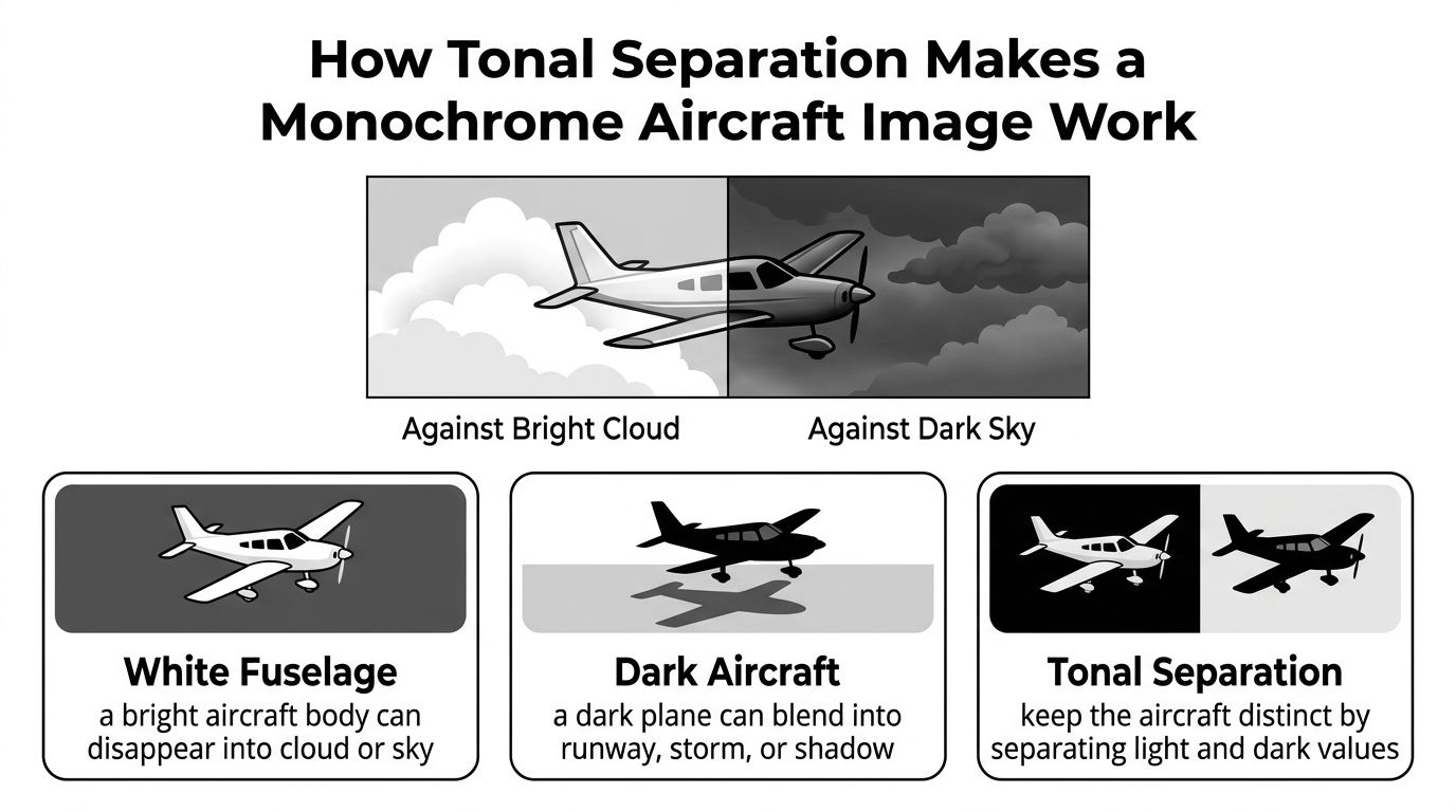
Think of the image as highlights, midtones, and silhouette. Highlights include bright cloud and reflections. Midtones describe curved metal, shaded surfaces, and softer sky. The silhouette is the aircraft's recognizable outline, even when you can't see its internal details.
Negative space is the area around the subject, not necessarily an empty white background. A quiet expanse of gray sky counts. So does a dark hangar opening without distracting detail.
A useful preview test is whether you can recognize the aircraft's main shape without relying on its markings.
Crop and aircraft scale affect depth, too. A large aircraft filling the frame feels close and physical. A small aircraft beneath layered cloud can suggest distance, provided the sky texture doesn't overwhelm it. These are composition choices, not reasons to reject an image automatically.
For a moving-image reference alongside the still diagrams, use the video below.
Finally, assess the actual crop offered for sale. A convincing full photograph can become less balanced when adapted to a different canvas shape.
White aircraft paint isn't merely a cosmetic convention. Thermal control is an important reason for choosing it: white coatings generally absorb less incoming sunlight, reducing heating of the fuselage.
NASA's thermal-control discussion describes matte white paint as combining low solar absorptivity with high infrared emissivity. In its solar-white coating example, measured solar absorptance was approximately 0.02 to 0.04, while thermal emittance was 0.93 to 0.99, according to NASA's thermal-control report. Those are coating-example measurements, not specifications for every white passenger aircraft.
The visual summary connects that engineering choice with the appearance of an aircraft photograph.
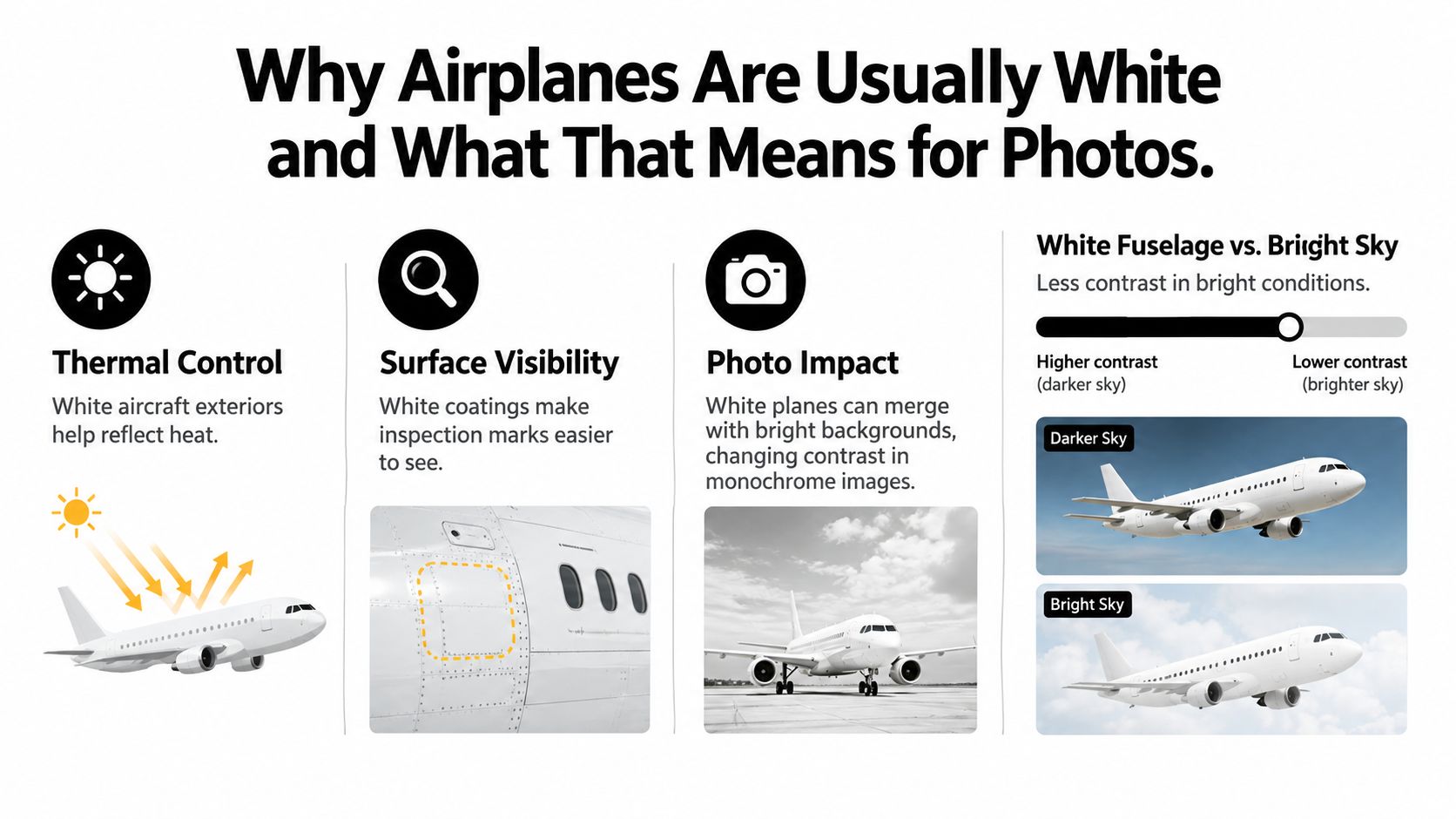
Solar absorptivity describes how readily a surface absorbs incoming solar energy. Infrared emissivity describes how effectively it radiates thermal energy away. A useful thermal-control coating can perform well at both jobs, rather than only looking bright to our eyes.
Lower absorption can reduce skin temperature and, in turn, cabin cooling demand, thermal expansion, and heat stress on sealants and bonded or composite structures. But white isn't a complete engineering specification. Pigments, gloss, contamination, and near-infrared reflectance also affect performance.
In a monochrome photograph, the fuselage might appear brilliant against a shaded background or subdued under cloud. Editing can strengthen that difference. The result describes the photographer's handling of light as well as the aircraft's exterior.
If you're drawn to airport settings rather than isolated aircraft, CFII's resource on Riverside Airport (KRAL) offers a specific place to explore alongside your image search. Keep that location research separate from judging the photograph: an interesting airport doesn't automatically produce a strong wall composition.
Aerial photography began before powered aviation. Nadar produced aerial images in 1858, James Wallace Black made balloon photographs in 1860, and aircraft-based photography was established by 1909, as traced in the Smithsonian's history of aerial photography.
That history changes how we read monochrome flight imagery. Black and white isn't a modern filter applied to make aircraft look old. It belongs to the medium's origins and to the period when monochrome photography was technically dominant.
The timeline offers a visual outline of that development.
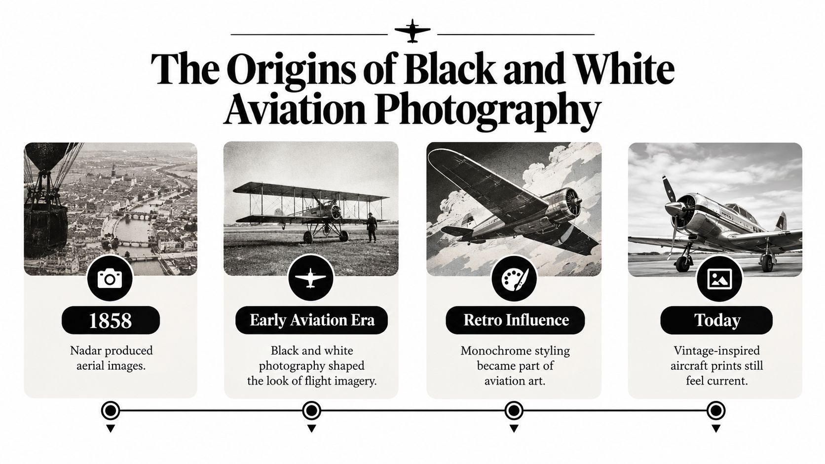
There's an important difference between aerial photography, made from a high airborne viewpoint, and a photograph of an aircraft. They overlap, but they aren't interchangeable. A balloon photograph of a city belongs to aerial history even when no airplane appears.
For wall art, a similar distinction separates an authentic historical photograph from a contemporary image given a vintage treatment. Both can be appealing. Only the former carries the documentary significance of having been made at that earlier moment.
| What you notice | What to investigate |
|---|---|
| Soft edges or visible grain | Whether these belong to the original image or later processing |
| Uneven framing | Whether you're seeing an original composition or a cropped reproduction |
| Strongly aged-looking tones | Whether the treatment is historical, restored, or newly applied |
| A caption naming a place or aircraft | Whether the seller provides useful provenance |
Don't date a photograph from grain alone. A contemporary photographer can introduce texture, while a historical image can be reproduced with considerable clarity. Treat visual cues as questions, not proof.
When browsing photography canvas wall art, decide whether you want a document of a particular moment or a photograph with a historical mood. For the former, prioritize a meaningful caption and provenance. For the latter, judge the image plainly as a present-day design choice.
You don't need to pretend a print is archival to enjoy its softness, atmosphere, or sense of distance.
Choose high contrast when you want the photograph to command attention. Choose a softer tonal treatment when you want to spend time discovering it. This is a design decision, not a ranking of photographic quality.
The comparison below shows the difference between graphic impact and gentler tonal transitions.
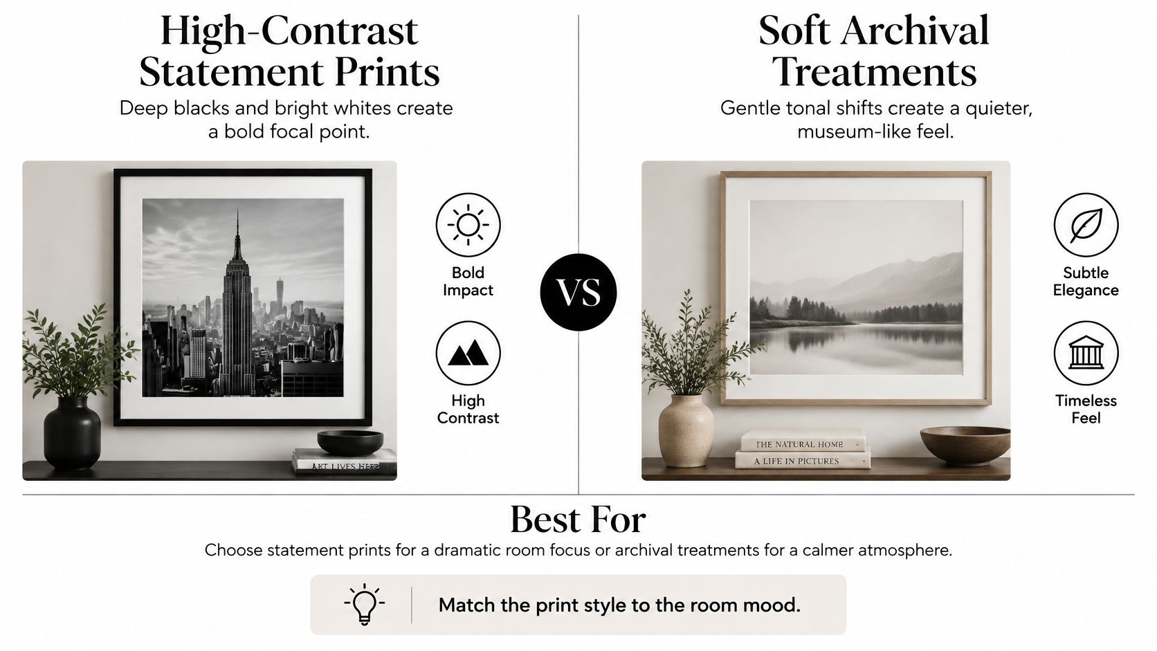
| Decision | High-contrast treatment | Soft archival treatment |
|---|---|---|
| Main attraction | Decisive shapes and dark-light boundaries | Atmosphere and gradual shading |
| My preferred setting | A room needing a clear visual anchor | A room intended for quiet attention |
| Detail to inspect | Whether shadows retain useful information | Whether the subject remains legible |
| Framing question | Does the border make the image too heavy? | Does the border overpower the image? |
A bold photograph can look convincing above a simple credenza, then feel insistent beside crowded shelves. A pale image may be lovely at close range but disappointing when viewed from the doorway. Assess both at the distance you'll use.
For a closer look at the dramatic end of the spectrum, the RevelRaw guide to dramatic monochrome is a useful companion. For your wall, however, the deciding factor is whether you enjoy living with that intensity.
Practical rule: Choose the contrast that suits your room's attention level, not the contrast that looks most impressive on your phone.
A wide white mat gives a photograph a larger quiet boundary. A dark frame can connect with deep shadows inside the image, while a natural wood frame can introduce warmth without adding color to the photograph itself. Check the complete framed dimensions rather than judging the image area alone.
Compare several subjects within a black-and-white canvas wall art collection to separate your preference for monochrome from your preference for aviation. For example, Astro Vision - Canvas Wall Art is a portrait, not an aircraft image; its sharp facial contrast, silver-gray chain details, and paint drips offer a different use of the same limited palette.
That comparison can clarify whether you want precise machinery, a recognizable subject, or a strong arrangement of light and dark.
Start with the furniture beneath the artwork, not the entire wall. A print can look appropriately sized for a room yet feel unrelated to a narrow desk. Conversely, a small image floating above a broad sofa may look like an unfinished arrangement.
Use a tape measure and removable painter's tape to mark the outer dimensions of the proposed piece. Include any frame and mat. Then sit down, stand in the doorway, and move through the room before deciding.
Your seated view matters more than a generic hanging formula. Position the taped outline where you can look up from your screen comfortably, without letting the monitor hide the most important part of the image.
The home office wall art collection is one place to compare artwork in the context of a workspace. Keep your taped outline visible while browsing so the room's limits remain concrete.
Above a sofa, allow visual breathing room between the furniture and the artwork. Beside a reading chair, consider whether the image works at close range, where surface texture and fine detail become more noticeable.
Measure the wall standing up, but approve the placement sitting down.
As one option alongside photographic paper prints and locally framed work, Jessie's Home offers artist-made canvas wall art and gallery-quality photo prints handcrafted in the USA. Its described canvas construction uses premium cotton-blend material, fade-resistant inks, solid wood frames, and a protective UV coating; confirm the details of the particular format you select.
A stretched canvas and a matted photograph require different decisions. Don't plan for a broad mat if you intend to order an unframed canvas. Check the listed format, finished dimensions, and hanging requirements before committing.
A black-and-white photograph doesn't tell you the aircraft's original paint colors. Different colors can reproduce as similar grays, and lighting or processing can alter their apparent brightness. If the actual livery matters to you, look for a reliable caption or a color reference rather than guessing from the print.
Nor does a dark livery, by itself, establish that an aircraft is unsafe. Darker schemes can reduce contrast against some surroundings and make surface defects harder to see, while white offers inspection visibility and lower solar heating; unusual liveries such as Air New Zealand's black aircraft illustrate that white isn't mandatory, as discussed in this explanation of aircraft color trade-offs.
Livery is one design consideration, not a substitute for examining the aircraft's engineering, condition, and operation. I wouldn't use a decorative photograph to draw conclusions about any of those.
For readers pursuing safety questions beyond wall art, airline crash facts from DuBois Aviation provide a separate resource to consult. Keep that inquiry distinct from judging the visual drama of an aircraft image.
The aviation black box is a flight-recorder system whose exterior is usually high-visibility orange. Its principal units are the flight data recorder, which preserves flight parameters and aircraft-system information, and the cockpit voice recorder, which preserves cockpit audio, as explained by the Friends of Flight 93 flight-recorder resource.
The orange finish helps searchers distinguish the recorder from surroundings and wreckage. It isn't a data-storage technology, and it doesn't make the unit indestructible.
Survivability depends on the protective enclosure, internal mounting, and crash-protection design. An underwater locator beacon assists recovery when the recorder enters water. The nickname describes neither its usual exterior color nor any special black aircraft configuration.
Make the decision with your room in view rather than another open browser tab. You already have enough criteria to narrow the choice.
Keep your shortlist small enough to compare thoughtfully. View each candidate from your normal seat and the room's entrance, then ask which one feels most at home rather than most impressive in isolation.
You're not trying to find the definitive airplane photograph. You're choosing an image whose subject, proportions, and mood belong in a particular place.
Explore artist-made canvas wall art and gallery-quality photo prints at Jessie's Home, browsing by room, style, or subject to compare options for your office or den. Keep your wall measurements beside you and use tonal separation, crop, and finished format to choose a piece you'll enjoy beyond the screen.

Modern, abstract, landscape and scripture ideas for Christian wall art in the living room, with sofa sizing, gallery wall layouts, tips for mixing faith art with your decor and well-known...
Modern, abstract, landscape and scripture ideas for Christian wall art in the living room, with sofa sizing, gallery wall layouts, tips for mixing faith art with your decor and well-known...

Staircase wall decor ideas that fit a sloped wall: four layouts, a step-by-step hanging method built on a 57 to 60 inch line above each nosing, plus sizes, landing, hallway...
Staircase wall decor ideas that fit a sloped wall: four layouts, a step-by-step hanging method built on a 57 to 60 inch line above each nosing, plus sizes, landing, hallway...

Airplane black and white prints explained: tonal contrast, vintage aviation photography, and the best rooms for monochrome aircraft wall art.
Airplane black and white prints explained: tonal contrast, vintage aviation photography, and the best rooms for monochrome aircraft wall art.


