Your wishlist is empty.
Secure Payment
30 days return

You find one while scrolling late at night. The colors are soft but not bland. The surface looks layered, almost like sea mist sitting over sand. It doesn't show a literal shoreline with every shell and wave spelled out, but it still feels unmistakably coastal.
Then the practical questions start. Would it calm down your living room or disappear into it? Would those blues fight with your rug? Is abstract beach art only for obvious coastal decor, or can it work in a city apartment, a modern townhouse, or a quiet bedroom with neutral walls?
That hesitation is normal. An abstract beach painting sits in an interesting middle ground. It carries the familiarity of water, sky, foam, and shore, but it leaves room for mood, texture, and interpretation. That's why many people respond to it so quickly. It feels like a memory more than a map.
I see this happen often with home decorators. They don't want a themed room. They want a room that exhales. The right abstract beach piece can do that. It can soften a hard-edged space, add movement to a flat wall, or bring in lightness without making a room feel staged.
A good abstract beach painting works the way a familiar scent works. You may not see every detail of the shoreline, yet your mind still recognizes salt air, wet sand, open sky, and shifting water.
That is what makes this category so useful in real homes. Instead of locking a room into a themed coastal look, it brings in the mood of the coast through color, texture, and spacing. A pale sand band can suggest shore. A cloudy blue field can suggest distance. A rough white stroke can read like foam or reflected light.
For many decorators, that difference is the turning point. They want the room to feel lighter and calmer, not decorated around a beach motif.
A recent Jessie's Home example shows how this works in practice. A homeowner had a contemporary living room with cream seating, black metal lighting, and warm oak accents. She wanted a coastal reference, but she also wanted the room to stay clean and modern. The piece she chose used layered neutrals, pale aqua, and textured whites. After hanging it, the room felt quieter and more grounded, as if the painting had given the space a horizon line.
You can browse similar abstract canvas wall art for coastal-inspired rooms if you want to compare how different levels of texture, color, and movement change the feeling of a space.
Abstract beach painting works best when it reads as atmosphere first and imagery second.
That idea can feel vague at first, so it helps to translate it into decorating terms. You are not only choosing art that references water or sand. You are choosing how the wall will behave in the room. Some pieces soften sharp architecture. Some add motion to still spaces. Some act like a quiet pause between stronger furniture, patterned rugs, or darker finishes.
Abstract beach painting usually stands apart from traditional coastal art in three clear ways:
That flexibility matters in a home. A literal seascape often asks the room to match it. An abstract beach painting usually gives you more room to mix materials, adjust color accents, and keep the overall look personal instead of overly coastal.
Some abstract beach paintings whisper. Others crash into the room like surf. Knowing the main visual families helps you shop with more confidence.
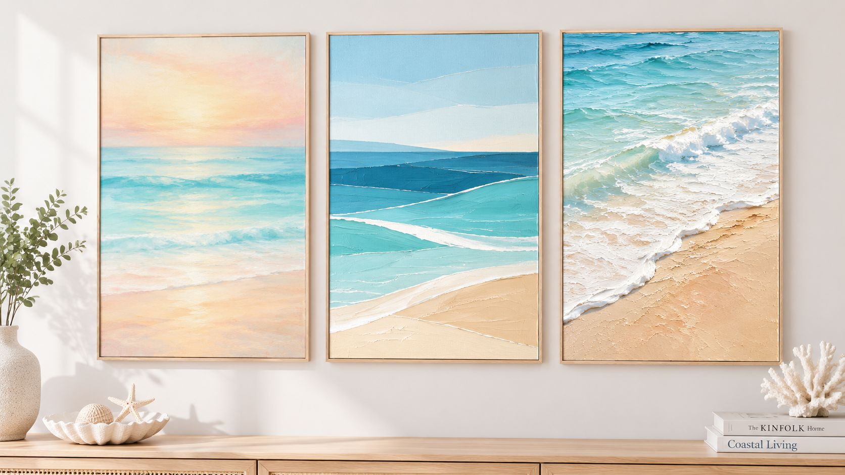
This is the style many people respond to first. The colors blur into one another, often with pale sand, misty blue, gray, and white. The effect is akin to watercolor bleeding on damp paper, except the final look can be richer and more layered.
These paintings are useful in rooms that already have enough visual activity. If your furniture has visible grain, your textiles have pattern, or your lighting is sculptural, a soft atmospheric piece can quiet the wall instead of competing with everything else.
A key technique behind this look is the underlayer. In abstract beach painting, some artists use a 1:6 gesso-to-water ratio as a damp base so color can blend properly. If that layer dries fully before color goes on, the pigments sit on top instead of integrating, which disrupts the soft transitions needed for ocean-light effects, as demonstrated in this abstract beach painting technique video.
Not every beach abstraction is hazy. Some artists break the shoreline into blocks, stripes, arcs, or bands. A pale horizontal strip becomes sky. A sharper turquoise line suggests water. A darker block can stand in for wet sand or rock.
This style works well when your home leans modern. Clean-lined sofas, black frames, flat-front cabinetry, and edited palettes usually pair nicely with structured beach abstraction. It gives you the coast without making the room feel casual.
If you're browsing a broader range of options, collections of abstract canvas wall art for contemporary interiors can help you compare whether you prefer a looser or more graphic take.
This is the most tactile branch. You'll often see thick white paint for foam, dragged pigment for currents, and energetic surface variation that catches side light. These pieces can feel almost sculptural.
The movement usually comes from directional mark-making. Diagonal brushstrokes suggest flow and turbulence. Palette knives can build thick arcs of white and light blue for foam and wave caps, and flicked watered-down white paint can create a mist effect, as described in this guide to wave movement and texture in abstract beach art.
Practical rule: If the room needs energy, choose visible texture. If the room needs rest, choose softer blending and fewer sharp contrasts.
Two paintings can share the same colors and still feel completely different because of technique.
Many shoppers get stuck. They think they're choosing color first. Usually they're reacting to paint handling first, then noticing color second. If a piece makes you take a deeper breath, that response often comes from the way the surface is built.
You find a painting you love on your phone. Then it arrives, goes on the wall, and suddenly the room feels off. Usually the problem is not the art itself. The wall needed a different size, a different mood, or a different level of movement.
Choose the painting the way you would choose lighting. A bedroom needs a softer effect than a family room. A home office usually needs focus, while an entry can handle more motion and contrast.
That simple shift helps many homeowners.
Instead of asking, “Do I like this piece?” ask, “What should this room feel like when I walk in?” If the answer is rest, look for hazy horizons, blended blues, pale sand tones, and gentle horizontal movement. If the answer is energy, stronger wave shapes, thicker texture, and bolder contrast often make more sense.
Jessie's Home examples are useful here because you can compare different levels of coastal mood in one place. Browsing canvas wall art for coastal homes makes it easier to see whether you respond more to quiet shoreline abstraction or pieces with more surf-like motion.
Color catches attention first, but scale usually decides whether the painting will be effective.
A painting above a sofa, bed, or console needs enough width to relate to the furniture below it. If it is too small, it reads like a note pinned to a large board. If it is too large, the wall can feel compressed. Painter's tape helps more than guesswork. Mark the artwork dimensions on the wall and live with that outline for a day.
If one large canvas feels too solid, a triptych can spread the visual weight more evenly. That approach often works well in coastal rooms because multiple panels can echo the rhythm of horizon, tide, and shoreline without making the wall feel heavy.
Color works best when it has a job.
It can echo what is already in the room, such as sandy beige from a rug, sea-glass green from a vase, or soft blue from upholstery. It can also contrast gently, which is often the better choice in neutral rooms. A mostly cream room may need a painting with cool blue-gray water tones to keep the space from feeling flat.
Many buyers get stuck here because they try to match every accent. A better method is to repeat only one or two colors from the painting elsewhere in the room. That gives the art support without turning the space into a theme room.
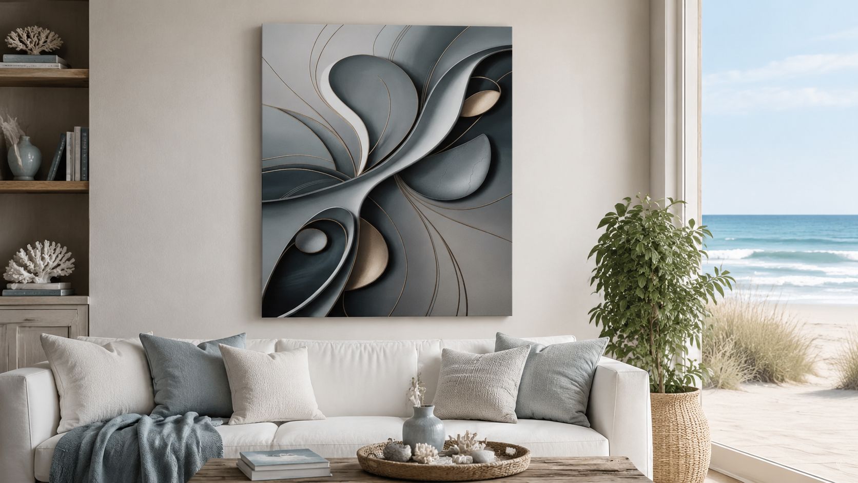
An abstract beach painting does not need a visible shell, dune, or wave to feel coastal. What matters is the atmosphere. Soft horizon bands, mineral blues, washed whites, sandy neutrals, and flowing marks often create the beach reference more effectively than obvious seaside symbols.
That is why the product image above needs a careful read. Amorphous Curves in Grey Abstract - Canvas Wall Art is not a direct beach example, but it can still work in a coastal interior if you are building a quieter, more refined version of the style. Its charcoal, slate, taupe, and gold-lined curves read more like weathered stone, tidal rock, or drift-shaped contours than a bright summer shoreline. At $53, it makes sense as a budget-friendly option for homeowners who want abstract movement in a coastal room without using obvious aqua or wave imagery.
Use that kind of piece in rooms where your coastal style is subtle. If you want the wall to say “ocean” right away, choose a painting with clearer sea-and-sand cues.
| Material | Durability | Color Vivacity | Price Range | Best Use |
|---|---|---|---|---|
| Canvas | Good for everyday wall display when properly stretched and cared for | Soft to rich, depending on finish and image style | Mid-range to premium | Living rooms, bedrooms, offices |
| Metal | Strong, rigid surface | Often appears crisp and vivid | Often higher | Modern spaces, kitchens, high-humidity-adjacent areas |
| Paper print | More vulnerable without framing and glazing | Can look excellent with proper printing | Broad range | Gallery walls, budget-conscious styling, framed collections |
Frame choice affects the message as much as the image does.
A wrapped canvas usually feels relaxed, which suits beach-inspired spaces well. A floater frame adds structure and can help abstract beach art look more finished in a formal living room or dining area. A matted print feels more traditional and often works best when the room already has classic furniture lines.
If your painting will share visual space with a television, frame simplicity matters even more. Too many heavy details can make the wall feel crowded. For proportion ideas in that setup, this guide to styling art above your television gives useful examples.
Placement decides whether art feels intentional or random. The same painting can look polished in one room and awkward in another based purely on height, spacing, and what surrounds it.
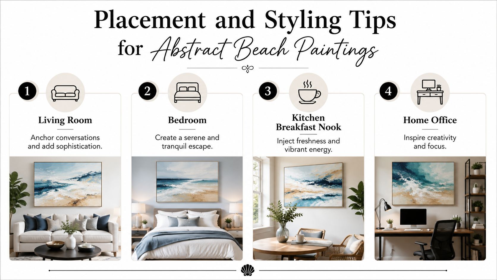
Abstract beach art often works hardest when it has to anchor conversation and relate to the biggest furniture pieces in the room.
Do place it so it visually connects to the sofa, console, or fireplace beneath it. Don't hang it so high that it floats alone near the ceiling. If your room has tall ceilings, a larger piece or a wide multi-panel arrangement usually looks more natural than a small centered canvas with lots of empty wall around it.
If your television shares the same wall zone, placement gets trickier. For a useful outside reference on balancing those proportions, this guide to styling art above your television offers practical visual cues.
Bedrooms usually benefit from quieter compositions. Soft bands of color, blurred horizons, and pale neutrals often work better here than highly textured storm-like pieces.
Try repeating the painting's colors in small ways. A linen throw, muted duvet, ceramic lamp, or sandy-toned bench can make the artwork feel integrated instead of isolated.
A broader look at canvas wall art for coastal homes can be helpful if you're trying to keep the bedroom serene rather than decorative.
A breakfast nook can handle more brightness than a bedroom. This is a good place for lively aqua tones, brighter whites, or pieces with playful directional movement.
Use the painting as the fresh note in the room. If the kitchen has wood, tile, stone, and practical finishes, one abstract beach piece can soften those harder surfaces. Just avoid hanging it where steam, grease, or repeated splatter are direct issues.
This short visual walkthrough shows how art can shift a room's energy without changing the furniture:
Offices need a different balance. You want inspiration, but you don't want a piece so busy that your eye keeps drifting to it.
A good office abstract beach painting often has movement contained within structure. Think layered horizons, rhythmic brushwork, or controlled texture rather than visual chaos. If your desk setup is sleek and minimal, the painting can provide the softer, human element in the room.
The best office art doesn't demand attention all day. It rewards attention when you pause.
You find a piece online that feels perfect on your screen. Then the practical questions start. Will it look flat in person? Is a print enough, or do you need an original? Will the size, surface, and framing still feel right once it reaches your home?
Those questions are useful because buying art is part design choice and part materials choice. At Jessie's Home, that usually means balancing the look you want with how the piece will live in an actual room, not a product page.
An original painting gives you the artist's exact surface. You see the ridges of paint, the small irregularities, and the hand behind the work. For some buyers, that physical texture is the whole point, especially with abstract beach painting, where scraped layers and broken color often create the feeling of sea, sky, and sand more than literal detail does.
A print solves a different problem well. It gives you access to a look, palette, or composition in a size and price range that often fits home decorating more comfortably. If you are styling several rooms in a related coastal direction, prints also make it easier to keep the visual language consistent.
Neither option is more serious. One is closer to collecting. The other is often better for decorating.
Abstract beach art depends on subtle shifts. Pale gray-blue against off-white. Soft horizon lines. Texture that suggests mist, foam, or wet sand without spelling it out. If the print quality is weak, those transitions can collapse into a flat block of color.
That is why construction details deserve a close look. Check the canvas material, the ink type, and the frame build. Premium cotton-blend canvases, fade-resistant inks, solid wood stretcher bars, and protective finishes are common markers of gallery-quality pieces. They influence sharpness, color stability, and how well the canvas keeps its shape over time.
A simple way to judge this is to treat the artwork like upholstery fabric. From a distance, many options look similar. Up close, the better-made one usually shows cleaner texture, steadier color, and fewer signs of strain.
Customization is often less about luxury and more about fit.
A wide sofa wall may need a long horizontal piece. A narrow hallway may call for a vertical composition with a quiet palette. If your room already has strong wood tones or a cool gray floor, even a small shift in blue, beige, or white can help the painting sit naturally with the rest of the space.
Frame choices matter too. A floating frame can give a loose, atmospheric beach abstraction more structure, which is helpful in rooms that already have clean lines or structured furniture.
Abstract coastal art continues to attract buyers because it crosses two interests at once. People respond to the calm, open feeling of beach imagery, and they also want art that reads as modern rather than theme-based. As noted earlier, market analysts have identified contemporary abstract wall art as a growing category, but market activity should only be background information.
Your room matters more than the trend.
A strong purchase usually comes down to four checks: scale, palette, surface quality, and mood. If those are right, the piece has a much better chance of feeling settled in the room a year from now, not just exciting on the day it arrives.
If you already know the piece will need precise placement once it gets to your wall, this installation guide from Giorgi Bros. Furniture experts is a helpful companion before you buy.
A strong piece loses impact fast if it's hung crooked, crowded, or exposed to rough conditions. Good installation is part of styling.
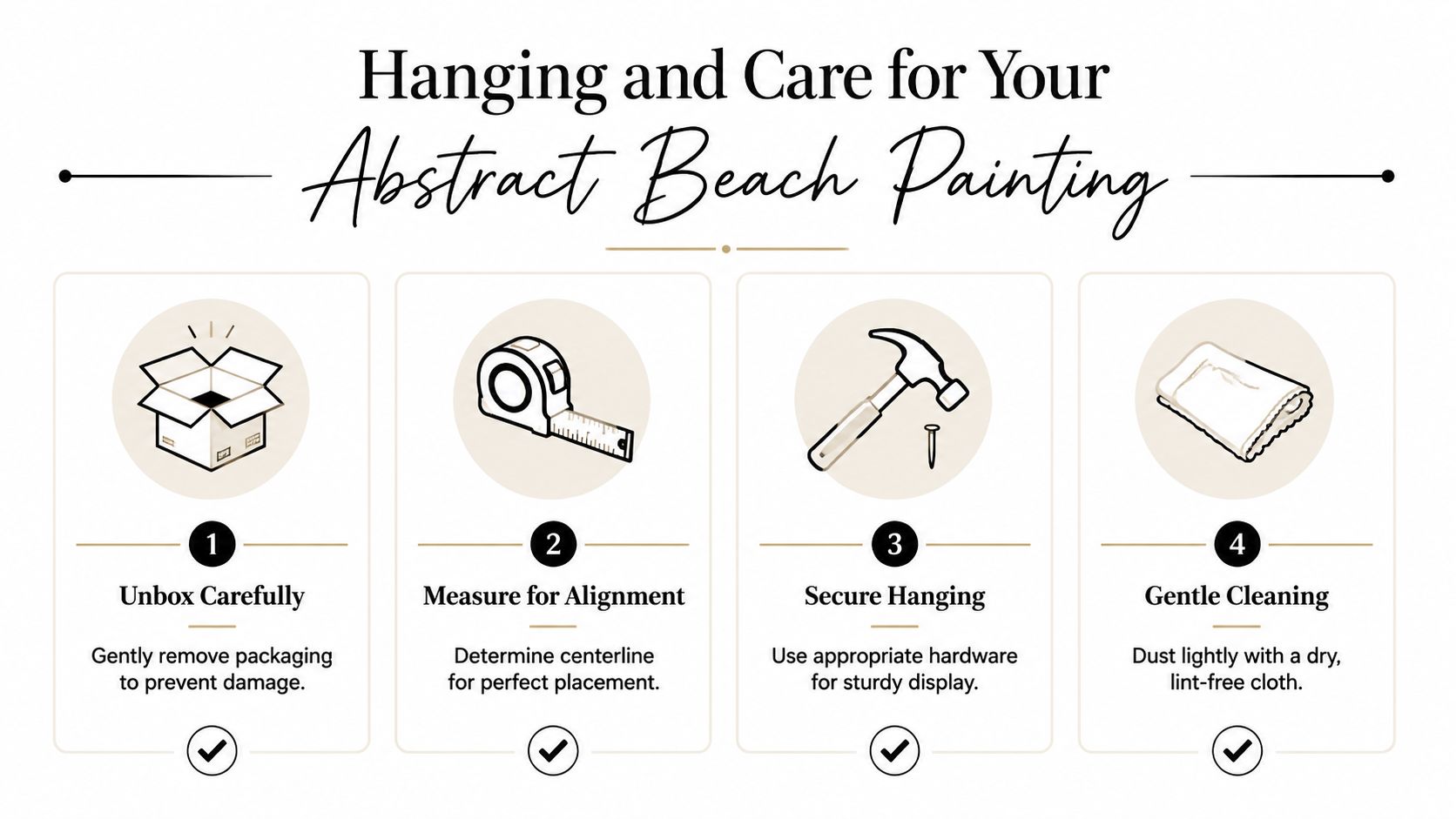
Start by unboxing slowly and keeping blades away from the canvas surface. Then measure the wall and mark the centerline before you touch any hardware. This prevents the common mistake of eyeballing placement and correcting it three times.
Use hanging hardware that matches the wall type and the weight of the piece. Once it's up, step back several feet and check both height and level. A painting can technically be straight and still feel off-center in relation to the furniture below it.
For a more detailed outside reference, this step-by-step guide from Giorgi Bros. Furniture experts is useful when you want a more exact installation method.
Canvas care is simple, but consistency helps.
A well-made canvas doesn't need complicated care. It needs gentle handling and a stable spot on the wall.
If the piece has visible texture, don't scrub the surface to “clean” it. Raised paint catches light beautifully, but it also deserves a soft touch.
Sometimes the easiest way to choose is to stop analyzing and start noticing what kind of room each piece wants to live in.
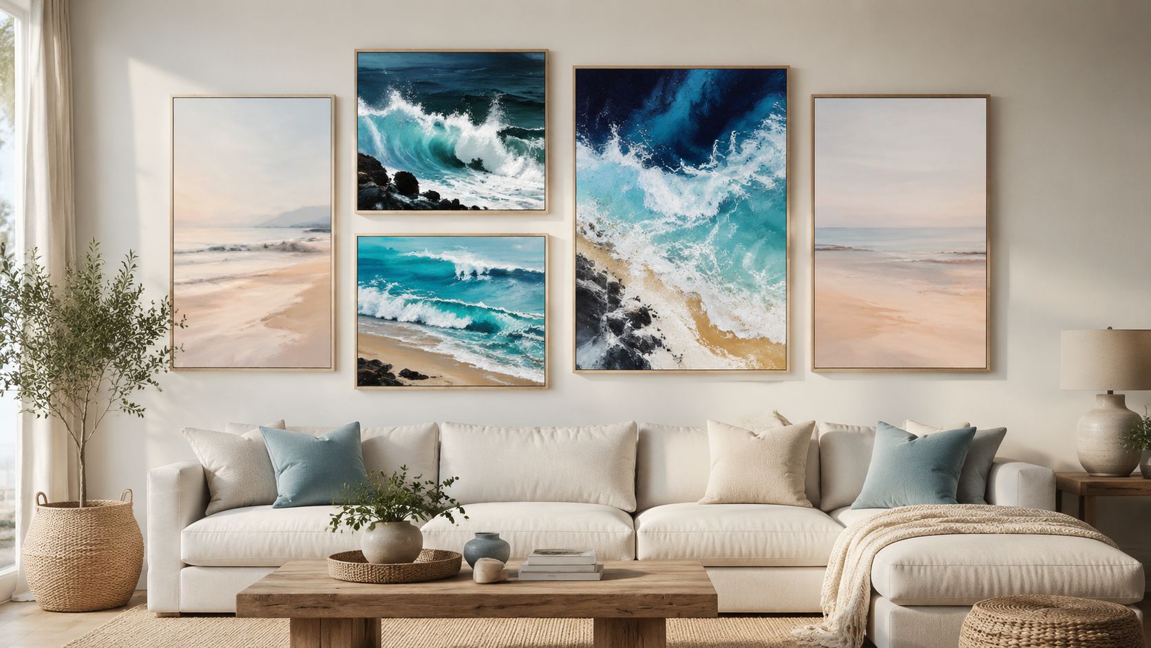
A misty shoreline piece works beautifully in Scandinavian-leaning rooms. Think pale oak, boucle, white walls, and soft gray textiles. The painting becomes the atmosphere setter, not the star performer.
A high-contrast wave composition fits better in a modern loft or a room that needs more energy. Concrete, black accents, leather, and cleaner silhouettes can handle stronger movement and sharper value changes without feeling overwhelmed.
Then there are the in-between pieces. These often use sandy neutrals, clouded whites, and a touch of blue-green. They're especially useful for coastal cottage interiors because they support the mood without turning every surface into a beach reference.
Gallery walls can also work with abstract beach art if the palettes relate. One larger ocean-inspired canvas can be surrounded by smaller abstract companions in similar tones. That arrangement feels collected rather than matched.
If you want to browse examples that lean coastal without locking you into one narrow style, this collection of beach canvas wall art is a practical place to compare mood, palette, and scale.
The useful question isn't “Do I like beach art?” It's “Which version of coastal mood suits the way I live?”
An abstract beach painting can do more than fill a wall. It can soften a room, guide the palette, and shape how the space feels day to day. The strongest choices usually come down to a few grounded decisions: choose the right scale, match the mood to the room's purpose, pay attention to technique and texture, and hang the piece so it connects clearly to the furniture and architecture around it.
That's why this category keeps working across very different homes. It isn't locked into one decorating style. A hazy shoreline can feel quiet and minimal. A textured wave can feel bold and sculptural. A neutral coastal abstraction can bridge modern furniture and warmer natural finishes without forcing a theme.
If you're still deciding, start with the room that needs the biggest emotional shift. Maybe your bedroom needs calm. Maybe your living room needs lightness. Maybe your office needs a sense of air.
Once you know the feeling you want, the right piece becomes much easier to recognize.
Jessie's Home offers a straightforward place to continue that search, with artist-made wall art, room-based browsing, and coastal collections that make it easier to compare size, palette, and style before you commit.

Discover how to pick, place, and style art with cat themes across your home. Covers popular styles, room-by-room placement, and mixing feline art
Discover how to pick, place, and style art with cat themes across your home. Covers popular styles, room-by-room placement, and mixing feline art

Discover how black and white minimalist art transforms any room with calm, contrast, and timeless style, plus tips on prints, framing, and placement.
Discover how black and white minimalist art transforms any room with calm, contrast, and timeless style, plus tips on prints, framing, and placement.

Discover watercolor abstract art techniques, learn how prints differ from originals, and get styling tips for your home. A complete guide for wall art lovers.
Discover watercolor abstract art techniques, learn how prints differ from originals, and get styling tips for your home. A complete guide for wall art lovers.


