Your wishlist is empty.
Secure Payment
30 days return

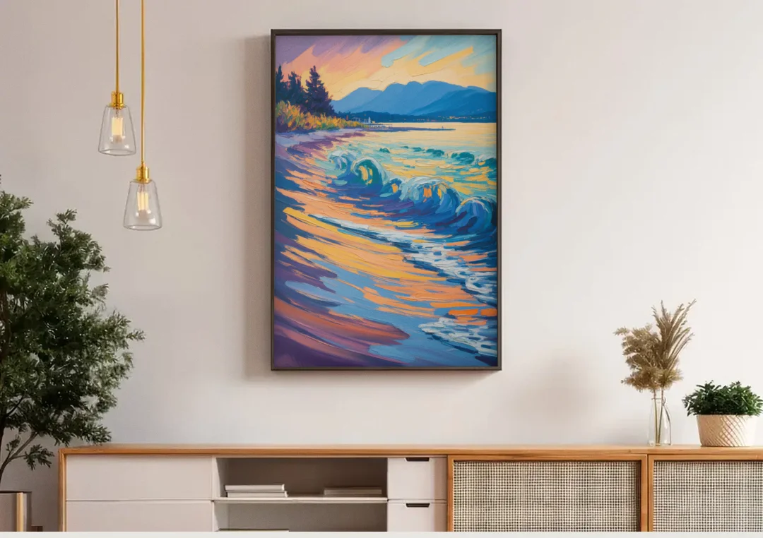
Art That Feels Like Home
Thousands of pieces from independent artists, all printed on thick, gallery-quality canvas. Find something that actually feels like you.
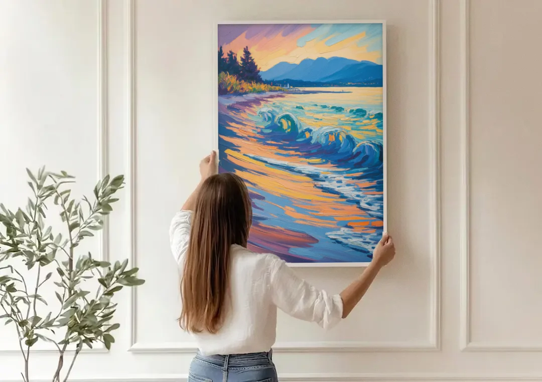
Ready to Hang
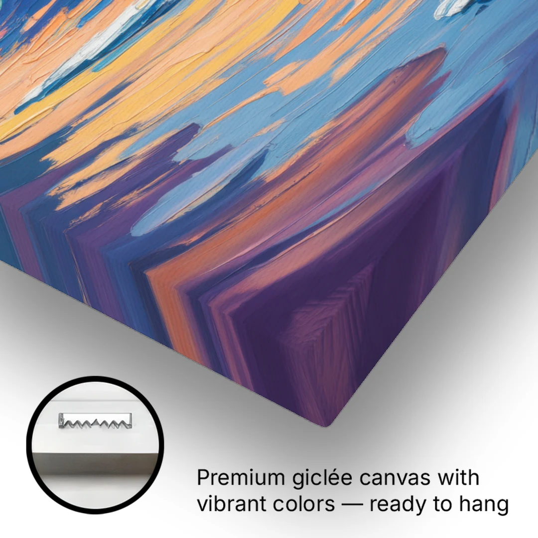
No assembly, no extra trips to the frame shop. Every canvas arrives stretched on solid wood, ready to go straight on your wall.
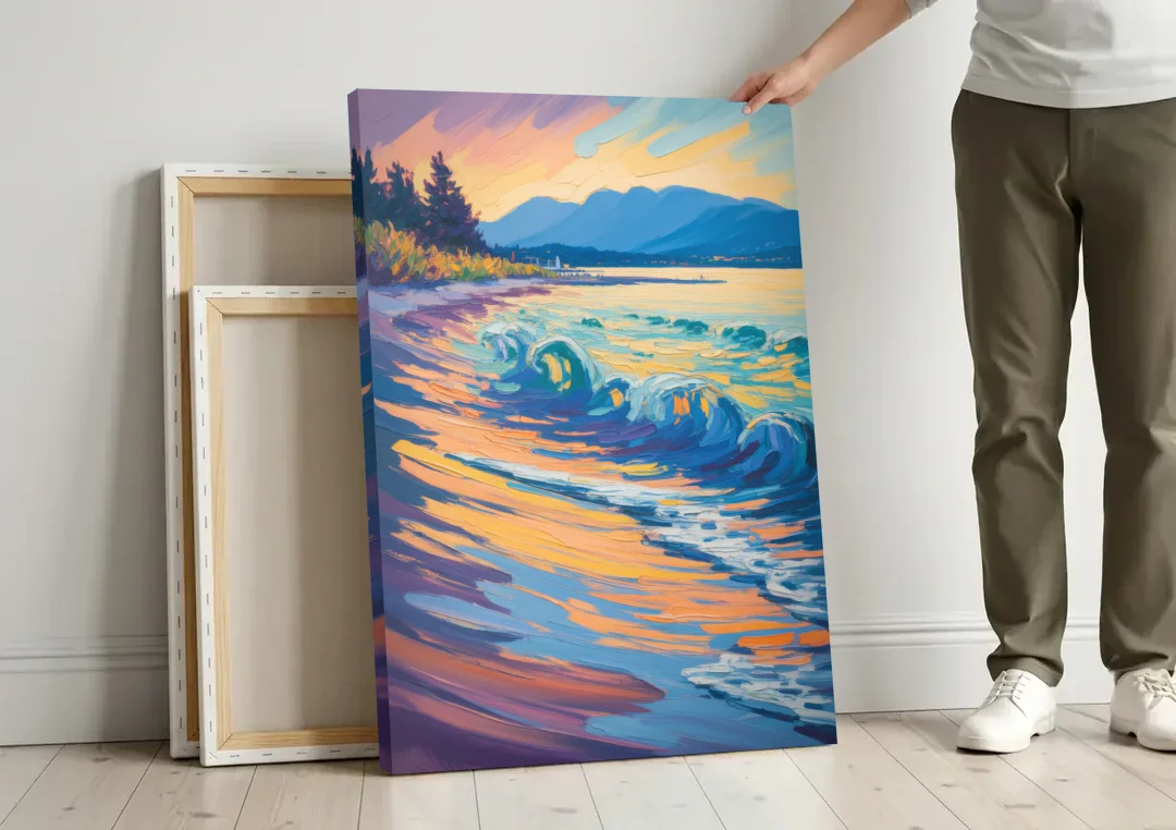
Built to Last
Printed with archival inks that won't fade. Made in the USA on materials that handle real life, not just showroom conditions.
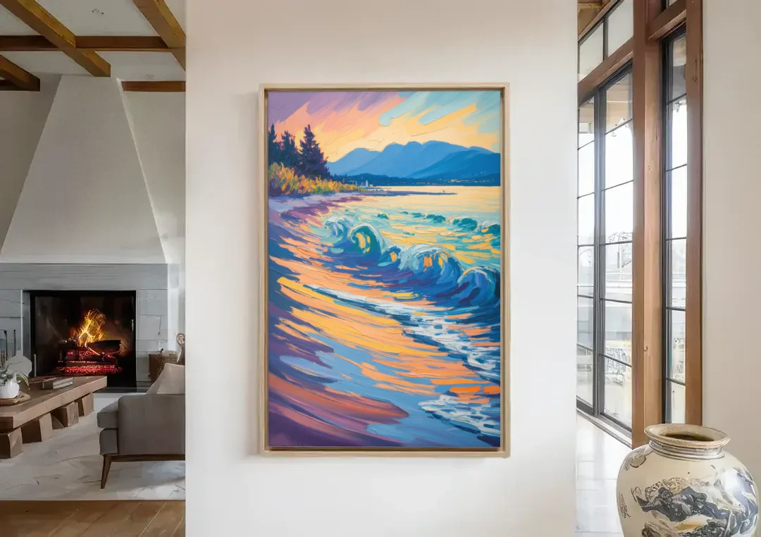
Your Walls, Your Way
7 sizes from 18" to 60". Frame or no frame. Find the perfect fit for any room.


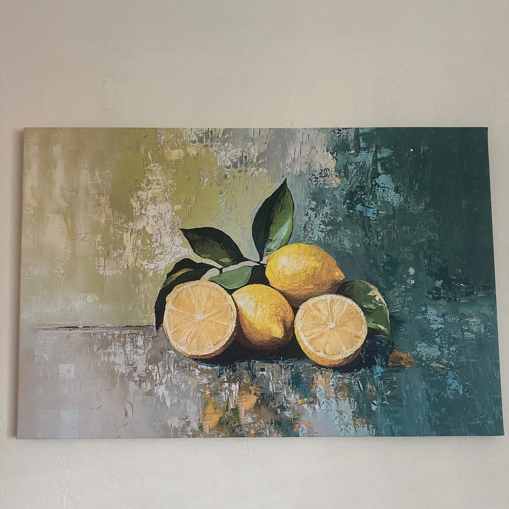
It looks amazing! The material creates the look of natural texture, even without raised detail.
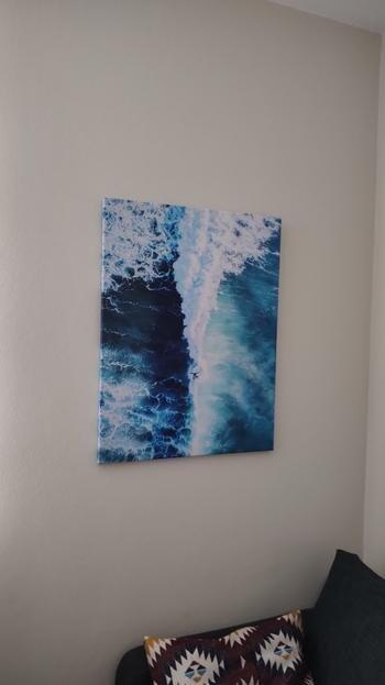
Exactly what I wanted! Adds a fresh, relaxing atmosphere to my home.
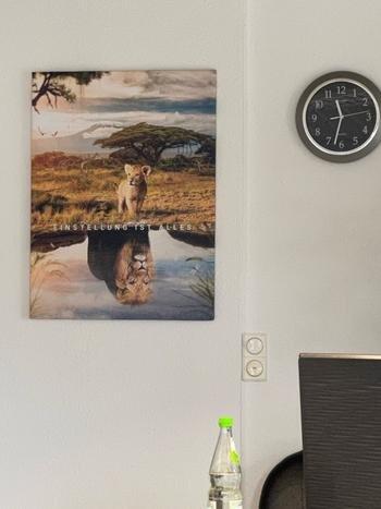
This canvas exceeded my expectations. The lion and its reflection are beautifully captured, and the quality of the print is superb. It adds a strong, motivational vibe to my room. I get compliments on it all the time!
Thrilled with the quality, the colors and the prompt delivery. Very impressed with this beautiful artwork! Just what this space needed! Will definitely do business with this company again! My clients loved it!! Thank you!!