Your wishlist is empty.
Secure Payment
30 days return

You're standing in a room that's almost finished. The sofa is in place, the paint looks right, the lighting is done, and yet the wall above the sofa still feels like a shrug. That's usually the moment people start looking at Van Gogh wall art, because one strong image can pull a room together faster than another lamp, another pillow, or another accent chair.
The problem is that most buyers stop at the image and ignore the part that makes the room work. Size, finish, frame depth, and print quality decide whether the piece feels intentional or like a souvenir shop impulse buy. Van Gogh's work gives you the color and energy, but the wrong format will still wreck the room.
A blank wall doesn't need more decoration, it needs conviction. Van Gogh solves that problem because his images have instant emotional charge, and they don't fade into the background the way many generic prints do. If a room feels flat, a bold Van Gogh reproduction often fixes the imbalance faster than any other classic art choice.
His appeal is not just art-historical. Van Gogh's compositions carry strong brushwork, saturated color, and visible movement, which gives a living room or bedroom a sense of life without adding clutter. That matters in contemporary homes, where clean lines and neutral furniture can start to feel sterile if the walls are too timid.
The Van Gogh Museum in Amsterdam holds more than 200 paintings, 500 drawings, and almost all of his letters, which is part of why his work feels so authoritative in decor markets worldwide. That collection also preserves the versions most buyers recognize, including Sunflowers, The Bedroom, and The Potato Eaters. The result is rare in wall art, a body of work that feels both culturally anchored and immediately familiar. Van Gogh Museum collection overview
Practical rule: If you want a room to feel collected rather than decorated, choose art with enough visual force to hold the wall on its own.
Van Gogh's imagery keeps working because it doesn't read as polite. His palette can be warm, electric, restless, or calm, depending on the piece, and that flexibility makes it easier to match real homes. A dining room can handle intensity. A bedroom can handle softness. A hallway can handle a single, high-impact image that stops people in their tracks.
His auction record reinforces that cultural pull. Sunflowers sold for $39.9 million in 1987, Portrait of Dr. Gachet reached $82.5 million in 1990, and Orchard with Cypresses sold for $117 million in 2022. Those prices don't tell you what to hang on your wall, but they do show how the imagery resonates beyond museums. Van Gogh auction milestone report
Design takeaway is simple. Van Gogh is strong enough to carry a room, but only if you treat the piece like architecture, not filler. Hang the wrong version, and it looks loud. Hang the right one, and the whole room finally settles.
Most shoppers think they're comparing paintings, but they're really comparing production methods, surface texture, and expectations. The market is split into a few very different categories, and if you don't know the difference, you'll overpay for something ordinary or underbuy something that deserves a better presentation.
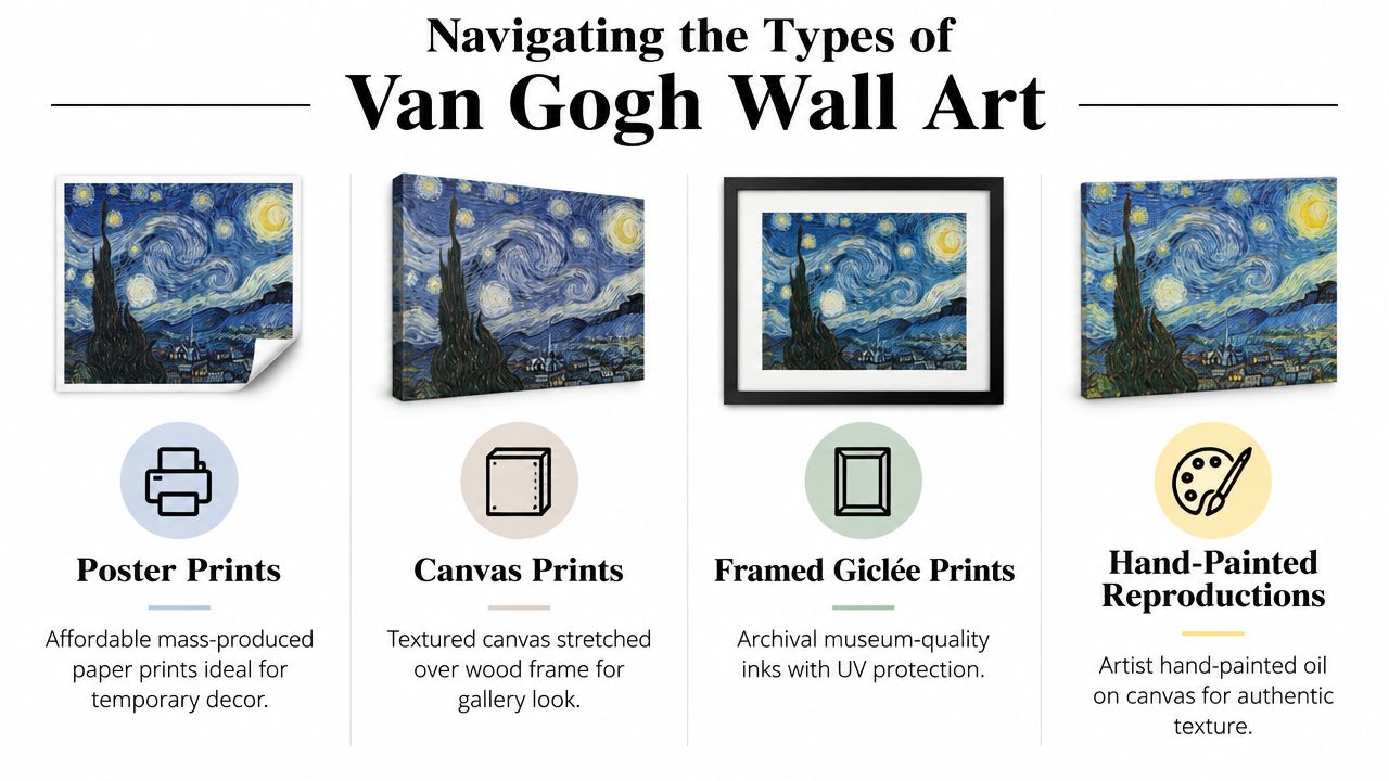
A useful way to think about it is like this, poster prints are convenience, canvas prints are decor, framed giclée prints are presentation, and hand-painted reproductions are craftsmanship. That's the hierarchy I'd use if I were furnishing a home from scratch.
Poster prints are the entry point. They're the cheapest to produce, easy to ship, and fine for temporary styling, dorm rooms, or a wall you know you'll change later. They usually look the most obviously printed, which is fine if you just want the image, not the finish.
Canvas prints are the safer middle ground. The texture helps the artwork read more like a designed object and less like office decor, especially when the image is large enough to make a statement. If you want the wall to feel finished without looking overly formal, this is usually the most practical format.
Framed giclée prints are where the piece starts to feel serious. The term matters because buyers should be looking for archival inks, careful color management, and a frame that supports the image instead of competing with it. For buyers who want the art to feel curated rather than casual, this is the cleanest route.
Hand-painted reproductions are for people who care about texture. They bring a physical, painterly surface that printed products can't match, but quality varies a lot and the wrong execution can look stiff or overworked. Buy this category only when the maker's skill is obvious.
For shoppers comparing retail options, a specialized collection like impressionist canvas wall art is useful because it keeps the style conversation focused instead of burying you in unrelated categories.
Do not let vague language trick you. If a listing says “museum style” but only mentions paper and ink, you're probably looking at a standard print with marketing copy. If it doesn't clearly say whether it's canvas, framed, hand-stretched, or reproduced with archival methods, assume the retailer is leaving out the parts that matter.
If the listing can't tell you what the surface is, the image quality won't save it.
The phrase “Van Gogh-inspired” also needs caution. That can mean a faithful reproduction, or it can mean an interpretive piece that only borrows the mood. Neither is wrong, but they are not the same product, and they shouldn't be priced as if they are.
A Van Gogh print either holds up as a real room piece or reads like temporary wall filler. The technical choices decide that fast. His color work is unforgiving, and weak printing muddies the yellows, flattens the blues, and strips away the brushwork that gives the image its force.
Canvas usually gives Van Gogh imagery a stronger presence in a home. The woven surface adds depth, and with a solid frame it feels integrated into the room instead of something hung on it. Paper can also look refined, but it relies more heavily on framing and matting to feel finished.
The first spec I would check is GSM, grams per square meter, for the paper or canvas stock. Heavier canvases, often listed at 300–450 GSM, feel more substantial and generally hold up better over time. Canvas print material guidance
Ink system matters just as much. Pigment-based inks are the safer choice for longevity because they hold color more reliably than cheap dye-heavy alternatives. Add UV-protective coatings, and the print stands up better in bright rooms where daylight hits it every day.
For faithful reproduction, color management has to be part of the process. Fine-art workflows use ICC profile-based color management to keep the image consistent from capture to proofing to printing, which matters with impressionist work that depends on subtle temperature shifts and visible texture. If a retailer cannot explain how it keeps color accurate, do not expect the final print to resemble the original well. Fine-art reproduction workflow guidance
Ask direct questions. What stock is it printed on? Is the canvas archival? Are the inks pigment-based? Does the print have UV protection? Is the piece hand-stretched, or just mounted?
If the seller dodges those questions, move on.
My take: The image gets attention. The materials decide whether you still like it after months in a sunny room.
A good-looking print that warps, fades, or turns dull is a bad buy, even if the product page looks polished. I would rather see someone choose a simpler image on better materials than a famous image produced carelessly.
Buyers often choose the right Van Gogh image and still ruin the result by hanging it too high, too small, or too far from the furniture it should relate to. Placement is a proportion decision, and proportion decides whether the room feels intentional or awkward.
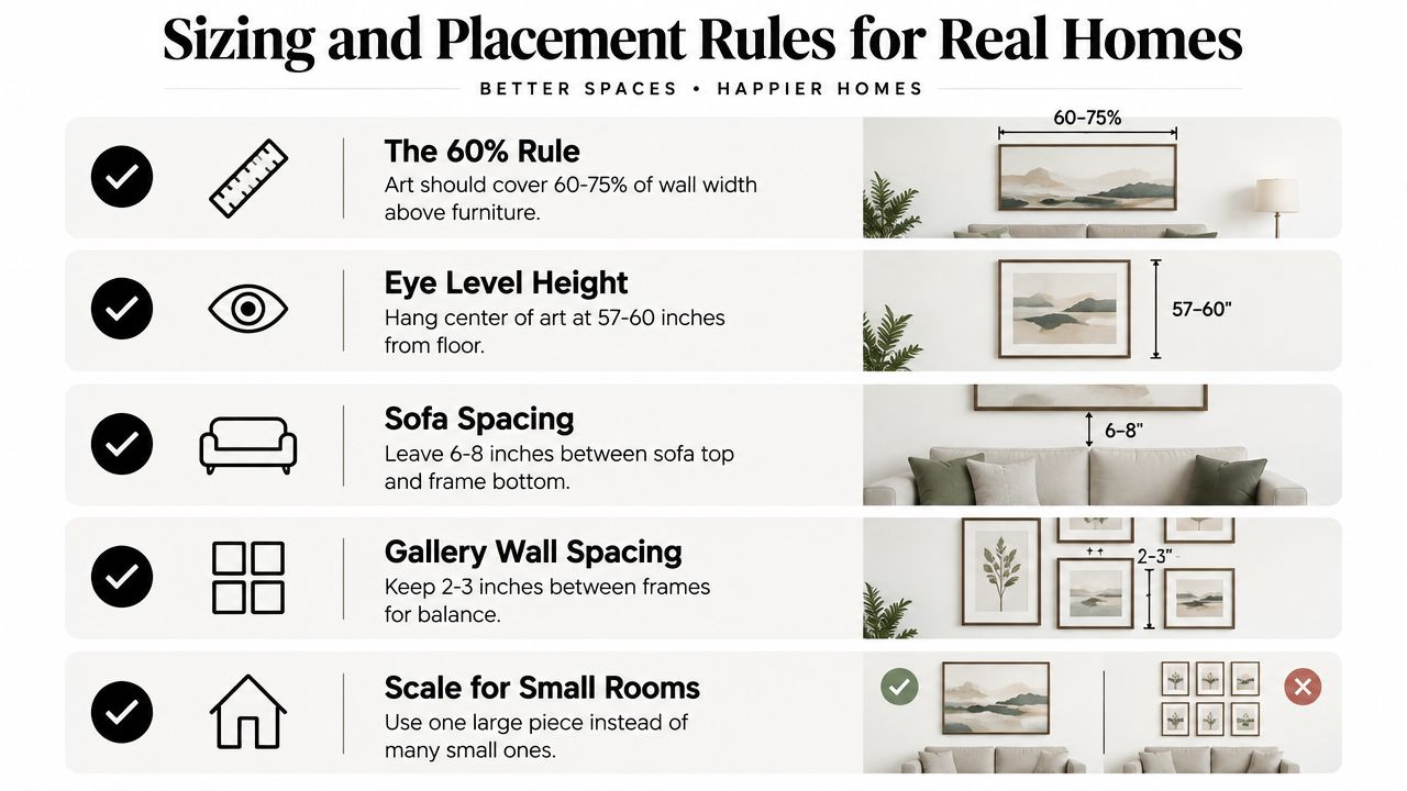
A good starting point is to let the art cover about 50% to 75% of the wall area above the furniture, or roughly two-thirds the width of the piece below it. That keeps the arrangement anchored. If your sofa is 90 inches wide, for example, the artwork should feel related to that width, not like a small rectangle drifting in open space. Wall art sizing guidance
Room depth matters too. The comfortable viewing distance is often about 1.5 to 2 times the artwork's diagonal, which means a large piece can feel right in a generous living room and overpowering in a narrow hall. For a clear, practical walkthrough on placement, exactly how to hang artwork is worth reading before you drill anything.
Above a sofa, leave about 6 to 8 inches between the top of the sofa and the bottom of the frame. That gap connects the two without crowding them. Hang the piece much higher, and the whole composition starts to float away from the room.
For eye level, center the art around 57 to 60 inches from the floor. That default works in real homes because people sit, stand, and move through spaces, not just view them from a gallery distance. It also keeps the piece from feeling installed for a standing crowd only.
In tight apartments or narrow bedrooms, one large Van Gogh piece usually works better than several smaller ones. Small works disappear unless they are grouped with discipline, and most rooms do not have the wall space for that to read cleanly. A single, well-scaled piece brings calm fast.
If you need custom proportions, browse custom canvas wall art before settling for a standard size that misses the wall. Custom dimensions solve more hanging mistakes than trying to force the wrong print into the right spot.
The frame can rescue a piece, or it can make a strong piece look cheap. With Van Gogh, the choice matters because the art already brings enough color and movement. The presentation should sharpen it, not compete with it.
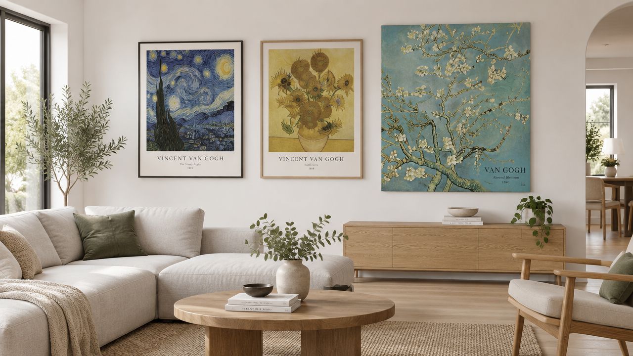
Canvas wraps often look strongest with a floating frame or shadow-box depth. Those treatments add dimension without hiding the edges, which is exactly what you want when the surface itself carries part of the visual interest. Recent framing coverage also points to stronger interest in statement framing and natural materials, so the frame can be design-forward without feeling fussy. Framing trend overview
Paper prints usually need more structure. A mat and frame make the piece read as finished, and a bold colored frame can work if the room needs an accent. If the decor is already loud, keep the frame simple and let the painting do the work.
A minimalist room doesn't need a literal museum replica. It needs a controlled presentation that respects the art while still feeling like it belongs to the home. In that setting, a thin black frame or a warm natural wood finish usually feels cleaner than an ornate border.
For gallery-wall thinking, gallery wall frame ideas is a useful reference when you're trying to balance multiple pieces without turning the wall into visual noise. The point isn't to copy a farmhouse look. The point is to see how frame tone and depth change the overall read of the wall.
Do not put a highly textured Van Gogh canvas inside an overdecorated frame. That usually makes the piece feel boxed in and dated. Also avoid tiny frames on oversized walls, because they make the art look accidental.
If the room is contemporary, keep the presentation crisp. If the room is traditional, let the frame carry a little more presence. Either way, the frame should make the art feel intentional, not nostalgic in a souvenir-shop way.
The same painting can work in one room and fail in another if the mood is wrong. That's why room choice matters. Van Gogh is versatile, but only when the color and scale match the function of the space.
A living room can handle the strongest Van Gogh compositions because it usually has the most visual breathing room. A large canvas above the sofa gives the room a focal point and stops the seating area from feeling like it's floating. For a broader set of living-room options, I'd start with living room wall art and then narrow by color temperature.
If your room is neutral, use a warmer Van Gogh image to bring in energy. If the room already has a lot of color, choose a more restrained piece with deeper blues or darker grounds so it doesn't fight the rest of the palette.
A bedroom can absolutely take Van Gogh, but pick the right image. A swirling sky works if the rest of the room is quiet, because the movement adds life without breaking the mood. Soft-toned florals also work well when you want the room to feel restful rather than dramatic.
Do not hang an aggressive, high-contrast piece directly across from the bed if you want the room to feel easy. That kind of placement turns the art into a visual alarm clock. Keep the strongest work where you see it on entry, not always where you see it at rest.
Dining rooms are one of the best places for saturated Van Gogh imagery. The room isn't usually asked to be restful, so stronger color feels appropriate and even desirable. A piece with rich yellows or deep night tones can make the whole space feel more deliberate.
Hallways are good for narrower compositions or a series of related prints. That's where a gallery-wall approach can work, but only if the spacing stays disciplined and the frames are coordinated. If the hallway is slim, one vertical piece is usually smarter than several small ones.
Opinionated rule: Match the art to the room's job. Calm rooms need control. Social rooms can handle drama.
A Van Gogh print can look right in the cart and wrong on the wall. That usually happens when the seller hides the basics. I want to see the frame construction, the canvas or paper stock, and the finish before I commit.
Start with the build. Look for hand-stretched solid wood frames, premium canvas, and a plain explanation of the print method. If a seller can describe the surface, the support, and the coating without buzzwords, that is a better sign than a polished product page with no real detail.
Return policy matters too. Wall art is a spatial purchase, and a piece can fail because the scale or color feels off in your room. Flexible returns and a responsive customer service team matter because they give you room to correct a bad fit instead of living with it.
Specialized art retailers usually make better decisions about scale and production because they sell wall art first, not general home goods. That focus shows up in color fidelity, format choices, and the way a piece is presented for real interiors.
For brands and studios that want the presentation right from the start, even a guide to product photography lighting and consistency can help explain how image quality, lighting, and visual consistency shape what buyers think they are seeing online. Poor photos hide flaws. Clear photos make the finish, edges, and texture easier to judge before anything ships.
If you want the piece to feel substantial, buy the version that already looks finished. That usually means a premium canvas or framed print with clear material specs, not a cheap poster with a famous image printed on it. A wall that matters deserves art that still looks intentional years later, not a stopgap choice.
Jessie's Home offers handcrafted canvas wall art and gallery-quality photo prints produced to museum standards, with premium cotton-blend canvas, fade-resistant inks, solid wood frames, and UV coating. For a Van Gogh-inspired room, that build separates a wall decoration from a real focal point.
If you want Van Gogh wall art that works in a real home, Jessie's Home is a practical place to start because the format, finish, and sizing options are built for everyday interiors. Visit Jessie's Home to choose a piece that fits your wall, your furniture, and the way you live.

Discover how black and white minimalist art transforms any room with calm, contrast, and timeless style, plus tips on prints, framing, and placement.
Discover how black and white minimalist art transforms any room with calm, contrast, and timeless style, plus tips on prints, framing, and placement.

Discover watercolor abstract art techniques, learn how prints differ from originals, and get styling tips for your home. A complete guide for wall art lovers.
Discover watercolor abstract art techniques, learn how prints differ from originals, and get styling tips for your home. A complete guide for wall art lovers.

Explore the beauty of modern landscape art and how to choose prints that transform your home. From trends to room-by-room styling tips, this guide covers it
Explore the beauty of modern landscape art and how to choose prints that transform your home. From trends to room-by-room styling tips, this guide covers it


