Your wishlist is empty.
Secure Payment
30 days return

“Pick art you love” is the default advice for a home office. It's also incomplete. You don't choose a desk because the color makes you happy in a showroom. You choose it because it supports the work, the screen, the lighting, and the hours you'll spend there. Your wall art deserves the same discipline.
The right piece can give a focus-heavy room a visual resting point, help a creative workspace feel energized, or make a client-facing background look intentional rather than improvised. The wrong piece can create glare, clutter your camera frame, or pull your attention away from the task in front of you. This guide matches home office wall art to the work you do, then handles the practical details that most style-focused guides skip.
Beautiful art can still sabotage a home office. A high-contrast abstract may look impressive in a hallway, yet create constant visual movement above your monitor. A detailed city photograph may suit a mood board, but overwhelm your eyes during a long spreadsheet session. Style alone is a poor buying test.
Ask, “What should this wall help me do?” Focus-heavy work needs calm structure and limited detail. Creative work can handle stronger color, unusual shapes, and more visual energy. Client-facing work needs a background that looks deliberate on camera without competing with your face or conversation.
Decorated workspaces produced better task results in a real-office experiment. Workers in a decorated room finished tasks about 17% faster than those in a bare room, while workers who arranged the decor themselves were about 32% faster, with no increase in errors, according to reported findings from a real-office experiment. A separate workplace-art summary reported that 83% of employees viewed art as significant, but that figure belongs to the source's industry summary, not a universal rule.
The finding does not justify covering every wall in colorful prints. It supports a more useful point: the space around your desk affects your sense of control, comfort, and involvement. Choose art that helps you enter the right working state, then let your personal taste shape the final choice.
Practical rule: Choose art for the mental state your work requires, not the mood you want to copy from a design feed.
Your walls sit in peripheral view, appear behind your shoulders on video calls, and can reflect light toward your eyes. A simple scene of natural scenery or low-detail view gives your gaze a place to rest between documents. A restrained abstract adds personality without forcing your brain to solve a new visual puzzle every time you look up.
Artwork visibility also remains limited in many workplaces. A UK study commissioned with YouGov found that 50% of indoor workers said their workplace had no artwork, while 65% couldn't see art from their desk, as reported by Living Spaces' office wall art guide. Preferred formats included wide-format photographs at 35%, broad-format paintings at 33%, abstract paintings at 25%, and textile art or large sculpture at 14% each.
Use those preferences as a starting point, not a formula. The right home office wall art supports attention, avoids glare and camera chaos, and makes the room look built for the work you do.
Scale is where many otherwise polished offices fall apart. A small print over a desk looks timid, while the same print can feel perfectly intentional on a narrow side wall. Wall art should relate to the furniture and the usable wall area beneath it, not merely fill an empty patch.
A practical benchmark is to cover roughly 60% to 75% of the usable wall area, a proportion supported by office artwork sizing guidance. Think of that as the total width and visual mass of the piece or grouping, not a command to cover every inch.
Start with painter's tape. Mark the usable wall rectangle, excluding shelves, windows, switches, and the area occupied by a monitor. Measure its width, then multiply by 0.60 and 0.75. Those figures give you the lower and upper boundaries for the art grouping.
For a 60-inch desk, a single piece around 24 to 36 inches wide usually creates a convincing relationship with the work surface. A diptych can span roughly 30 to 40 inches combined, provided the gap between panels is narrow enough that they read as one composition. On an opposite wall, a wider piece around 36 to 48 inches can work because it sits farther from your direct eyeline.
Don't mount a huge frame just because the wall is blank. If the art enters your peripheral vision while you work, excessive scale can make the room feel compressed. If it disappears behind the monitor, it isn't doing enough.
| Placement | Desk Width | Art Width | Coverage % |
|---|---|---|---|
| Above desk, single piece | 60 inches | 24 to 36 inches | 60% to 75% of usable wall area |
| Above desk, diptych | 60 inches | 30 to 40 inches combined | 60% to 75% of usable wall area |
| Opposite desk wall | Not applicable | 36 to 48 inches | 60% to 75% of usable wall area |
Before ordering, tape the proposed dimensions directly onto the wall and sit at the desk. Photograph the mock-up from your webcam position. If you want a custom option, browse custom canvas wall art for measured spaces only after you know the dimensions you're trying to fill.
Measure twice: A correctly sized ordinary print will look more expensive than an exceptional print that's too small.
Choose the palette for the work, not just the room. Focus-heavy tasks need visual calm, creative tasks benefit from controlled energy, and client-facing work needs a background that looks composed on camera.
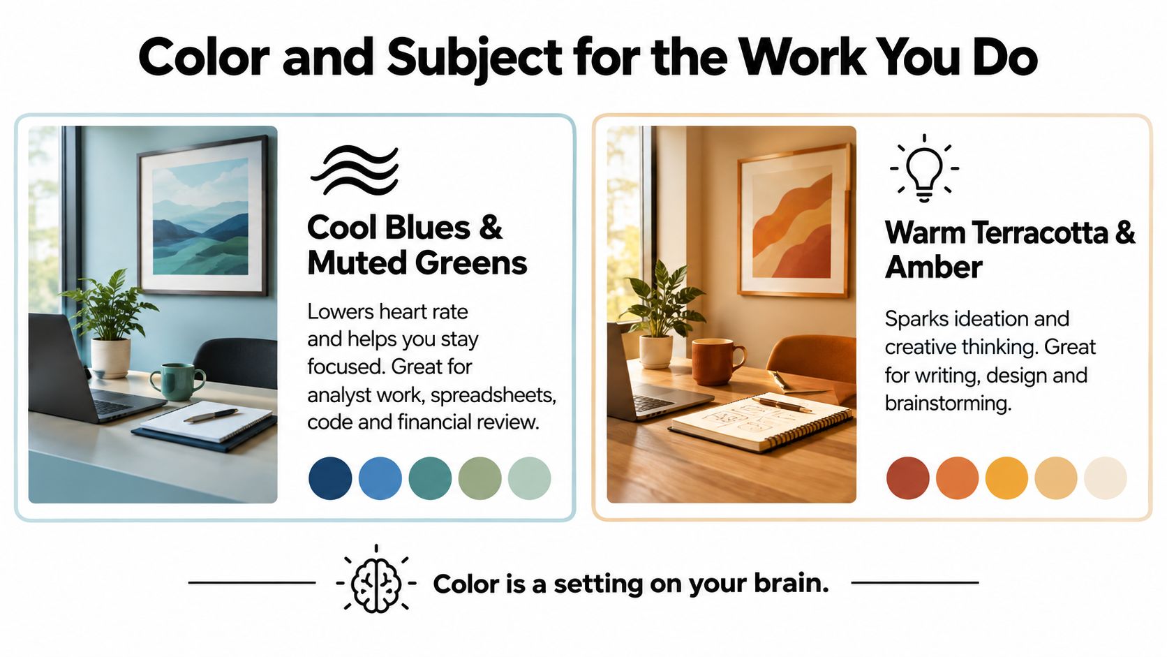
For focus-heavy work, choose desaturated blues, soft gray, restrained blue-greens, and quiet natural forms. Analysts, developers, accountants, and anyone reading long documents need visual stability. A horizon line, broad tonal fields, or an abstract with only a few shapes will settle in the background, supporting your attention. Avoid intricate scenes and tiny marks that keep pulling your eyes around the frame.
For creative work, use ochre, amber, terracotta, or one concentrated accent color. Writers, designers, architects, and strategists usually need stimulation rather than a blank visual field. A bold abstract can work above the monitor if its structure is clear. Random detail creates noise, not creative energy. Keep the strongest contrast away from the exact spot where your eyes rest during long work sessions.
For client-facing work, build around sand, stone, charcoal, soft cream, or muted blue. These shades photograph reliably and keep attention on your face. Add one accent color for personality. A restrained botanical, architectural print, or calm abstract looks considered without turning the background into a retail display.
Subject choice matters as much as color. Busy streets, crowded interiors, and literal scenes deliver more visual information than open views or simple geometric compositions. Put a louder piece on a side wall if you want a daily mood lift. Behind the monitor, choose the composition you can ignore when concentration matters.
Zoom compresses depth and exaggerates contrast. Glossy highlights become bright patches, detailed backgrounds turn messy, and balanced in-person art can look chaotic in a small video window. Keep the wall area visible to clients simple. Check the artwork from your webcam position before you buy it, not only from the chair where you normally admire it.
One short motivational phrase in clean typography can work. Several slogans make the room feel like a temporary productivity booth. Image-led art usually gives the office more personality without competing with your face or captions. Jessie's Home's business motivation canvas wall art collection lets you compare text-led designs with more visual options.
Use contrast deliberately. A pale print behind a pale wall may vanish on camera, while a high-contrast black-and-white piece can dominate every call. Aim for one clear focal point, then let the surrounding wall stay quiet.
Material changes how art behaves under real office lighting. It affects reflections, texture, weight, sound, and the way the background reads on a camera. Don't choose a finish from a product thumbnail alone. Put the material in the same room as your monitor and window before deciding.
Canvas is the safest choice for a focus-heavy office. Its surface absorbs light, softens the wall visually, and usually avoids the sharp reflections that make glass distracting. It can scuff more easily and direct sunlight can affect color over time, so keep it away from unfiltered, intense exposure.
Framed prints look crisp and established. They suit consultants, attorneys, therapists, and other client-facing professionals who want a polished background. The weakness is unprotected glass. A monitor or window opposite the frame can create a bright rectangle that appears in every call. Matte glazing or anti-glare acrylic is the practical fix.
Metal prints deliver saturated color and a clean, modern surface. They wipe easily and work well in creative studios, but the hard surface can feel cold in a traditional room and may add a slightly livelier acoustic quality. Acrylic face-mounts create depth and punch, though they reflect more light than canvas and need careful placement.
If you're comparing hanging systems alongside the artwork, this guide to different framing methods for water filter setups offers a useful reminder that hardware and mounting context matter, even when the object on the wall changes.
| Material | Glare Level | Video Call Appearance | Durability | Best For |
|---|---|---|---|---|
| Canvas | Low | Soft, low-distraction background | Can scuff and fade in direct sun | Deep-focus rooms |
| Framed print with glass | Medium to high | Crisp and professional, but reflection-prone | Protective surface, heavier hanging needs | Client-facing rooms with controlled light |
| Metal | Low to medium | Saturated, modern, sharply defined | Wipe-clean and resilient | Creative or contemporary offices |
| Acrylic | Medium to high | Dimensional and vivid | Durable surface, reflection-sensitive | Creative studios with controlled lighting |
Weight matters on drywall, plaster, and rented walls. Use hardware rated for the finished piece, not merely the frame size, and don't assume adhesive strips are appropriate for every material. A beautiful frame that shifts, tilts, or leaves the wall damaged is not a successful office decision.
A good office setup starts with the work pattern. These three configurations show how the same room can become calmer, more energetic, or more camera-ready without relying on generic “inspiring” art.
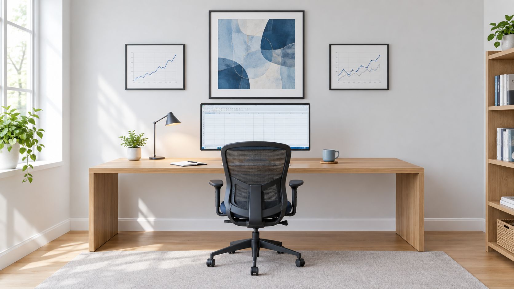
An analyst, developer, or financial reviewer needs a visual rest zone, not another dashboard. Put a low-contrast scene above the desk in muted blue-greens, with a matte walnut frame or a low-reflective canvas finish. For a 60-inch desk, keep the main piece within the measured range of 24 to 36 inches wide, then place a smaller secondary piece on a side wall if the room needs another point of interest.
The main art should have broad shapes, a quiet horizon, and limited contrast. Don't choose a dramatic storm, a crowded skyline, or anything with fine detail directly above the monitor. The side piece can carry a little more personality because it won't sit in your primary sightline.
Keep plant maintenance equally sensible. If you want greenery without adding another demanding task, use the guide to easy-care succulents for offices to choose a small companion for the side desk.
A designer, writer, or brand strategist can use stronger visual input. Hang a bold abstract acrylic above or beside the monitor, with saturated accents that echo one object already in the room, such as a lamp, notebook, or chair. Acrylic works here because its depth and color intensity reinforce the room's energy, but place it away from a direct window to control reflection.
Add a compact inspiration board on a perpendicular wall rather than crowding the main art. That keeps references available without turning the entire background into a collage. A curated piece from canvas wall art for modern homes can soften the harder look of acrylic if the space starts to feel like a studio showroom.
A short visual reset is useful. The art should spark association when you look away from the screen, then let you return to the task without demanding prolonged attention.
A consultant, salesperson, coach, or therapist needs a background that supports trust. Use a tidy grid of two framed prints in warm neutrals, muted blue, or soft charcoal. Position the grouping inside the camera frame but to one side of your head, never directly behind the screen where it competes with your face.
Keep the composition symmetrical and the frames consistent. Matte glazing is worth prioritizing because clients notice glare before they notice craftsmanship. The art should look deliberate at thumbnail size, with clean edges and broad tonal blocks rather than intricate detail.
Even excellent home office wall art fails when it hangs too high or catches the monitor's reflection. Start with the center of the artwork at 57 to 60 inches from the floor, a museum-style eye-level benchmark supported by picture-hanging guidance from The DIY Playbook. That rule applies to the artwork or the full grouping treated as one visual unit.
Seated viewing changes the calculation. If the monitor blocks the lower half of the piece, lower the artwork until you can see the composition naturally while sitting. The wall should support your working posture, not force you to crane your neck from a standing position.
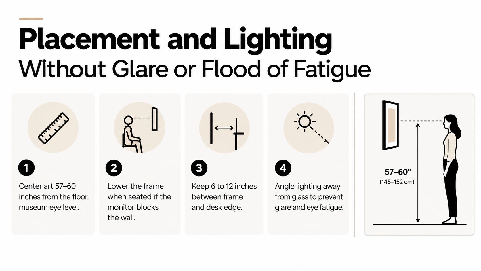
Above a desk, leave 6 to 12 inches between the desk surface and the bottom of the artwork. This gap keeps the frame connected to the furniture without making the wall feel crowded. If your monitor is tall, use the lower end only when the art remains visible and doesn't collide visually with the screen.
Don't place a glossy piece directly opposite a window or monitor. Reflections create eye fatigue, destroy contrast on the artwork, and can turn your video background into a bright distraction. Canvas, matte paper, and low-reflective metal are more forgiving.
Use a soft picture light or track fixture angled around 30 to 45 degrees toward the artwork, not straight at a reflective surface. The goal is an even wash, not a hot spot in the upper corner of the frame.
Test at midday and at the time you usually take calls. A frame that looks perfect under morning light may reflect a late-day window. If a window sits behind your chair, add a sheer shade to diffuse the light and choose a finish that won't throw the window back at the camera.
The practical test: Sit down, turn on the monitor, open your video preview, and check the wall from the exact angle your camera sees. If the art fights the screen, move it or change the finish.
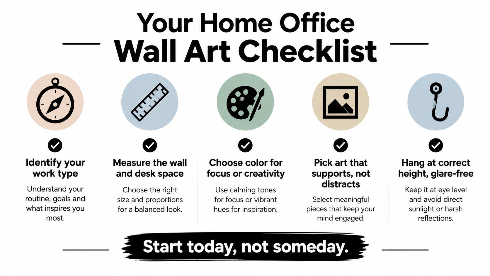
Good design becomes easier when you remove the vague decisions. Before you buy, make five choices in order.
The oversized single piece directly behind the monitor is a common failure. It disappears from your normal view, dominates the camera frame, or makes the screen feel trapped. A glossy frame opposite the monitor is worse because it creates a reflection you'll see every working day.
Gallery clusters above a desk also deserve skepticism. Several small frames can create visual chatter, especially in a narrow office. If you want a grouping, keep it tight, treat it as one composition, and make sure its total width relates to the desk.
Order a sample, use a print preview, or tape a paper mock-up to the wall before committing. Your office lighting will shift the colors, and a piece that looks balanced online may be too dark, too bright, or too reflective in the room where you work. Choose one piece this week, measure before ordering, and make your Zoom background support your work instead of working against it.
Jessie's Home offers artist-made canvas wall art and gallery-quality photo prints in styles ranging from abstract and minimalist to botanical, skyline, and coastal imagery. Browse Jessie's Home to compare ready-to-hang pieces for your measured wall, then choose a low-glare canvas or print that fits the work your office needs to support.

Discover how black and white minimalist art transforms any room with calm, contrast, and timeless style, plus tips on prints, framing, and placement.
Discover how black and white minimalist art transforms any room with calm, contrast, and timeless style, plus tips on prints, framing, and placement.

Discover watercolor abstract art techniques, learn how prints differ from originals, and get styling tips for your home. A complete guide for wall art lovers.
Discover watercolor abstract art techniques, learn how prints differ from originals, and get styling tips for your home. A complete guide for wall art lovers.

Explore the beauty of modern landscape art and how to choose prints that transform your home. From trends to room-by-room styling tips, this guide covers it
Explore the beauty of modern landscape art and how to choose prints that transform your home. From trends to room-by-room styling tips, this guide covers it


