Your wishlist is empty.
Secure Payment
30 days return

You're standing in front of a blank wall with a coastal print in one hand and a very real concern in the other. Will that beach photograph make the room feel calm, or will it turn your apartment into a seaside souvenir shop? The answer depends less on whether the image shows water and more on how its palette, material, scale, and placement work with the room.
Coastal artwork prints can feel personal, architectural, relaxed, or painfully themed. The difference comes down to three decisions: choosing a coastal language that fits your furniture, selecting a format suited to the room's conditions, and protecting the piece from light and moisture after it arrives.
A framed shoreline photograph can do very different work in two homes. Above a weathered oak console, a hazy horizon with sand, sage, and soft gray may make a beach cottage feel quieter. In a small rental with white walls and glossy furniture, the same image might need a narrow frame, generous negative space, and a muted palette to avoid looking like a vacation rental cliché.
That's why I don't begin with the question, “Does this look coastal?” I ask, “What feeling does this bring into the room?” A distant horizon can make a compact space feel open. A close crop of waves adds movement. A harbor scene can introduce memory and place, while an abstract water texture supplies atmosphere without announcing a theme.
Coastal imagery is a feeling, not a uniform.
The environmental side matters just as much. A print destined for a bright sunroom has different requirements from one going into a shaded bedroom. A beach house with salt-laden air, an unconditioned vacation property, and a city living room are not interchangeable display environments. The subject may be identical, but the material, glazing, wall location, and maintenance plan shouldn't be.
Look at the elements already fixed in place. Warm wood, linen upholstery, woven baskets, and terracotta accents can support a softer coastal print. Crisp white furniture and navy details can handle a more structured maritime image. A minimalist room often benefits from one restrained horizon rather than a collection of literal beach symbols.
The United States has an unusually strong connection to coastal imagery. NOAA reports that approximately 129 million people, almost 40% of the U.S. population, live in coastal counties, while those counties occupy less than 10% of the nation's land area, excluding Alaska. That makes coastal subject matter relevant to shoreline residents, travelers, and anyone who links the coast with home, rest, or escape. NOAA's coastal demographics overview provides the broader context.
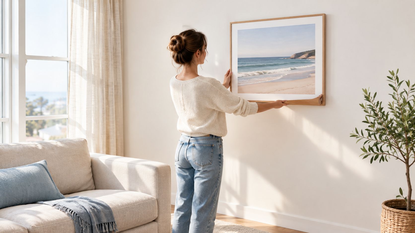
Before buying, decide whether you want the artwork to deliver regional identity, vacation memory, visual calm, or texture. That answer will guide the substyle, material, size, and wall location far more reliably than choosing an image just because it contains blue water.
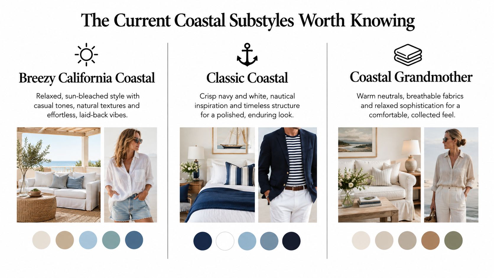
Coastal style has split into several recognizable directions, and shopping gets easier once you know which one belongs in your home. Current trend reporting describes a move away from literal anchors, lighthouses, and beach signs toward warmer, more textural rooms with less obvious theming. One 2026 report states that 75% of homeowners prefer organic, unthemed coastal atmospheres, with blue used selectively instead of dominating the room. Treat that figure as directional trend evidence, not a universal measure, but the visual shift is easy to recognize in practice. Decor Quarter's coastal design guide outlines this change.
This is the easiest style to live with in a modern apartment. Think sun-bleached sand, pale sage, warm white, faded denim, light oak, and relaxed linen. The best print choices are wide horizons, soft surf, dune grasses, and hazy coastal views with plenty of visual breathing room.
Avoid highly saturated turquoise unless the room already has strong color. A washed-out photograph or painterly image will complement casual upholstery and pale timber without making the space feel like a themed resort.
Classic coastal is cleaner and more deliberate. Navy, white, rope, stripes, polished wood, and orderly symmetry create its foundation. A harbor, sailboat, lighthouse, or clipped ocean horizon can work here, but restraint still matters. Choose one maritime reference, not every maritime reference at once.
This style suits rooms with custom sofas, dark wood, brass, or crisp cotton. A photographic print with a strong horizontal composition can reinforce the room's structure, especially when hung above a console or centered over a substantial sofa.
Coastal Grandmother is warmer and less literal. Picture oatmeal linen, creamy walls, weathered wood, soft blue-gray, sage, terracotta, and baskets with visible texture. The artwork should feel collected rather than purchased as a matching set.
Look for quiet beaches, botanical shoreline details, old piers, atmospheric water, or neutral abstract forms. A canvas with a tactile surface often feels more natural here than a glossy photographic print.
Hold the print next to your largest upholstered piece and your dominant wood finish. If the artwork repeats one color but introduces a different texture, you're on the right track. If it repeats every motif already in the room, it may look staged.
For a broader selection of beach-focused pieces, browse Jessie's Home's beach canvas wall art collection, then filter your choices by palette and mood rather than choosing the first obviously nautical image.
Material changes the personality of a coastal image. It also changes how much protection the artwork receives, how much glare you'll see, and whether the piece feels casual or formal.
Canvas is my default for living rooms, bedrooms, offices, and rentals. Cotton-blend canvas softens photographic detail slightly, adds useful texture, and can disguise minor wall imperfections better than a highly reflective frame. A hand-stretched canvas over a solid wood frame also arrives ready to hang, which keeps the installation simple.
Photographic paper delivers sharper detail. It's the right choice for a detailed coastline, architectural harbor scene, or limited-edition photograph where fine lines and tonal transitions matter. Put it behind glazing, though, and plan around reflections from windows and lamps.
Fine-art paper has a more tactile, gallery-like presence. It works well with a generous mat and a simple wood or metal frame, particularly in a study, hallway, or curated gallery wall. The frame becomes part of the design, so a cheap-looking moulding can undermine an otherwise beautiful print.
A 2025 market estimate places canvas prints at approximately 34.2% of global art-print revenue, while photographic prints account for 19.4%. Those figures show how established both formats are, not that one is automatically superior. The market estimate from DataIntelo provides the underlying category breakdown.
| Material | Best For | Texture | Framing Needs | Care Notes |
|---|---|---|---|---|
| Canvas | Warm living rooms, bedrooms, rentals, offices | Soft, woven, lightly tactile | Often ready to hang without additional framing | Keep away from direct sun and moisture |
| Photographic paper | Detailed shorelines, harbors, limited editions | Crisp and smooth | Needs a frame with glazing or acrylic | Watch glare, fingerprints, and light exposure |
| Fine-art paper | Studies, hallways, collected gallery walls | More tactile and art-focused | Use a proper mat and protective glazing | Avoid unstable humidity and bright windows |
A wide sofa usually needs a horizontal print or a balanced pair. A narrow console can take a vertical coastal study, while a tall wall may benefit from stacked pieces rather than one undersized rectangle. Diptychs work especially well with horizons because the division echoes the natural line of sea and sky.
My simple rule is canvas for warmth and texture, paper for crisp detail, and mixed-media groupings for a collected feel. Choose the format before you fall in love with the image, because a beautiful print in the wrong proportion will still look awkward on the wall.
Coastal art often becomes the visual anchor of a wall, so placement matters more than people expect. A print that's slightly too high can make the sofa look disconnected. One that's too small can leave the room feeling unfinished, even if the image itself is excellent.
Start by placing the center of the artwork around eye level. For most rooms, that means the center sits approximately 57 to 60 inches from the floor, adjusted for unusually high or low furniture. Above a sofa, keep roughly 6 to 8 inches between the frame and the sofa back. Above a headboard, leave around 6 to 10 inches so the composition feels attached to the bed rather than floating above it.
A large coastal print should sit within the visual footprint of the furniture beneath it. Above a sofa, the artwork generally needs enough width to feel connected to the seating rather than stranded in the middle of a large wall. If one oversized piece isn't practical, stack two smaller prints or use a diptych with related tones.
For a gallery wall, vary scale and subject. Pair a beach photograph with a small abstract, a line drawing, or a framed map. Repeating the ocean in every frame makes the display feel like a catalog; repeating one or two colors gives it cohesion without turning it into a theme wall.
Practical rule: Match the grouping to the furniture below, then let the negative space keep the room calm.
Blue looks strongest against warm wood, natural linen, cream upholstery, and woven textures. Don't fill every nearby surface with shells, rope, and driftwood. One tactile element is enough to support the print. The art should carry the atmosphere.
For more help with tricky focal points, especially when a television competes with the wall, this guide to finishing the wall above your TV offers useful placement ideas.
Watch the hanging sequence here before drilling into the wall:
If you're furnishing a room designed around shoreline light and relaxed textures, explore Jessie's Home's canvas wall art for coastal homes for ready-to-hang directions that work with sofas, beds, and consoles.
Coastal artwork prints work in city apartments, offices, clinics, restaurants, and hotels when the image supports the room instead of announcing a theme. In a compact apartment, choose a muted horizon, gray-blue water, warm sand, or a low-contrast abstract. Pair it with black metal, walnut, or cream upholstery. The room will feel more open and deliberate.
A home office needs movement without visual noise. A distant coastline or soft water texture can break up shelving while keeping attention on the workday. Clinics need even more restraint. Skip busy surf, dramatic storms, and high-contrast nautical symbols. A clear horizon and generous open space create a calmer impression.
In a bedroom, choose soft tonal variation and matte surfaces. Glossy glazing catches bedside lamps, while textured canvas keeps the composition quiet. Bathrooms demand more care. Steam and condensation create a harsher setting than the coastal mood suggests, so keep artwork away from direct spray and heavy steam. Use a protected format suited to the room. Jessie's Home's bathroom wall art collection offers styles to compare, but moisture conditions should make the final decision.
Restaurants and hotels need art that reads from a distance. Large horizons, simplified forms, and strong tonal blocks outperform tiny photographic details. In busy spaces, use sealed surfaces and secure hanging hardware. Keep pieces away from cleaning spray, seating impact, and direct sunlight.
As noted earlier, roughly 40% of the U.S. population lives in coastal counties. That reach helps explain why coastal imagery works beyond beach houses. Travel, family history, and the desire for escape give the subject meaning in homes far from the shoreline.
A beach photograph can sit beside a botanical print when both share a muted green. An abstract can follow a harbor image when their shapes echo one another. Match palette, scale, or line quality rather than forcing every piece to depict the sea. Shared visual structure makes the grouping feel collected instead of themed.
Renters should choose one substantial piece when a permanent gallery wall is impractical. A ready-to-hang canvas can finish a blank wall while leaving the rest of the room flexible. In a larger home, place that piece where its horizon has room to breathe, then let nearby furniture and non-coastal art keep the setting grounded.
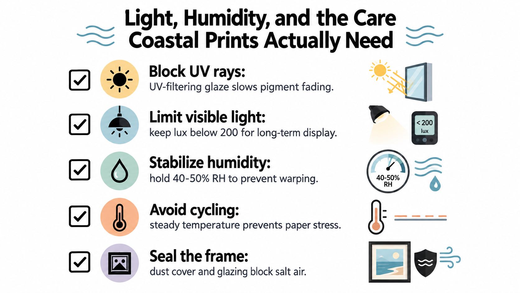
A coastal print doesn't become durable just because it depicts water. Light and moisture damage the artwork, not the subject matter. Ultraviolet radiation can break down colorants, and visible light can also fade pigments depending on the print process. Conservation testing found that UV-filtering glazing improved colorant retention in pigment prints and reduced fading, paper yellowing, and gloss change. Museums Galleries Scotland's care guidance explains why reducing exposure matters.
Keep prints out of direct sun whenever possible. If a piece must hang near a window, use indirect lighting, UV-absorbing glazing, or a protective coating. None of these makes artwork immune to fading. UV protection lowers risk, but visible light remains relevant.
Canvas, paper, cotton fibers, and wooden stretcher bars respond to changes in moisture. Repeated expansion and contraction can contribute to cracking, buckling, flaking, and structural weakness. Conservation guidance recommends stable relative humidity in the broad range of 40% to 60%, with daily fluctuations no greater than approximately ±10%. Bendigo Art Gallery's conservation guidance provides the relevant recommendations.
For a home, I'd aim for roughly 45% to 55% relative humidity when possible. Avoid bathrooms, kitchens with heavy steam, exterior walls prone to condensation, and spots directly above radiators or HVAC outlets. In humid coastal climates, leave a small air gap behind the piece and consider a dehumidifier. Let framed or stretched artwork acclimatize before installation if it has arrived from a different climate.
If you're troubleshooting a damp home, Covenant Aire Solutions offers a practical humidity guide for healthier indoor conditions.
Use a soft, dry microfiber cloth on the frame and surrounding wall. Don't spray cleaner onto canvas, glazing, or the frame. For paper prints, keep liquids away entirely. In a salty environment, inspect metal hardware and frame edges occasionally, and make sure the backing remains sealed and dry.
A small wall offset improves airflow, but it won't rescue artwork installed in a persistently damp room. If you see waviness, corner lifting, mold spotting, or a musty smell, move the piece to a stable environment before attempting to clean it.
The coastal print you'll still like later probably won't be the one with the loudest nautical message. It will have a connection to a place, color, texture, or memory that belongs to you. Choose the beach you actually remember, the harbor you visit, or the quiet quality you want the room to hold.
Use four decisions:
Will a coastal print age well in a beach house? Yes, if you treat light, humidity, and salt air as part of the purchase decision. Placement and protection matter more than the word “coastal” on the product page.
Can coastal artwork work in a minimalist room? Absolutely. Choose one restrained horizon or abstract water image, then give it space. Minimalism needs fewer, stronger pieces.
How do you avoid the dated nautical look? Skip matching anchors, signs, ropes, and lighthouses. Use atmosphere, texture, and a controlled palette instead. One literal maritime image can work, but it shouldn't have to explain the entire room.
Jessie's Home offers artist-made coastal canvas wall art and gallery-quality photo prints designed for rooms that need a personal sense of place, from beach houses to city apartments. Browse Jessie's Home to find a coastal print that fits your style, material preference, and wall conditions, then give it the placement and care it deserves.

Choose, size, and hang large abstract wall art with confidence. Practical tips on scale, materials, and placement for every room.
Choose, size, and hang large abstract wall art with confidence. Practical tips on scale, materials, and placement for every room.

Discover 7 spring wall art ideas with florals, pastels, and light compositions, plus quick tips to refresh your decor this season and style with confidence.
Discover 7 spring wall art ideas with florals, pastels, and light compositions, plus quick tips to refresh your decor this season and style with confidence.

Home gym wall decor - Turn a blank wall into daily motivation. Learn which materials hold up to sweat, how to size pieces for your space, and layout tricks
Home gym wall decor - Turn a blank wall into daily motivation. Learn which materials hold up to sweat, how to size pieces for your space, and layout tricks


