Your wishlist is empty.
Secure Payment
30 days return

You've found the perfect blue-and-white artwork, held it against the blank wall, and then hesitated. Will the room feel fresh or freezing? Collected or overly nautical? Calm or strangely flat?
That hesitation makes sense. Blue with white isn't one fixed style. It can feel airy, traditional, architectural, soft, dramatic, or modern depending on the blue's depth, the white's undertone, the room's natural light, and the materials surrounding the art. The most successful rooms don't rely on color alone. They balance contrast with texture and repeat the palette with enough variation to keep it personal.
Blue-and-white ceramics have a long visual history. The style is widely traced to China, where it first appeared during the Tang dynasty, from 618 to 906, and Jingdezhen potters refined porcelain production during the Yuan dynasty, from 1279 to 1368, by using kaolin clay and improved firing technology. The Victoria and Albert Museum traces the development of Chinese blue-and-white ceramics, including the tradition's later influence across Eurasian trade routes.
This guide treats the pairing as a tunable system. You'll learn how to choose warm or cool white, soft blue or deep navy, textured or crisp artwork, and materials that make the final room feel inviting rather than sterile.
A blank wall can make a familiar color combination feel surprisingly complicated. You may love the clean rhythm of blue and white in a painting or ceramic vase, yet worry that repeating it at home will turn your living room into a beach rental or make a north-facing bedroom feel chilly.
The solution usually isn't abandoning the palette. It's adjusting the temperature and weight of each color. A powder blue print on warm white canvas feels gentle and hazy. Navy lines against crisp white create sharper definition. The same basic pairing can shift mood because one blue is muted and one is saturated, or because one white carries a creamy undertone while another appears bright and cool.
Blue and white has endured because it gives the eye two useful experiences at once. Blue creates a visual anchor, while white leaves breathing room around it. Historically, the pairing also traveled widely. Chinese blue-and-white porcelain became a major international luxury export from the 16th to the 19th centuries, and its cobalt pigment originally came from Persia during the 14th century, as described by the Birmingham Museum of Art in its overview of the style's international influence, The Blue and White Pandemic.
Stylist's rule: Choose the room's feeling first, then choose the shade that creates it.
Start by observing the wall and the daylight rather than shopping immediately. Does the room receive soft, indirect light? Does the furniture already include honey-colored wood, black metal, linen, or woven fibers? Is the wall a creamy neutral or a bright white? Those details tell you whether the artwork needs softness, contrast, warmth, or depth.
You don't need a complete blue-and-white makeover. One well-sized canvas can establish the direction, then smaller objects can echo its tones without making every surface match. Once you understand how blue and white interact, the palette becomes less of a decorating gamble and more like a set of controls you can adjust.
Think of blue as ink and white as paper. The paper gives the ink room to register, while the ink gives the paper a point of focus. If the ink is pale, the page feels gentle and quiet. If it's dark and concentrated, the same page feels graphic and formal.
That simple relationship explains why blue with white can feel so different from room to room.
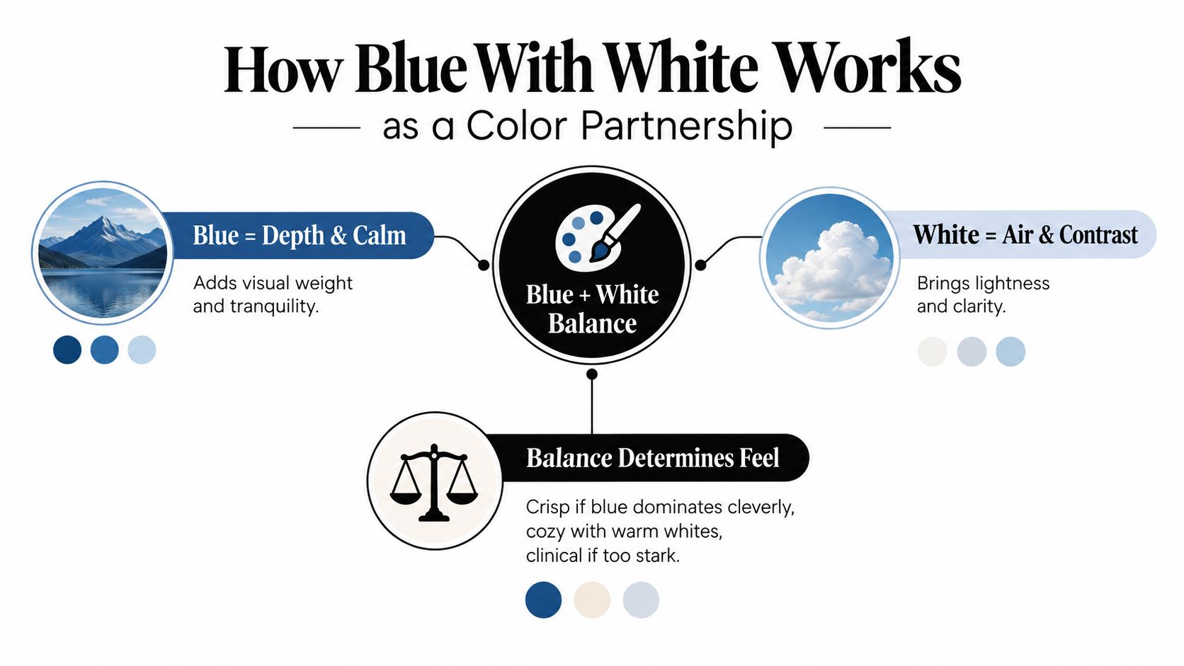
Blue can lean gray, green, violet, or almost black. White can lean yellow, pink, gray, or blue. You don't need to identify the exact undertone with professional color tools, but you should compare samples in the room where the art will hang.
A blue with a green cast can feel organic beside oak, sage, or rattan. A violet-leaning blue may feel richer with cool gray and polished metal. Warm white softens a strong navy. Crisp white makes navy look more graphic and defined.
If you're comparing neighboring shades, a blue green hex guide can help you understand how digital color references describe blue-green variations. Treat a screen value as a starting point, not a substitute for seeing paint, fabric, or canvas in your own light.
For digital and print design, pure blue, #0000FF, has an estimated contrast ratio of 8.6:1 against white, exceeding the 4.5:1 threshold for normal text and the 3:1 threshold for large text and interface graphics, according to WebAIM's contrast guidance. That makes strong blue-on-white combinations legible in small labels and graphic details, while lighter blues may fall below accessibility thresholds and should be checked with a contrast analyzer.
In interiors, the same principle appears visually. A pale blue line on a bright white wall may disappear, while indigo brushwork remains readable from across the room. Contrast is useful, but it shouldn't be the only ingredient. Add a warm frame, textured textile, or wood surface so the pairing feels dimensional rather than merely high-impact.
The easiest way to choose a blue-and-white scheme is to compare complete moods rather than isolated paint chips. Each combination below has a different level of contrast, softness, and visual weight.
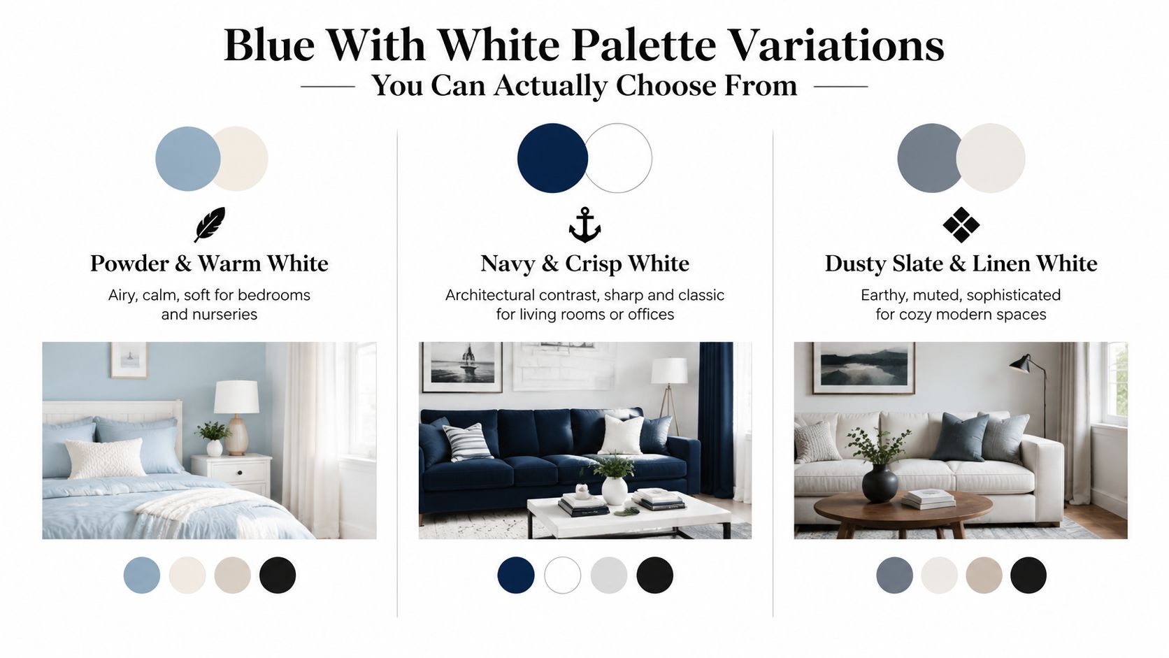
This is the gentlest option. Powder blue artwork, especially when it contains gray or a subtle green cast, works beautifully with warm white walls, pale oak, natural linen, and soft upholstery. The effect is airy without becoming stark.
Choose it for bedrooms, nurseries, reading corners, or rooms with strong daylight where you want the art to filter the brightness. Look for loose abstracts, misty views, delicate botanicals, or minimal linework. A bright primary blue would overpower this mood, so keep the artwork softly diluted.
Navy with crisp white gives you the clearest architectural contrast. It suits living rooms, entryways, dining rooms, and offices where the art needs to hold its own beside structured furniture.
Pair navy geometry, bold brushwork, or simplified coastal forms with white walls, black accents, polished chrome, or darker wood. This combination can nod toward classic nautical design, but it doesn't have to. Avoid adding too many literal anchors, stripes, or ocean motifs. Let the contrast and composition carry the character.
Dusty slate blue sits comfortably between blue and gray. Linen white adds a softened, natural counterpoint, especially beside mushroom, taupe, tan, or warm gray upholstery. The result feels quieter and more contemporary than a bright blue-and-white scheme.
This palette suits cozy modern spaces, apartments, layered living rooms, and guest bedrooms. Choose abstract art with visible brush texture, weathered architectural forms, or restrained shapes. For ideas that keep a relaxed home feeling polished and welcoming, explore family-friendly Hamptons decor without copying its lighter coastal formula exactly.
Indigo creates richness without requiring a dark wall. Use it in a canvas, ceramic collection, or patterned textile, then temper the intensity with cane, oak, jute, terracotta, or aged brass. This is the strongest choice for readers who like blue and white but want to move beyond the beach-house association.
A single indigo artwork can anchor an otherwise neutral room. Browse blue abstract canvas wall art for compositions where white space and blue movement create interest without relying on obvious maritime imagery.
| Palette | Mood and Best Fit | Art Style to Pair |
|---|---|---|
| Powder blue and warm white | Airy, calm, and soft for bedrooms or nurseries | Hazy landscapes, botanicals, delicate abstracts |
| Navy and crisp white | Sharp, classic, and architectural for living rooms or offices | Geometry, bold brushwork, simplified forms |
| Dusty slate and linen white | Muted, earthy, and sophisticated for cozy modern spaces | Textured abstracts, quiet landscapes, architectural studies |
| Indigo and natural materials | Rich, grounded, and design-led for living or dining spaces | Expressive abstracts, layered marks, dramatic negative space |
Watch the video below for another visual reference as you compare the palette directions.
Blue with white feels cold when every surface repeats the same cool temperature. A blue artwork sits on a blue-white wall, a white sofa sits beneath it, and glossy accessories reinforce the contrast. Instead of reading as layered, the room starts to feel clinical because nothing introduces softness or visual friction.
Light direction can amplify the problem. Low-light and north-facing rooms often make cool whites look more distant, while pale blue can lose its warmth and appear gray. That doesn't mean you can't use the palette. It means the white should usually do more warming work.
Current design coverage points toward softer whites and warmer neutrals, while richer, deeper colors are gaining attention over stark contrast. Veranda's 2025 interior trend coverage describes the importance of warm-versus-cool white decisions and the risk of cool white reading clinical in certain rooms. The practical lesson is simple: don't treat “white” as a neutral, invisible background.
Hold the art against the wall at different times of day. If the white in the artwork looks yellow beside the wall, the wall may be cooler than the canvas. If the blue looks washed out in the evening, the room may need stronger value contrast.
Use this quick diagnostic:
Wood is one of the quickest warmers because its grain breaks up the hard edge between blue and white. Linen and cotton add softness. Rattan, wicker, jute, and matte ceramics create small variations that make the palette feel lived in.
The goal isn't to make blue warm. The goal is to give cool blue a warmer neighborhood.
A blue-and-white room also needs breathing room. Don't fill every shelf with matching pieces. Keep a few quiet areas so the artwork remains the focal point, then repeat one or two tones elsewhere through a cushion, vase, book cover, or small textile. The room will feel connected without becoming themed.
The right artwork changes depending on the room's function. A living room can handle stronger contrast, while a bedroom usually benefits from softer edges. Use the same palette logic, but change the scale, composition, and surrounding materials.
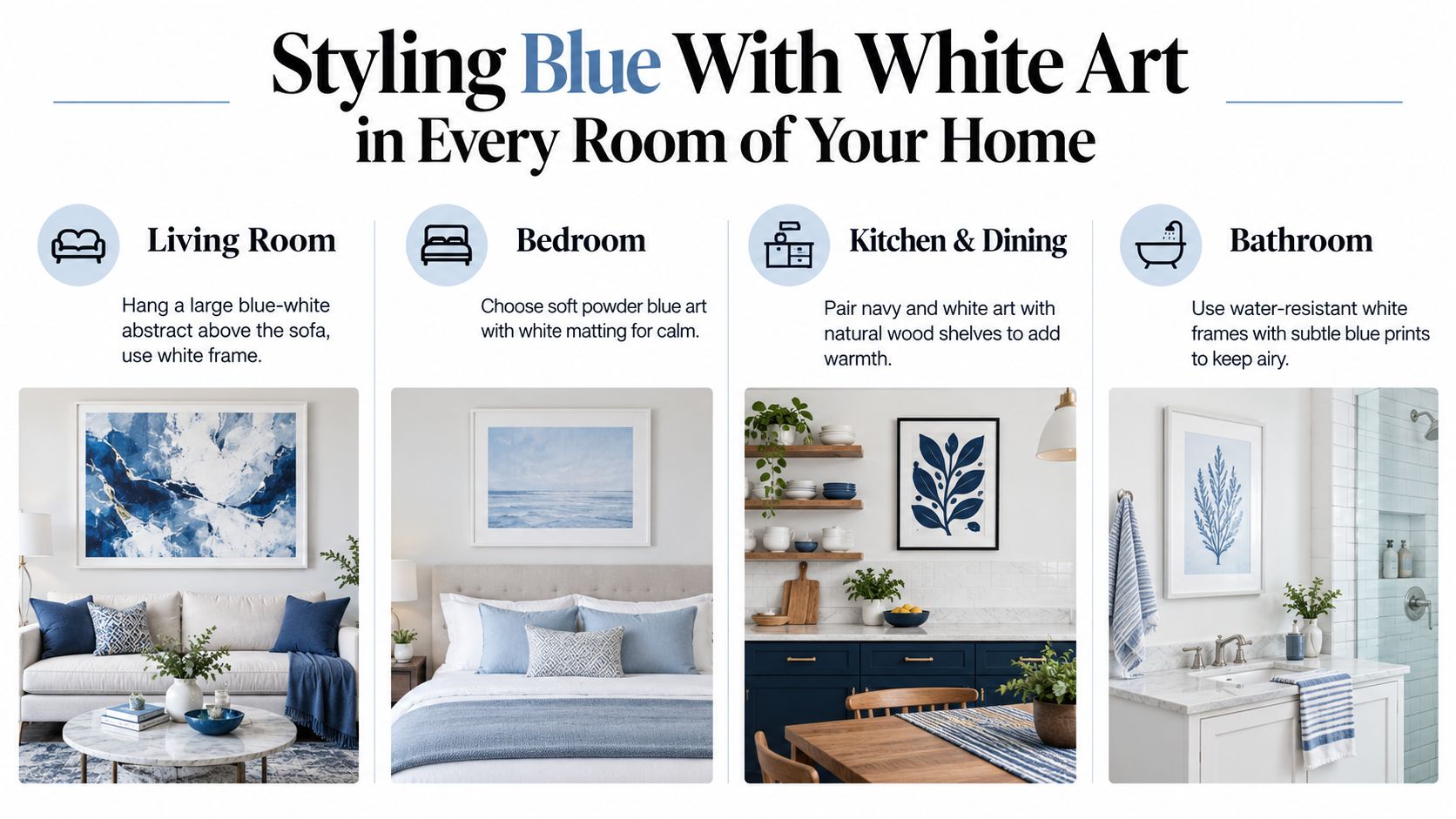
Treat the wall above a sofa as a visual anchor. A large blue-and-white abstract can create more presence than several tiny pieces scattered across a broad wall. Choose a white, pale oak, or natural wood frame according to the room's temperature, then echo one blue in a cushion or ceramic rather than matching every accessory.
If the sofa is deep navy, use artwork with generous white space so the wall doesn't become visually heavy. If the sofa is cream or light gray, indigo or slate artwork can supply the needed depth.
Bedrooms benefit from softened contrast. Powder blue, dusty slate, and warm white create a restful combination when paired with linen bedding, pale wood, and low-gloss surfaces. Hang one horizontal piece above the headboard or create a restrained pair with matching white mats.
For a relaxed seaside mood, oversized bedding can help establish softness, but avoid making every element coastal. This guide to oversized bedding for beachy bedrooms offers useful layering ideas, even if your final room leans modern rather than nautical.
Navy-and-white art works especially well against light cabinetry because it gives the room definition without competing with food, dishes, or open shelving. Add natural wood shelves, woven seating, or a warm metal pendant to stop the scheme from feeling too polished.
The color direction also reflects a wider move away from automatic all-white kitchens. A major NKBA trend report cited by Artsy says 71% of designers prefer colorful kitchens over all-white ones, as reported in Vogue's 2025 interiors color coverage. Use blue as a deliberate architectural accent, not merely a substitute for white.
In bathrooms, choose subtle blue prints, white or light frames, and moisture-resistant finishes. The effect stays spa-like when the composition is quiet and the blue isn't overly saturated.
A home office can take a stronger navy or indigo piece because contrast helps define the work zone. For coastal homes that need a more contemporary expression, explore canvas wall art for coastal homes, then look for abstract or designs that avoid literal beach imagery.
A blue-and-white artwork can look completely different depending on its surface and frame. Glossy paper with a thin, bright frame feels crisp and graphic. Matte canvas with a natural wood frame feels softer, more tactile, and easier to blend with relaxed furniture.
Canvas is especially useful when the room already has strong contrast. Its weave and low-sheen surface diffuse sharp edges, so navy and white feel less like a printed pattern and more like an art object. That quality helps a bold piece sit comfortably above a sofa, bed, or console.
Use the surrounding materials as your guide:
A frame shouldn't disappear. It should either soften the art or clarify its edges. If the wall, artwork, and furniture all have pale finishes, a light wood frame may provide just enough structure to prevent the display from fading into the background.
Repeat texture, not just color. A linen cushion can echo the white ground of the canvas. A blue ceramic bowl can repeat a small brushstroke. A wood tray can connect the frame to the coffee table. These relationships make the artwork feel placed rather than pasted onto the wall.
For a restrained room, one large canvas and two supporting objects often have more impact than a crowded arrangement. If you prefer a gallery grouping, vary the scale and let one piece carry the deepest blue. The eye needs a hierarchy.
Finishing move: Let the art provide the strongest color statement, then repeat its quieter tones through objects you can move.
If you prefer clean compositions with fewer decorative layers, look through minimalist canvas wall art for pieces that use negative space, restrained marks, or simplified forms. They can keep a blue-and-white room expressive without making the wall feel busy.
You don't need to decide whether your home is coastal, traditional, or modern before choosing blue with white art. Start with four practical questions: How much natural light reaches the wall? Which undertone does the room already have? Does the space need softness or contrast? Which material will keep the composition from feeling flat?
Choose warm white when the room feels dim, the furniture is natural, or the existing palette includes cream, tan, oak, or woven fibers. Choose crisp white when the room has strong daylight, clean-lined furniture, and a need for definition. Pick powder blue or dusty slate when you want quiet. Choose navy or indigo when the wall needs weight and the room can support stronger contrast.
Then use one anchor piece. Hold it against the wall in morning and evening light, step back several feet, and notice whether the white blends with the room or looks disconnected. From there, repeat only the tones that feel natural. A pillow, ceramic, throw, or small print can create continuity without turning the space into a matching set.
Blue and white isn't disappearing. Its most useful expression is becoming more flexible. Instead of relying on bright stripes and obvious seaside references, homeowners can use deeper blues, warmer whites, tactile canvas, wood, linen, and mixed materials to create rooms that feel calm but architectural.
Your first choice doesn't need to solve the entire room. It only needs to give the wall a confident point of view.
Jessie's Home offers artist-made canvas wall art and gallery-quality photo prints in abstract, coastal, botanical, minimalist, and other styles, with pieces produced on premium canvas and hand-stretched over solid wood frames. Visit Jessie's Home to find a blue-and-white artwork that suits your room's light, undertones, and materials.

Discover how to pick, place, and style art with cat themes across your home. Covers popular styles, room-by-room placement, and mixing feline art
Discover how to pick, place, and style art with cat themes across your home. Covers popular styles, room-by-room placement, and mixing feline art

Discover how black and white minimalist art transforms any room with calm, contrast, and timeless style, plus tips on prints, framing, and placement.
Discover how black and white minimalist art transforms any room with calm, contrast, and timeless style, plus tips on prints, framing, and placement.

Discover watercolor abstract art techniques, learn how prints differ from originals, and get styling tips for your home. A complete guide for wall art lovers.
Discover watercolor abstract art techniques, learn how prints differ from originals, and get styling tips for your home. A complete guide for wall art lovers.


